- Ebooks & Courses
- Practice Tests

How To Write an IELTS Bar Chart Essay
There are 5 steps to writing a good IELTS bar chart essay:
1) Analyse the question
2) Identify the main features
3) Write an introduction
4) Write an overview
5) Write the details paragraphs
Use this simple planning process as you practice writing IELTS bar chart essays and you’ll have no problem remembering it in the exam.
Steps 1 and 2 of the planning process should take around 5 minutes. It is essential that you don’t miss these out as they are the key to writing a high-scoring essay.
On this page, I’m going to take you through the whole planning process step-by-step as we work on a practice question.
Before we begin, here’s a model essay structure that you can use as a guideline for all IELTS Academic Task 1 questions.
Ideally, your essay should have 4 paragraphs:
Paragraph 1 – Introduction
Paragraph 2 – Overview
Paragraph 3 – 1 st main feature
Paragraph 4 – 2 nd main feature
Now that we have all these tools we need, we’re ready to begin planning and writing our IELTS bar chart essay.
Here’s our practice question:
The bar chart below shows the sector contributions to India’s gross domestic product from 1960 to 2000.
Summarise the information by selecting and reporting the main features, and make comparisons where relevant.
Write at least 150 words.
Contribution as % of India's GDP

Source: EPW Research Foundation
Step 1 – Analyse the question
The format of every Academic Task 1 question is the same. Here is our practice question again with the words that will be included in all questions highlighted .
The bar chart below shows the sector contributions to India’s gross domestic product from 1960 to 2000.
Every question consists of:
- Sentence 1 – A brief description of the graphic
- Sentence 2 – The instructions
- The graphic – chart, graph, table, etc.
Sentence 2 tells you what you have to do.
You must do 3 things:
1. Select the main features.
2. Write about the main features.
3. Compare the main features.
All three tasks refer to the ‘ main features ’ of the graphic. You do not have to write about everything. Just pick out 2 or 3 key features and you’ll have plenty to write about.
Our practice graphic is a dynamic bar chart. That is, it includes a timeline giving data from several different points in time.
So, for this question, we need to identify the main trends (that is, the general developments or changes in situation) in the three key sectors of the Indian economy – agriculture, industry and service – between 1960 and 2000.
Alternatively, a bar chart may be static with the data coming from one point in time, as in the example below. For this graphic, we would need to compare the different variables, that is, the different leisure activities favoured by Canadian boys and girls.

Step 2 – Identify the Main Features
The graphic in IELTS bar chart questions should not be difficult to interpret. Each question has been created to test your language skills, not your mathematics ability.
All you are looking for are the main features. These will usually be the easiest things to spot. As we’ve just seen, the type of key features will depend on whether the bar chart is dynamic or static.
There will be lots of information in the graphic to help you identify them. Here are some useful questions to ask?
- What information do the 2 axes give?
- Is it dynamic or static?
- What are the units of measurements?
- What are the time periods?
- What can you learn from the title and any labels?
- What is the most obvious trend?
- Are there any notable similarities?
(I give more detail on how to use these questions, plus downloadable checklists for identifying the main features of all 7 different types of IELTS Academic Writing Task 1 questions, in the lesson on How To Understand & Analyse Task 1 Questions .)
So, what main features stand out in our practice graphic?
Here's our practice IELTS bar chart again.
There are 3 main features/trends in this IELTS bar chart:
Main feature 1: The contribution of the agricultural sector dropped steadily.
Main feature 2: The contribution of the service sector increased each decade.
Main feature 3: Industry remained static from 1980 to 2000.
The general trends you select will be the starting point for your essay. You will then go on to add more detail.
With just 20 minutes allowed for Task 1, and a requirement of only 150 words, you won't be able to include many details.
We’re now ready to begin writing our essay. Here’s a reminder of the 4 part structure we’re going to use.
Step 3 – Write an Introduction
In the introduction, you should simply paraphrase the question, that is, say the same thing in a different way. You can do this by using synonyms and changing the sentence structure. For example:
Introduction (Paragraph 1):
The bar graph illustrates the relative percentage contributions made by the agricultural, industrial and service sectors to the Indian economy between 1960 and 2000.
This is all you need to do for the introduction.
Ideally, key words such as ‘sector’ and ‘contributions’ should be replaced by synonyms but there aren’t any obvious words that could be used instead so it’s fine to repeat them. It’s important that your language sounds natural so never try to force in synonyms that don’t quite fit.
Step 4 – Write an Overview (Paragraph 2)
In the second paragraph, you should report the main features you can see in the graph, giving only general information. The detail comes later in the essay. You should also make any clear comparisons you spot.
This is where we write about the general trends. Here are the ones we picked out above.
Now form these ideas into two or three sentences with a total of around 40 words. State the information simply using synonyms where possible. No elaborate vocabulary or grammar structures are required, just the appropriate words and correct verb tenses.
For example:
Overview (Paragraph 2) :
Over the whole time period, the significance of agriculture declined steadily while services grew in importance decade by decade. A different patterned emerged for industry, which initially showed a slowly increasing percentage but then plateaued from 1980 onwards.
Step 5 – Write the 1st Detail Paragraph
Paragraphs 3 and 4 of your IELTS bar chart essay are where you include more detailed information about the data in the graphic. In paragraph 3, you should give evidence to support your first 1 or 2 key features. Don’t forget to make comparisons when relevant.
Here are our first 2 main features again:
And this is an example of what you could write:
Paragraph 3 :
In 1960, agriculture contributed by far the highest percentage of GDP, peaking at 62%, but it then dropped in steady increments to a low of 12% in 2000. The service sector, on the other hand, had a relatively minor impact on the economy in 1960. This situation changed gradually at first, then its percentage contribution jumped from 28% to 43% between 1980 and 1990. By 2000 it matched the high point reached by agriculture in 1960, showing a reversal in the overall trend.
Step 6 – Write the 2nd Detail Paragraph
For the fourth and final paragraph, you do the same thing for your remaining feature/s. We have one main feature left to write about.
Here’s an example of what you could write:
Paragraph 4 :
Industry remained a steady contributor to India’s wealth throughout the period. As a sector, it grew marginally from 16% in 1960 to exactly a quarter in 1980 then remained static for the next two decades, maintaining a constant share of the overall GDP.
Here are the four paragraphs brought together to create our finished essay.
Finished IELTS Bar Chart Essay
(188 words)
This sample IELTS bar chart essay is well over the minimum word limit so you can see that you don’t have space to include very much detail at all. That’s why it is essential to select just a couple of main features to write about.
Now use what you’ve learnt in this lesson to practice answering other IELTS bar chart questions. Start slowly at first and keep practicing until you can plan and write a complete essay in around 20 minutes.
Want to watch and listen to this lesson?
Click on this video.
Would you prefer to share this page with others by linking to it?
- Click on the HTML link code below.
- Copy and paste it, adding a note of your own, into your blog, a Web page, forums, a blog comment, your Facebook account, or anywhere that someone would find this page valuable.
Like this page?
Ielts academic writing task 1 – all lessons.
IELTS Academic Writing – A summary of the test including important facts, test format & assessment.
Academic Writing Task 1 – The format, the 7 question types & sample questions, assessment & marking criteria. All the key information you need to know.
Understanding Task 1 Questions – How to quickly and easily analyse and understand IELTS Writing Task 2 questions.
How To Plan a Task 1 Essay – Discover 3 reasons why you must plan, the 4 simple steps of essay planning and learn a simple 4 part essay structure.
Vocabulary for Task 1 Essays – Learn key vocabulary for a high-scoring essay. Word lists & a downloadable PDF.
Grammar for Task 1 Essays – Essential grammar for Task 1 Academic essays including, verb tenses, key sentence structures, articles & prepositions.
The 7 Question Types:
Click the links below for a step-by-step lesson on each type of Task 1 question.
- Table Chart
- Process Diagram
- Multiple Graphs
- IELTS Writing
- IELTS Bar Chart
- Back To Top
* New * Grammar For IELTS Ebooks

$9.99 each Full Set Just $ 23.97
Find Out More >>
IELTS Courses

Full details...

IELTS Writing Ebook

Discount Offer
$7 each Full Set Just $ 21

Find out more >>
Testimonials
“I am very excited to have found such fabulous and detailed content. I commend your good work.” Jose M.
“Thanks for the amazing videos. These are ‘to the point’, short videos, beautifully explained with practical examples." Adari J.
"Hi Jacky, I bought a listening book from you this morning. You know what? I’m 100% satisfied. It’s super helpful. If I’d had the chance to read this book 7 years ago, my job would be very different now." Loi H.
"Hi Jacky, I recently got my IELTS results and I was pleased to discover that I got an 8.5 score. I'm firmly convinced your website and your videos played a strategic role in my preparation. I was able to improve my writing skills thanks to the effective method you provide. I also only relied on your tips regarding the reading section and I was able to get a 9! Thank you very much." Giano
“After listening to your videos, I knew I had to ditch every other IELTS tutor I'd been listening to. Your explanations are clear and easy to understand. Anyways, I took the test a few weeks ago and my result came back: Speaking 7, listening 9, Reading 8.5 and Writing 7 with an average band score of 8. Thanks, IELTS Jacky." Laide Z.
Contact
About Me
Site Map
Privacy Policy
Disclaimer
IELTS changes lives.
Let's work together so it changes yours too.
Copyright © 2024 IELT Jacky
All Right Reserved
IELTS is a registered trademark of the University of Cambridge, the British Council, and IDP Education Australia. This site and its owners are not affiliated, approved or endorsed by the University of Cambridge ESOL, the British Council, and IDP Education Australia.

Figures and Charts
What this handout is about.
This handout will describe how to use figures and tables to present complicated information in a way that is accessible and understandable to your reader.
Do I need a figure/table?
When planning your writing, it is important to consider the best way to communicate information to your audience, especially if you plan to use data in the form of numbers, words, or images that will help you construct and support your argument. Generally speaking, data summaries may take the form of text, tables or figures. Most writers are familiar with textual data summaries and this is often the best way to communicate simple results. A good rule of thumb is to see if you can present your results clearly in a sentence or two. If so, a table or figure is probably unnecessary. If your data are too numerous or complicated to be described adequately in this amount of space, figures and tables can be effective ways of conveying lots of information without cluttering up your text. Additionally, they serve as quick references for your reader and can reveal trends, patterns, or relationships that might otherwise be difficult to grasp.
So what’s the difference between a table and a figure anyway?
Tables present lists of numbers or text in columns and can be used to synthesize existing literature, to explain variables, or to present the wording of survey questions. They are also used to make a paper or article more readable by removing numeric or listed data from the text. Tables are typically used to present raw data, not when you want to show a relationship between variables.
Figures are visual presentations of results. They come in the form of graphs, charts, drawings, photos, or maps. Figures provide visual impact and can effectively communicate your primary finding. Traditionally, they are used to display trends and patterns of relationship, but they can also be used to communicate processes or display complicated data simply. Figures should not duplicate the same information found in tables and vice versa.
Using tables
Tables are easily constructed using your word processor’s table function or a spread sheet program such as Excel. Elements of a table include the Legend or Title, Column Titles, and the Table Body (quantitative or qualitative data). They may also include subheadings and footnotes. Remember that it is just as important to think about the organization of tables as it is to think about the organization of paragraphs. A well-organized table allows readers to grasp the meaning of the data presented with ease, while a disorganized one will leave the reader confused about the data itself, or the significance of the data.
Title: Tables are headed by a number followed by a clear, descriptive title or caption. Conventions regarding title length and content vary by discipline. In the hard sciences, a lengthy explanation of table contents may be acceptable. In other disciplines, titles should be descriptive but short, and any explanation or interpretation of data should take place in the text. Be sure to look up examples from published papers within your discipline that you can use as a model. It may also help to think of the title as the “topic sentence” of the table—it tells the reader what the table is about and how it’s organized. Tables are read from the top down, so titles go above the body of the table and are left-justified.
Column titles: The goal of column headings is to simplify and clarify the table, allowing the reader to understand the components of the table quickly. Therefore, column titles should be brief and descriptive and should include units of analysis.
Table body: This is where your data are located, whether they are numerical or textual. Again, organize your table in a way that helps the reader understand the significance of the data. Be sure to think about what you want your readers to compare, and put that information in the column (up and down) rather than in the row (across). In other words, construct your table so that like elements read down, not across. When using numerical data with decimals, make sure that the decimal points line up. Whole numbers should line up on the right.
Other table elements
Tables should be labeled with a number preceding the table title; tables and figures are labeled independently of one another. Tables should also have lines demarcating different parts of the table (title, column headers, data, and footnotes if present). Gridlines or boxes should not be included in printed versions. Tables may or may not include other elements, such as subheadings or footnotes.
Quick reference for tables
Tables should be:
- Centered on the page.
- Numbered in the order they appear in the text.
- Referenced in the order they appear in the text.
- Labeled with the table number and descriptive title above the table.
- Labeled with column and/or row labels that describe the data, including units of measurement.
- Set apart from the text itself; text does not flow around the table.
Table 1. Physical characteristics of the Doctor in the new series of Doctor Who
| Height | Age (yrs.) | |
| Ninth Doctor | 6’0” | 41 |
| Tenth Doctor | 6’1” | 35 |
| Eleventh Doctor | 5’11” | 25 |
Table 2. Physical characteristics of the Doctor in the new series of Doctor Who
| Personal Appearance | Wardrobe | |
| Ninth Doctor | Close-cropped hair Blue eyes Slightly stockier build | Black leather jacket Dark colored, v-necked shirts Black combat boots |
| Tenth Doctor | Longer, mussed-up hair Brown eyes Very thin build | Beige trench coat Pin-striped suit and tie Chuck Taylors |
| Eleventh Doctor | Longer, side-swept hair Green eyes Slightly stockier build | Brown tweed jacket Bow tie and suspenders Black Boots |
Using figures
Figures can take many forms. They may be graphs, diagrams, photos, drawings, or maps. Think deliberately about your purpose and use common sense to choose the most effective figure for communicating the main point. If you want your reader to understand spatial relationships, a map or photograph may be the best choice. If you want to illustrate proportions, experiment with a pie chart or bar graph. If you want to illustrate the relationship between two variables, try a line graph or a scatterplot (more on various types of graphs below). Although there are many types of figures, like tables, they share some typical features: captions, the image itself, and any necessary contextual information (which will vary depending on the type of figure you use).
Figure captions
Figures should be labeled with a number followed by a descriptive caption or title. Captions should be concise but comprehensive. They should describe the data shown, draw attention to important features contained within the figure, and may sometimes also include interpretations of the data. Figures are typically read from the bottom up, so captions go below the figure and are left-justified.
The most important consideration for figures is simplicity. Choose images the viewer can grasp and interpret clearly and quickly. Consider size, resolution, color, and prominence of important features. Figures should be large enough and of sufficient resolution for the viewer to make out details without straining their eyes. Also consider the format your paper will ultimately take. Journals typically publish figures in black and white, so any information coded by color will be lost to the reader. On the other hand, color might be a good choice for papers published to the web or for PowerPoint presentations. In any case, use figure elements like color, line, and pattern for effect, not for flash.
Additional information
Figures should be labeled with a number preceding the table title; tables and figures are numbered independently of one another. Also be sure to include any additional contextual information your viewer needs to understand the figure. For graphs, this may include labels, a legend explaining symbols, and vertical or horizontal tick marks. For maps, you’ll need to include a scale and north arrow. If you’re unsure about contextual information, check out several types of figures that are commonly used in your discipline.
Quick reference for figures
Figures should be:
- Labeled (under the figure) with the figure number and appropriate descriptive title (“Figure” can be spelled out [“Figure 1.”] or abbreviated [“Fig. 1.”] as long as you are consistent).
- Referenced in the order they appear in the text (i.e. Figure 1 is referenced in the text before Figure 2 and so forth).
- Set apart from the text; text should not flow around figures.
Every graph is a figure but not every figure is a graph. Graphs are a particular set of figures that display quantitative relationships between variables. Some of the most common graphs include bar charts, frequency histograms, pie charts, scatter plots, and line graphs, each of which displays trends or relationships within and among datasets in a different way. You’ll need to carefully choose the best graph for your data and the relationship that you want to show. More details about some common graph types are provided below. Some good advice regarding the construction of graphs is to keep it simple. Remember that the main objective of your graph is communication. If your viewer is unable to visually decode your graph, then you have failed to communicate the information contained within it.
Pie charts are used to show relative proportions, specifically the relationship of a number of parts to the whole. Use pie charts only when the parts of the pie are mutually exclusive categories and the sum of parts adds up to a meaningful whole (100% of something). Pie charts are good at showing “big picture” relationships (i.e. some categories make up “a lot” or “a little” of the whole thing). However, if you want your reader to discern fine distinctions within your data, the pie chart is not for you. Humans are not very good at making comparisons based on angles. We are much better at comparing length, so try a bar chart as an alternative way to show relative proportions. Additionally, pie charts with lots of little slices or slices of very different sizes are difficult to read, so limit yours to 5-7 categories.

The chart shows the relative proportion of fifteen elements in Martian soil, listed in order from “most” to “least”: oxygen, silicon, iron, magnesium, calcium, sulfur, aluminum, sodium, potassium, chlorine, helium, nitrogen, phosphorus, beryllium, and other. Oxygen makes up about ⅓ of the composition, while silicon and iron together make up about ¼. The remaining slices make up smaller proportions, but the percentages aren’t listed in the key and are difficult to estimate. It is also hard to distinguish fifteen colors when comparing the pie chart to the color coded key.

The chart shows the relative proportion of five leisure activities of Venusian teenagers (tanning, trips to Mars, reading, messing with satellites, and stealing Earth cable). Although each of the five slices are about the same size (roughly 20% of the total), the percentage of Venusian teenagers engaging in each activity varies widely (tanning: 80%, trips to Mars: 40%, reading: 12%, messing with satellites: 30%, stealing Earth cable: 77%). Therefore, there is a mismatch between the labels and the actual proportion represented by each activity (in other words, if reading represents 12% of the total, its slice should take up 12% of the pie chart area), which makes the representation inaccurate. In addition, the labels for the five slices add up to 239% (rather than 100%), which makes it impossible to accurately represent this dataset using a pie chart.
Bar graphs are also used to display proportions. In particular, they are useful for showing the relationship between independent and dependent variables, where the independent variables are discrete (often nominal) categories. Some examples are occupation, gender, and species. Bar graphs can be vertical or horizontal. In a vertical bar graph the independent variable is shown on the x axis (left to right) and the dependent variable on the y axis (up and down). In a horizontal one, the dependent variable will be shown on the horizontal (x) axis, the independent on the vertical (y) axis. The scale and origin of the graph should be meaningful. If the dependent (numeric) variable has a natural zero point, it is commonly used as a point of origin for the bar chart. However, zero is not always the best choice. You should experiment with both origin and scale to best show the relevant trends in your data without misleading the viewer in terms of the strength or extent of those trends.

The graph shows the number of male and female spaceship crew members for five different popular television series: Star Trek (1965), Battlestar (1978), Star Trek: TNG (1987), Stargate SG-1 (1997), and Firefly (2002). Because the television series are arranged chronologically on the x-axis, the graph can also be used to look for trends in these numbers over time.
Although the number of crew members for each show is similar (ranging from 9 to 11), the proportion of female and male crew members varies. Star Trek has half as many female crew members as male crew members (3 and 6, respectively), Battlestar has fewer than one-fourth as many female crew members as male crew members (2 and 9, respectively), Star Trek: TNG has four female crew members and six male crew members, Stargate SG-1 has less than one-half as many female crew members as male crew members (3 and 7, respectively), and Firefly has four female and five male crew members.
Frequency histograms/distributions
Frequency histograms are a special type of bar graph that show the relationship between independent and dependent variables, where the independent variable is continuous, rather than discrete. This means that each bar represents a range of values, rather than a single observation. The dependent variables in a histogram are always numeric, but may be absolute (counts) or relative (percentages). Frequency histograms are good for describing populations—examples include the distribution of exam scores for students in a class or the age distribution of the people living in Chapel Hill. You can experiment with bar ranges (also known as “bins”) to achieve the best level of detail, but each range or bin should be of uniform width and clearly labeled.
XY scatter plots
Scatter plots are another way to illustrate the relationship between two variables. In this case, data are displayed as points in an x,y coordinate system, where each point represents one observation along two axes of variation. Often, scatter plots are used to illustrate correlation between two variables—as one variable increases, the other increases (positive correlation) or decreases (negative correlation). However, correlation does not necessarily imply that changes in one variable cause changes in the other. For instance, a third, unplotted variable may be causing both. In other words, scatter plots can be used to graph one independent and one dependent variable, or they can be used to plot two independent variables. In cases where one variable is dependent on another (for example, height depends partly on age), plot the independent variable on the horizontal (x) axis, and the dependent variable on the vertical (y) axis. In addition to correlation (a linear relationship), scatter plots can be used to plot non-linear relationships between variables.

The scatter plot shows the relationship between temperature (x-axis, independent variable) and the number of UFO sightings (y-axis, dependent variable) for 53 separate data points. The temperature ranges from about 0°F and 120°F, and the number of UFO sightings ranges from 1 to 10. The plot shows a low number of UFO sightings (ranging from 1 to 4) at temperatures below 80°F and a much wider range of the number of sightings (from 1 to 10) at temperatures above 80°F. It appears that the number of sightings tends to increase as temperature increases, though there are many cases where only a few sightings occur at high temperatures.
XY line graphs
Line graphs are similar to scatter plots in that they display data along two axes of variation. Line graphs, however, plot a series of related values that depict a change in one variable as a function of another, for example, world population (dependent) over time (independent). Individual data points are joined by a line, drawing the viewer’s attention to local change between adjacent points, as well as to larger trends in the data. Line graphs are similar to bar graphs, but are better at showing the rate of change between two points. Line graphs can also be used to compare multiple dependent variables by plotting multiple lines on the same graph.
Example of an XY line graph:

The line graph shows the age (in years) of the actor of each Doctor Who regeneration for the first through the eleventh regeneration. The ages range from a maximum of about 55 in the first regeneration to a minimum of about 25 in the eleventh regeneration. There is a downward trend in the age of the actors over the course of the eleven regenerations.
General tips for graphs
Strive for simplicity. Your data will be complex. Don’t be tempted to convey the complexity of your data in graphical form. Your job (and the job of your graph) is to communicate the most important thing about the data. Think of graphs like you think of paragraphs—if you have several important things to say about your data, make several graphs, each of which highlights one important point you want to make.
Strive for clarity. Make sure that your data are portrayed in a way that is visually clear. Make sure that you have explained the elements of the graph clearly. Consider your audience. Will your reader be familiar with the type of figure you are using (such as a boxplot)? If not, or if you’re not sure, you may need to explain boxplot conventions in the text. Avoid “chartjunk.” Superfluous elements just make graphs visually confusing. Your reader does not want to spend 15 minutes figuring out the point of your graph.
Strive for accuracy. Carefully check your graph for errors. Even a simple graphical error can change the meaning and interpretation of the data. Use graphs responsibly. Don’t manipulate the data so that it looks like it’s saying something it’s not—savvy viewers will see through this ruse, and you will come off as incompetent at best and dishonest at worst.
How should tables and figures interact with text?
Placement of figures and tables within the text is discipline-specific. In manuscripts (such as lab reports and drafts) it is conventional to put tables and figures on separate pages from the text, as near as possible to the place where you first refer to it. You can also put all the figures and tables at the end of the paper to avoid breaking up the text. Figures and tables may also be embedded in the text, as long as the text itself isn’t broken up into small chunks. Complex raw data is conventionally presented in an appendix. Be sure to check on conventions for the placement of figures and tables in your discipline.
You can use text to guide the reader in interpreting the information included in a figure, table, or graph—tell the reader what the figure or table conveys and why it was important to include it.
When referring to tables and graphs from within the text, you can use:
- Clauses beginning with “as”: “As shown in Table 1, …”
- Passive voice: “Results are shown in Table 1.”
- Active voice (if appropriate for your discipline): “Table 1 shows that …”
- Parentheses: “Each sample tested positive for three nutrients (Table 1).”
Works consulted
We consulted these works while writing this handout. This is not a comprehensive list of resources on the handout’s topic, and we encourage you to do your own research to find additional publications. Please do not use this list as a model for the format of your own reference list, as it may not match the citation style you are using. For guidance on formatting citations, please see the UNC Libraries citation tutorial . We revise these tips periodically and welcome feedback.
American Psychological Association. 2010. Publication Manual of the American Psychological Association . 6th ed. Washington, DC: American Psychological Association.
Bates College. 2012. “ Almost everything you wanted to know about making tables and figures.” How to Write a Paper in Scientific Journal Style and Format , January 11, 2012. http://abacus.bates.edu/~ganderso/biology/resources/writing/HTWtablefigs.html.
Cleveland, William S. 1994. The Elements of Graphing Data , 2nd ed. Summit, NJ: Hobart Press..
Council of Science Editors. 2014. Scientific Style and Format: The CSE Manual for Authors, Editors, and Publishers , 8th ed. Chicago & London: University of Chicago Press.
University of Chicago Press. 2017. The Chicago Manual of Style , 17th ed. Chicago & London: University of Chicago Press.
You may reproduce it for non-commercial use if you use the entire handout and attribute the source: The Writing Center, University of North Carolina at Chapel Hill
Make a Gift
Grammar check | Essay checker | Writing checker
December 22, 2018
Writing about Charts, Graphs, and Diagrams
by Nicholas Walker , under IELTS and TOEFL
Make sure to organize your IELTS Task 1 essay so that the reader can navigate it easily.
Step 1: Give a clear overview of what the figure is about, showing that you understand the main message it conveys.
Step 2: Describe the data in a systematic way (left to right, top to bottom, biggest to smallest) using numbers and words from the figure.
Step 3: Compare significant elements of the figure, mentioning any trends or changes in the past, extrapolating for the future if you can.
Useful chart, graph, and diagram vocabulary
Some words are likely to appear in a discussion of a chart, graph, or diagram. Use the target structure checker with the following list of common chart, graph, and diagram vocabulary to see if you are using the vocabulary your readers (the examiners) are expecting to see.
above, according to, apparent, are compared, are presented, bar graph, below, can be seen, chart, climbed, comparable, compares, considerable, considerably, decline, decrease, demonstrates, detailed, details, difference, dipped, diving sharply, downward, dramatic, dropped off, evident, falls, fell, fluctuation, fluctuations, gap, gradual, graph, greater, grew, grows, high, higher, highlighted, highlights, highs, histogram, illustrated, illustrates, increase, indicates, jump, leads, led, level, leveled, levelled, leveling, levelling, levels, lists, low, lower, lows, moderate, narrowed, note, number, observe, peak, peaks, period, photo, pie chart, pinpoints, plummeted, presents, proves, rapid climb, rates of, reports, reveals, remained, remains, rise, rises, rose, shown, shows, significant, slid, slight, steady, summarizes, results, value of, to every, to the left, to the right, total, trend, upward, we can see, widened, widening, widens
Want more like this?
Get new posts by email, recent posts.
- ConverSolo to Provide AI Language Learning Tools to Quebec Colleges and University– A First of its Kind AI Application in Higher Learning
- Virtual Writing Tutor Membership Plan Options
- Automated Essay Scoring Moodle Plugin
- 30 conversation questions to ask a traveler or a voice-enabled chatbot
- Inflation for ESL students
- Improve Writing
- What’s my English level?
- Automatically Scored Emails
- ESL Strategies: Flashcards
- Applied Linguistics at Concordia University
Enjoy this blog? Please spread the word :)
- A Beginner’s Guide to IELTS
- Common Grammar Mistakes [for IELTS Writing Candidates]
Writing Correction Service
- Free IELTS Resources
- Practice Speaking Test
Select Page
How to Describe a Bar Chart [IELTS Writing Task 1]
Posted by David S. Wills | Apr 13, 2020 | IELTS Tips , Writing | 5
![How to Describe a Bar Chart [IELTS Writing Task 1]](https://cdn.shortpixel.ai/spai/q_lossy+ret_img+to_webp/ted-ielts.com/wp-content/uploads/2020/04/Describe-Bar-Charts-for-IELTS-1280x640.png "an essay on chart")
There are various kinds of diagrams and charts that you may be asked to describe in the IELTS writing test, and one of those is the bar chart . In today’s lesson, I want to share some important advice that can help you improve your writing performance in your next IELTS test.
Describing data for task 1 of the IELTS writing exam is quite difficult and it will vary according to what you actually see. In other words, it is hard to simply teach some language for describing bar charts… Instead, your language will vary according to what the bar chart shows.
However, in this article I am going to break the process down and show you some examples so that you can understand it fully. At the end, I will give you a sample band 9 answer for a really difficult bar chart about people’s weight.
What are Bar Charts?
First of all, let’s start with the most basic question. You can feel free to skip this if you are already totally familiar with it. 😁 What is a bar chart? Basically, it is a visual representation of data using bars, like these:

Bar charts are used to show the difference between volumes or quantities of things because it is easy for the human eye to interpret. Let’s take a look at this example bar chart. I just found it on Google and will use it because it is simple. This is not a real IELTS chart. 🤪

You can easily see what this means. The most common excuse is “I forgot to set my alarm” and the least common is “It was still too dark; I thought it was still night-time.”
That is the purpose of a bar chart. It shows data in a way that is really easy for people to understand. As such, you may encounter it in your IELTS test. In that case, you will have to pick out the most important data and describe it.
Bar Charts for IELTS Writing
As we have seen, a bar chart is just another way of expressing data. For task 1 of the IELTS writing test, you may be asked to write about a bar chart. You will have to write more than 150 words and it is recommended that you do this in 20 minutes or less. (You will have a total of 1 hour for 2 tasks.)
It is important to note that you do not have to describe everything in the chart . Part of the task is picking out and describing only the relevant details. That usually means:
- The highest
- Major differences
- Anything interesting
What does that mean? This is very subjective, and so it is certainly open to debate. Let’s look at an example in order to understand it better:

In this bar chart, our eyes are naturally drawn towards the highest and lowest figures. The highest was in Sweden in 2012 and the lowest was in Finland in 2012. Therefore, both the highest and lowest figures occurred in the same year. That’s interesting!😅
Another interesting factor is that, in every year except one, Sweden had a higher divorce rate than Finland. It was only in 2015 that Finland’s divorce rate was higher than Sweden’s.
The Process
When you need to describe a bar chart for IELTS, you should take the same basic process as for describing anything else:
- Take time to read the question carefully.
- Look at the data and make sure you understand it.
- Find important data to describe.
- Plan your essay structure.
- Write your essay carefully.
- Check your answer for mistakes.
If you follow this basic routine, you will have a good chance of providing a strong answer to the question.
Language for Describing Bar Charts
In the past, I have talked about the language required to describe the following IELTS writing task 1 assignments:
- Process diagram
Bar charts are a little different because the language you would use depends on what is being described and there is no common set language that you would use just to talk about bar charts in general.
In the previous example, we can see that the bar chart features changing data over time. In such cases, we can use relatively similar language to that which we used for line graphs. You could say, for example:
Divorce rates in Sweden peaked in 2012 at a little under 50%, but fell in each of the subsequent years.
However, you can see that in the first bar chart there was no progression of time, so you cannot use language that shows changes in data. This brings us to the next stage…
Common Problems in Describing Bar Charts for IELTS
I used to teach writing skills at a university in China, and one of the most common problems I would have was teaching my students to write about bar charts. They could describe line graphs really easily, but the problem was that they would use the same expressions and structures for bar charts, when in fact something different was needed. Let’s look at two example charts. These contain similar data but there is an essential difference:

You can see that the line graph talks about changing phone prices over time, whereas the bar chart shows the different prices of phones. These prices are all taken from the same point in time .
Therefore, in order to adequately describe these, you must show that you understand the data.
For the line graph, you can say:
The price of Phone A rose from £380 to £410 between December and January.
However, you cannot use this language for the bar chart:
INCORRECT: The price rose from £380 for Phone B to £410 for Phone C. CORRECT: Phone C cost £30 more than Phone B, which cost £380.
This may seem easy to some people, but it is an important distinction and a common mistake. You should practice often to make sure that you know the difference.
Task 1 Essay Structure
There is no single perfect essay structure for IELTS, but there are some that are better than others. For task 1, I generally recommend writing an essay like this:
| Introduction | Give overview of the data Describe the main trend |
| Main paragraph #1 | Describe the main set of data OR Describe the first group of data |
| Main paragraph #2 | Describe secondary set of data OR Describe the second group of data |
Let me explain what I mean by that.
It is really important to group your data appropriately. This can be quite difficult, so you should read this article first.
Essentially, you need to choose how to put groups of data together. Let’s take another example:
The chart below shows the total number of minutes (in billions) of telephone call in the UK, divided into three categories, from 1995-2002. Summarise the information by selecting a reporting the main features, and make comparisons where relevant.

For this sort of bar chart, you might choose to write two or three body paragraphs. Perhaps you would describe local fixed line phones first, then start a new paragraph for national and international ones, with another paragraph for mobiles.
Another way would be to break the data in half – one paragraph for 1995 to 1998 and another paragraph for 1999 to 2002.
There are lots of different ways. The only really important thing is that you make it clear to your reader why you have chosen to group the data this way. In other words, it must be logical .
Sample Answer
My answer to this question would look something like this:
| Introduction | Give overview of the data Describe the main trend |
| Main paragraph #1 | Describe local calls |
| Main paragraph #2 | Describe other 2 types of call |
The bar chart shows the time spent on three different kinds of phone calls in the United Kingdom over a period of eight years, starting in 1995 and ending in 2002. Local calls were the most common type of phone call made during the entire period, although both national/international and mobile calls grew in popularity to narrow the gap between these three types of call by 2002. In 1995, local calls were by far the most common type of phone call in the UK, with more than 70 billion minutes recorded on this chart. This is about double the amount of time spent on national and international calls, and more than ten times as much as was spent on mobile phone calls. All three types of phone calls grew in popularity until 1999, after which local calls decreased year-on-year until they ended the period at around the same figure as they began it – 70 billion minutes. National and international calls grew steadily over the recorded eight years, from about half the popularity of local calls to only slightly less in 2002. Mobile phone calls, however, grew ten-fold from about four billion minutes to more than forty billion.
A Really Difficult Bar Chart
Finally, let’s look at a difficult bar chart in order to show how we can tackle challenging problems.

As you can see, the first problem is that there are two charts! Already, that will prove more difficult than describing just one chart.
Another issue is that these bars look strange. They are all the same size… Why? Well, these represent the population. Each one is 100%, with the colours making up the different weight categories. The total can never be more than 100% because that it is the full population.
Now, you should try to interpret the data. What are the main changes?
- In 1955, there are lots of people at an ideal weight and very few people are obese.
- In 2015, many older people are obese. Fewer people are at an ideal weight.
- The weight distribution was similar regardless of age in 1955, but in 2015 it is very different.
Once you have picked out the important data, you should figure out how to structure your answer. I will use this structure:
| Introduction | Give overview of the data Describe the main trend |
| Main paragraph #1 | Describe 1955 data |
| Main paragraph #2 | Describe 2015 data |
However, I will make sure that there are clear comparisons between the 1955 and 2015 data. It is not enough to describe them in isolation.
Language for Talking about Age and Weight
To be honest, the hardest part of this bar chart is not that data but the terminology around age and weight. You can see from the chart that were are looking at age groups and weight groups. Many native speakers find this really difficult to talk about.
When we talk about age and weight, we usually say some form of “to be” rather than “to have.” For example:
- INCORRECT: In 2015, a higher percentage of people had overweight or obesity than in any other group.
- CORRECT: In 2015, a higher percentage of people were overweight or obese than in any other group.
- INCORRECT: In both years, the people who were most likely to be an ideal weight had 20 to 29 years.
- CORRECT: In both years, the people who were most likely to be an ideal weight were aged 20 to 29 years.
You can see how I explained this to one of the students on my writing correction service :

There are also problems with grouping people according to age. We can just say “people in the ___ age group/category” but this becomes repetitive after a while, so we need to use different language.
Talking about age is difficult, especially when describing groups of people who fall into different age categories. One thing to know is that, when you say use numbers, it is a sort of adjective and thus you need a noun to follow it or else it is meaningless:
- The criminals arrested were all 16 to 25 years old.
- I saw a 15-year-old boy running away.
You can turn the “old” into a noun by adding an “-s”:
- There was an increase of 25% in the unemployment rate for 20-29-year olds.
You can also put “aged” before the numbers:
- Most of the recipients were aged 18-22.
Sample Band 9 Answer
Here is my description of the bar chart above:
There are two bar charts showing the distribution of weight categories for people living in Charlestown. The first one is from 1955 and the second is from 2015. It is clear that vast changes have occurred in people’s health during this sixty year period. In 1955, very few people were overweight or obese, and most were healthy or even underweight. In each of the age groups, at least half of people were classified as in the ideal weight range, but towards the ends of the spectrum – the youngest and the oldest people – there were more people who fell into the underweight bracket. Being overweight or obese was a problem primarily affecting middle aged people, but not the most elderly ones. However, this distribution had completely changed by 2015. Although some young adults and elderly people remained underweight, a very slim number in the middle of the age groups did. Being overweight had become increasingly common, and obesity had become a huge issue, affecting people more and more as they got older. For people aged fifty and older, more than half suffered from obesity, and very few fell into a healthy weight range.
Useful Language
I will excerpt some of the useful phrases that appeared in this answer so that you can see how I have managed to describe ages and weights:
- very few people were overweight or obese
- most were healthy or even underweight
- at least half of people were classified as in the ideal weight range
- people who fell into the underweight bracket
- Being overweight or obese was a problem
- elderly people remained underweight
- Being overweight had become increasingly common
- obesity had become a huge issue
- more than half suffered from obesity
- very few fell into a healthy weight range
This was a really difficult bar chart to describe, but using this language I have managed to do it accurately and comprehensively.
Improve your Writing
If you want to get better at IELTS writing, the only way to ensure constant progress is by having an expert give you feedback. Most of the writing correction services that you find online are rubbish. They are run by people do not speak much English or do not understand IELTS. My writing correction service is one of the few that is truly worthwhile. I can tell you all your problems and help you to fix them.
Here is my feedback to someone who wrote an essay about the Charlestown weight distribution bar charts:

Let me know in the comment section if you have any questions. 🙂
About The Author

David S. Wills
David S. Wills is the author of Scientologist! William S. Burroughs and the 'Weird Cult' and the founder/editor of Beatdom literary journal. He lives and works in rural Cambodia and loves to travel. He has worked as an IELTS tutor since 2010, has completed both TEFL and CELTA courses, and has a certificate from Cambridge for Teaching Writing. David has worked in many different countries, and for several years designed a writing course for the University of Worcester. In 2018, he wrote the popular IELTS handbook, Grammar for IELTS Writing and he has since written two other books about IELTS. His other IELTS website is called IELTS Teaching.
Related Posts

6 Tips to Boost Your IELTS Reading Score
October 30, 2016

IELTS History Vocabulary
December 6, 2021

Formal and Informal Vocabulary for IELTS
September 28, 2020

The Importance of Hedging Language
June 19, 2023

Hi, David. I noticed that you didn’t include any figures at all in your sample answer for the weight assessment. Is that acceptable? This is because I have seen some IETLS teacher who taught us to include most of important figures. Thank you.
The important thing about IELTS is that it is an English test, so you should use your language to describe the data. Most candidates attempt to cram lots of numbers in so that they can use fewer words. The fewer numbers you use, the better. Sure, you can have one or two, but if you are able to use words to describe trends, reflect important data, or make comparisons, then it is much better. If you read my essay carefully, you will notice that I said things like “at least half of people” rather than just repeating numbers. This is a good strategy, although you can certainly put in a few numbers if you want.

Hi David. Thank you for your explanation. I have a question! for describing a chart what verb tens we should use? It depends on something or it has a rule! Thank you.
It depends on the situation. Pay attention to any time frame that is given or the origin of the data. If none is given, then present simple is fine.

Asalam O Alakum David
Can we explain only things in overview except figures, percentage and time trend? I mean only what they have mentioned in the picture.
Secondly, in last 2 paragraphs only should we write those things which they have showed in the graph, chart or map in a simple way.\
Please, confirm me.
With regards
Leave a reply Cancel reply
Your email address will not be published. Required fields are marked *
This site uses Akismet to reduce spam. Learn how your comment data is processed .
Download my IELTS Books

Recent Posts
- British vs American Spelling
- How to Improve your IELTS Writing Score
- Past Simple vs Past Perfect
- Complex Sentences
- How to Score Band 9 [Video Lesson]

Recent Comments
- Francisca on Adverb Clauses: A Comprehensive Guide
- Mariam on IELTS Writing Task 2: Two-Part Questions
- abdelhadi skini on Subordinating Conjunction vs Conjunctive Adverb
- David S. Wills on How to Describe Tables for IELTS Writing Task 1
- anonymous on How to Describe Tables for IELTS Writing Task 1
- Lesson Plans
- Model Essays
- TED Video Lessons
- Weekly Roundup
IELTS Writing Task 1: How to Describe a Bar Chart

If you’re not sure where to start, that’s ok! In this piece, we’ll provide an overview of how to describe a typical IELTS Writing Task 1 bar chart. We also suggest taking a look at resources in this piece on useful words for writing an IELTS Graph Essay
Table of Contents
What will you see in an ielts writing task 1 bar diagram, how to write about an ielts writing task 1 bar chart, how to describe an ielts writing task 1 bar chart, a final word on describing ielts academic bar charts.
A bar chart uses either horizontal or vertical bars to show comparisons among two or more categories. The bar chart has two main features: an X-axis and a Y-axis. One axis of the chart shows the specific categories being compared, and the other axis of the graph shows a given value (usually a percentage or a dollar amount).

To effectively write about an IELTS Writing Task 1 bar chart, follow these tips.
1. Start by Reading the Title
First and foremost, you should read the title. Often, I have students report on the essay in an inverted order because they didn’t read the bar chart title.
For example, an IELTS Writing Task 1 bar chart that I give students has the chart title “Expected City Visits by Country of Origin for 2018.” Yet I often get sample sentences back that read: “It is predicted that people from France will be the most likely to visit the United States in 2018.” The correct answer should be “It is predicted that Americans will choose France as their favorite city to visit in 2018.”
2. Look at the Time Frame
Look at the given period of time covered in the chart. Are you looking at a specific year? Are there multiple years being compared? Are we talking about something in the future? This will determine your grammar and style to some extent. For example, whether you need to use past tense language, the language of change, or future tense language when discussing your data.
3. Decide What You Are Comparing
What titles are given to the Y- and X-axis? This important information will form the language that you will use in the essay and the corresponding synonyms you should also use.
For example, the bar chart above compares the gross earnings of fiction books in five categories (Young Adults, Classics, Mystery, Romance and Sci-Fi and Fantasy) between 2006 and 2010. (Incidentally, this sentence is exactly what you would say for your introduction!)
Now that you know what the IELTS Writing Task 1 bar chart is about, these are the vital elements to include in your essay:
- Start with an introduction. The introduction explains what the chart is about, and gives an overview of the main points. Make sure you include one! Your introduction can be short, but it must be there. If you’ve spent time examining the chart this should be easy to write.
- Look for the key data and make sure that you are comparing and contrasting the data, NOT just listing the data from one section to the next. If you just write about what happened to X, what happened to Y, and what happened to Z, without showing any relationship between them, you will not get a high score.
To do this, you will need to look for similarities and differences when you first analyze the chart and you will need to decide what can logically be put together or not. This means that you don’t have to describe everything that you see in the bar chart, just the key points!
For example, for the above chart, you might say: It is interesting to note that Romance novels earned the most income each year between 2006 and 2010 with sales ranging from $70,000 to $115,000. In contrast, Sci Fi and Fantasy novels were the poorest revenue generators of the five categories earning only $20,000 at its highest point in 2007 and a mere $10,000 at its lowest point in 2009.
- Group the data together so that you have a well-organized and coherent answer. It is a good idea to divide your answer into two or three paragraphs so it is well organized. To do this, you should group similar ideas together into paragraphs or sections. Cohesion and coherence are key!
- Use a wide variety of sentence structures. Include complex sentences and simple sentences.
- It is equally important to use appropriate transitions between describing each data point.
- Always provide a short summary conclusion of what you included in your essay. One line is enough here. For example, It can be seen from the chart that overall, 2007 was the best year for book sales in all five categories.
- Finally, make sure that your word count is 150.
Overall, describing a an IELTS academic bar chart is a pretty straightforward task on your exam. Remember that in order to write well about a bar chart, you’ll want to be very clear on the relationship being expressed in it, so be careful not to rush past this step.
That said, you won’t want to spend more than about 20 minutes on IELTS writing task 1, so save most of your time for essay writing.
We hope we answered all of your IELTS Writing Task 1 bar diagram and bar chart questions! For more advice, we recommend taking a look at this IELTS writing task 1 vocab guide .
Good luck on your IELTS writing test!

Eliot Friesen-Meyers is the Senior Curriculum Manager for Magoosh IELTS and TOEFL. He attended Goshen College (B.A.), New York University (M.A.), and Harvard University (M.T.S.), gaining experience and skills in curriculum development, ESOL instruction, online teaching and learning, and IELTS and TOEFL test prep education. Eliot’s teaching career started with Literacy Americorps in Pittsburgh, Pennsylvania, and later, taught ESL programs at Northeastern University, University of California-Irvine, and Harold Washington College. Eliot was also a speaker at the 2019 TESOL International Conference . With over 10 years of experience, he understands the challenges students face and loves helping them overcome those challenges. Come join Eliot on Youtube , Facebook , and Instagram . Recent blog posts Complete Guide to IELTS Writing Task 1 Complete Guide to IELTS Writing Task 2
View all posts
More from Magoosh

3 responses to “IELTS Writing Task 1: How to Describe a Bar Chart”
Thank you so much for your units and sharing.
We’re so glad we can help! 🙂
The bar chat illustrates the total amount of earning in sales of fiction books(young adults,classics,mystery,romance,sci-fi and fantasy) between 2096 and 2010. Overall,the total amount of sales of earning in romance book has highest through out the give decades while sci-fi and fantasy books has lowest amount of sales. In 2097 romance book earings has raised more than 10000000 respectively and then decreased to 9ne third in 2008 about 70,000,00 whereas the last two decades 2009 and 2010 upsurge arround 79,999,99 and 35,000,00 while the total gross earnings in the mystery books in 2006 arround 60,000,00 and increased in 2006 arround 82,000,00 has highest constant more than 40,000,00 same in 2009. On other hand,the total amount earings in young adults and classic book in 2007 and 2009 remains same about 25,000,00 meanwhile in 2006 and 2019 young adults books gross earnings has highest about 15,000,00 and 14,000,00 classic downsurge arround 99,999,99 however from 2006 to 2019 sci-fi and fantasy books earings has lowest sales less than 20,000,00 approximately.
Leave a Reply Cancel reply
Your email address will not be published. Required fields are marked *
Have a language expert improve your writing
Run a free plagiarism check in 10 minutes, generate accurate citations for free.
- Knowledge Base
- How to write an essay outline | Guidelines & examples
How to Write an Essay Outline | Guidelines & Examples
Published on August 14, 2020 by Jack Caulfield . Revised on July 23, 2023.
An essay outline is a way of planning the structure of your essay before you start writing. It involves writing quick summary sentences or phrases for every point you will cover in each paragraph , giving you a picture of how your argument will unfold.
Instantly correct all language mistakes in your text
Upload your document to correct all your mistakes in minutes

Table of contents
Organizing your material, presentation of the outline, examples of essay outlines, other interesting articles, frequently asked questions about essay outlines.
At the stage where you’re writing an essay outline, your ideas are probably still not fully formed. You should know your topic and have already done some preliminary research to find relevant sources , but now you need to shape your ideas into a structured argument.
Creating categories
Look over any information, quotes and ideas you’ve noted down from your research and consider the central point you want to make in the essay—this will be the basis of your thesis statement . Once you have an idea of your overall argument, you can begin to organize your material in a way that serves that argument.
Try to arrange your material into categories related to different aspects of your argument. If you’re writing about a literary text, you might group your ideas into themes; in a history essay, it might be several key trends or turning points from the period you’re discussing.
Three main themes or subjects is a common structure for essays. Depending on the length of the essay, you could split the themes into three body paragraphs, or three longer sections with several paragraphs covering each theme.
As you create the outline, look critically at your categories and points: Are any of them irrelevant or redundant? Make sure every topic you cover is clearly related to your thesis statement.
Order of information
When you have your material organized into several categories, consider what order they should appear in.
Your essay will always begin and end with an introduction and conclusion , but the organization of the body is up to you.
Consider these questions to order your material:
- Is there an obvious starting point for your argument?
- Is there one subject that provides an easy transition into another?
- Do some points need to be set up by discussing other points first?
Receive feedback on language, structure, and formatting
Professional editors proofread and edit your paper by focusing on:
- Academic style
- Vague sentences
- Style consistency
See an example

Within each paragraph, you’ll discuss a single idea related to your overall topic or argument, using several points of evidence or analysis to do so.
In your outline, you present these points as a few short numbered sentences or phrases.They can be split into sub-points when more detail is needed.
The template below shows how you might structure an outline for a five-paragraph essay.
- Thesis statement
- First piece of evidence
- Second piece of evidence
- Summary/synthesis
- Importance of topic
- Strong closing statement
You can choose whether to write your outline in full sentences or short phrases. Be consistent in your choice; don’t randomly write some points as full sentences and others as short phrases.
Examples of outlines for different types of essays are presented below: an argumentative, expository, and literary analysis essay.
Argumentative essay outline
This outline is for a short argumentative essay evaluating the internet’s impact on education. It uses short phrases to summarize each point.
Its body is split into three paragraphs, each presenting arguments about a different aspect of the internet’s effects on education.
- Importance of the internet
- Concerns about internet use
- Thesis statement: Internet use a net positive
- Data exploring this effect
- Analysis indicating it is overstated
- Students’ reading levels over time
- Why this data is questionable
- Video media
- Interactive media
- Speed and simplicity of online research
- Questions about reliability (transitioning into next topic)
- Evidence indicating its ubiquity
- Claims that it discourages engagement with academic writing
- Evidence that Wikipedia warns students not to cite it
- Argument that it introduces students to citation
- Summary of key points
- Value of digital education for students
- Need for optimism to embrace advantages of the internet
Expository essay outline
This is the outline for an expository essay describing how the invention of the printing press affected life and politics in Europe.
The paragraphs are still summarized in short phrases here, but individual points are described with full sentences.
- Claim that the printing press marks the end of the Middle Ages.
- Provide background on the low levels of literacy before the printing press.
- Present the thesis statement: The invention of the printing press increased circulation of information in Europe, paving the way for the Reformation.
- Discuss the very high levels of illiteracy in medieval Europe.
- Describe how literacy and thus knowledge and education were mainly the domain of religious and political elites.
- Indicate how this discouraged political and religious change.
- Describe the invention of the printing press in 1440 by Johannes Gutenberg.
- Show the implications of the new technology for book production.
- Describe the rapid spread of the technology and the printing of the Gutenberg Bible.
- Link to the Reformation.
- Discuss the trend for translating the Bible into vernacular languages during the years following the printing press’s invention.
- Describe Luther’s own translation of the Bible during the Reformation.
- Sketch out the large-scale effects the Reformation would have on religion and politics.
- Summarize the history described.
- Stress the significance of the printing press to the events of this period.
Literary analysis essay outline
The literary analysis essay outlined below discusses the role of theater in Jane Austen’s novel Mansfield Park .
The body of the essay is divided into three different themes, each of which is explored through examples from the book.
- Describe the theatricality of Austen’s works
- Outline the role theater plays in Mansfield Park
- Introduce the research question : How does Austen use theater to express the characters’ morality in Mansfield Park ?
- Discuss Austen’s depiction of the performance at the end of the first volume
- Discuss how Sir Bertram reacts to the acting scheme
- Introduce Austen’s use of stage direction–like details during dialogue
- Explore how these are deployed to show the characters’ self-absorption
- Discuss Austen’s description of Maria and Julia’s relationship as polite but affectionless
- Compare Mrs. Norris’s self-conceit as charitable despite her idleness
- Summarize the three themes: The acting scheme, stage directions, and the performance of morals
- Answer the research question
- Indicate areas for further study
If you want to know more about AI tools , college essays , or fallacies make sure to check out some of our other articles with explanations and examples or go directly to our tools!
- Ad hominem fallacy
- Post hoc fallacy
- Appeal to authority fallacy
- False cause fallacy
- Sunk cost fallacy
College essays
- Choosing Essay Topic
- Write a College Essay
- Write a Diversity Essay
- College Essay Format & Structure
- Comparing and Contrasting in an Essay
(AI) Tools
- Grammar Checker
- Paraphrasing Tool
- Text Summarizer
- AI Detector
- Plagiarism Checker
- Citation Generator
Prevent plagiarism. Run a free check.
You will sometimes be asked to hand in an essay outline before you start writing your essay . Your supervisor wants to see that you have a clear idea of your structure so that writing will go smoothly.
Even when you do not have to hand it in, writing an essay outline is an important part of the writing process . It’s a good idea to write one (as informally as you like) to clarify your structure for yourself whenever you are working on an essay.
If you have to hand in your essay outline , you may be given specific guidelines stating whether you have to use full sentences. If you’re not sure, ask your supervisor.
When writing an essay outline for yourself, the choice is yours. Some students find it helpful to write out their ideas in full sentences, while others prefer to summarize them in short phrases.
You should try to follow your outline as you write your essay . However, if your ideas change or it becomes clear that your structure could be better, it’s okay to depart from your essay outline . Just make sure you know why you’re doing so.
Cite this Scribbr article
If you want to cite this source, you can copy and paste the citation or click the “Cite this Scribbr article” button to automatically add the citation to our free Citation Generator.
Caulfield, J. (2023, July 23). How to Write an Essay Outline | Guidelines & Examples. Scribbr. Retrieved June 9, 2024, from https://www.scribbr.com/academic-essay/essay-outline/
Is this article helpful?

Jack Caulfield
Other students also liked, how to create a structured research paper outline | example, a step-by-step guide to the writing process, how to write an argumentative essay | examples & tips, get unlimited documents corrected.
✔ Free APA citation check included ✔ Unlimited document corrections ✔ Specialized in correcting academic texts
- Skip to primary navigation
- Skip to main content
- Skip to primary sidebar
- Skip to footer
IELTS Advantage
IELTS Preparation Courses
IELTS Bar Chart Sample Essay
Static or Dynamic?
Before writing an IELTS task 1 bar chart or line graph answer it is important that we analyse the question correctly. Taking a few minutes to do this will help us write a clear answer that fully responds to the question. Just what the examiner wants us to do.
The first thing we need to do is decide if the bar chart is static or dynamic. Static means that the data comes from one point in time. Dynamic means the data comes from more than one point in time.
Whether a chart is static or dynamic will affect the information we choose to include in our answer and the kind of language (tense, grammar etc.) we use.
If it is dynamic we will have to compare the different times and comment on the general trends over the time period.
If it is static we will have to compare the different variables, in this case countries, car price, GDP and time it takes for one person to buy a car.
Main Features
Every IELTS academic task 1 question asks us to ‘select and report the main features’.
This means that we have to not only pick the most significant information from the graph and include it in our essay, but also decide which information is not important and should therefore not be included in our essay. One of the biggest mistakes you can make in task 1 is including all the information you see.
So which information should you choose?
You should look for:
- highest/lowest values
- biggest differences
- similarities
- significant exceptions
- anything else that really stands out
There are 3 main features in this graph
1) It takes over 26 years for a Vietnamese person to buy a car.
2) Vietnam has the second highest average costs but the second lowest wages.
3) Cost of a car in Singapore is nearly 3 times the next most expensive.
I advise my students to follow a basic four paragraph structure for these kinds of questions.
Paragraph 1
Paraphrase the question using synonyms.
Paragraph 2
Provide an overview of the main features. No need to include any data in this paragraph, just tell the examiner what is happening in general terms. If you had to describe the main features in two sentences, what would you say?
Paragraph 3
This is where we get more specific and use data. Take 2 of the main features (from your overview) and describe them in detail using data from the chart.
Paragraph 4
Simply do the same thing as you did in paragraph 3, but with two other main features (from your overview).
Sample Answer

The graph compares the GDP per capita, cost of a Toyota Camry and approximate length of time it takes for 1 citizen to purchase that mode of transport in eight Asian countries.
Despite having the second lowest average yearly income, it costs more to buy this car in Vietnam than in all but one other Asian nation. It also takes significantly longer for a standard person to buy an automobile in Vietnam than in any other state in Asia. On the other end of the scale, Singaporeans have to pay nearly three times more for their cars than the Vietnamese and it takes them the least amount of time to afford a motor vehicle.
It costs $49,944 to buy a Toyota Camry in Vietnam, but this dwarfs the average yearly income per person at just $1,910. It would therefore take a normal man or woman 26.1 years to save up for that particular car.
This is in contrast to Singapore where it costs $126,245 for that model of motorcar, however the average salary is much greater at $55,182. This means that it generally takes just over 2 years for a typical individual from Singapore to acquire this vehicle.
(200 words) Band 9.
It should be noted that this is not a real IELTS task 1 question. This is just a chart that I saw on the internet, but it allowed me to make a very important point- you don’t have to mention everything on the graph. I only talked about 2 out of the 8 countries and I still wrote 200 words and answer the question fully. The key is finding the most significant data and not talking about anything else. Don’t worry, you won’t lose marks for not talking about everything, quite the opposite.
This graph is also good for demonstrating how important it is to vary your vocabulary. There were four words that could have been overused in this essay- car, average, country and people. Instead of repeating them over and over again I used synonyms to show the examiner I have a wide vocabulary and gain extra marks. Here are the synonyms:
Car- Toyota Camry- automobile- vehicle- motor vehicle- motorcar
Average- approximate- normal- typical- standard
Country- countries- nation- state
People- citizen- man or woman- individual
Next time you see a chart or graph in a newspaper, in a textbook or on the internet, think about what the main features are and what common words would you have to vary with synonyms.
I hope you have found these tips useful. If you have any questions, let me know below.
For more band 9 sample essays check out our task 1 sample essay page.

About Christopher Pell
My name is Christopher Pell and I'm the Managing Director of IELTS Advantage.
I started IELTS Advantage as a simple blog to help 16 students in my class. Several years later, I am very humbled that my VIP Course has been able to help thousands of people around the world to score a Band 7+ in their IELTS tests.
If you need my help with your IELTS preparation, you can send me an email using the contact us page.

Describing graphs, charts, diagrams and tables for band 9 in IELTS writing + Best structures and useful vocabulary
The ability to describe graphs, charts, diagrams, and tables is crucial for achieving a high score on the IELTS writing test. This skill demonstrates your proficiency in English and ability to analyze and communicate complex information clearly. This article provides a comprehensive guide on excelling in describing various types of graphs, charts, diagrams, and tables in IELTS writing.
Understanding the nuances of different types of visual data is the first step toward mastering their description. Each type of graph or chart presents unique challenges and opportunities for analysis. Here’s how to approach each one:
Line Graphs
Line graphs depict data points over time, illustrating trends, growth rates, declines, and periodic fluctuations. They can feature single or multiple lines to allow comparisons between different datasets over identical time periods, making them invaluable for showing changes and trends.
Answering Strategies
To excel in describing line graphs, consider the following strategies:
- Start with paraphrasing the information provided by the line graph in your introduction. This involves rewording the graph’s title and any accompanying descriptions to introduce the topic without directly copying the text.
- Include essential axis information in your introduction if necessary, such as the categories being compared (e.g., years, quantities) and the units of measurement. This sets a clear context for your analysis.
- The overview or overall statement is crucial. It should summarize the main trends observed in the graph, including any significant changes or patterns. This part is considered the most important statement in your IELTS Writing Task 1, as it provides a snapshot of your analytical abilities.
- Ensure that each sentence in your body paragraphs is supported by specific numbers and dates from the graph. This factual support is vital for credibility and accuracy. Double-check to make sure all the data mentioned is correct.
- Use a variety of linking words to connect your ideas and ensure the coherence of your essay. Try to avoid repeating the same linking words, as a range of connectors demonstrates linguistic flexibility.
- Aim for around 180 words for Writing Task 1. This is generally considered an appropriate length to adequately describe and analyze the data without being overly verbose or too brief.
Best Essay Structure
- Introduction : Paraphrase the line graph’s title and introduce the main categories and units of measurement.
- Overview : Provide a summary of the main trends and key features. This is the pivotal part of your essay.
- Discuss each main trend in detail, including rises, falls, and periods of stability. Use data points, including numbers and dates, to support your descriptions.
- Compare and contrast data where multiple lines are present, highlighting significant differences or similarities.
- Conclusion : Reinforce the most significant trend(s) observed or conclude by comparing the initial and final data points.
Basic Vocabulary to Use
- Increase: rise, grow, climb
- Decrease: fall, drop, decrease
- Stability: remain stable, level off, maintain
Advanced Vocabulary to Use
- Sharp increase: surge, skyrocket, sharply rise
- Gradual decrease: gradually decline, slowly fall, taper off
- Long-term stability: consistently maintain, remain steady, show no significant fluctuation
Read Also : IELTS Writing Task 2 Essay Types and Structures + Samples
Bar charts are utilized to compare quantities across different categories or time periods. Each bar represents a category, and its height or length corresponds to its value or quantity. Bar charts can effectively showcase differences or similarities between groups.
- Paraphrase the bar chart information for a concise introduction, typically fitting into one sentence.
- Include units of measurement in the introduction if relevant (“Units are measured in…”).
- Add essential details such as country names, category names, and dates in the introduction to set the context.
- Identify key features of the bar chart, such as the highest and lowest bars, main differences, or notable trends, for the overview.
- Compile key features into a coherent overview, crucial for Task Achievement score.
- Ensure the essay contains more than one body paragraph, ideally two, to adequately cover the chart’s information.
- Organize the information logically across paragraphs, deciding on a logical division for each paragraph’s focus.
- Support each statement in the body paragraphs with specific numerical data from the chart.
- Use a range of complex sentence structures to demonstrate linguistic capability and enhance readability.
- Employ a variety of linking devices to articulate comparisons and contrasts, improving Coherence and Cohesion.
- Linking devices examples include “whereas,” “compared to,” and “in comparison with” to structure your analysis clearly.
- Practice using model answers to learn effective sentence structures and linking word applications.
- Introduction : Introduce the chart by paraphrasing the title.
- Overview : Offer a summary of the most significant data points or overall trends.
- Detail comparisons between categories.
- Discuss any noticeable trends or patterns.
- Conclusion : Provide insights or implications based on the data.
- High: high, higher, highest
- Low: low, lower, lowest
- Average: average, moderate, middle
- Substantial difference: significant disparity, marked difference, considerable variance
- Slight variation: minor fluctuation, slight deviation, negligible difference
- Steady growth: consistent growth, steady increase, uniform rise
Read Also : Cohesive Devices for Band 9 in IELTS Writing: The ultimate guide
Pie charts display data as circular charts divided into slices to illustrate numerical proportions as a whole. Each slice’s size indicates the proportion of the part it represents, making pie charts ideal for showing the distribution or composition of a dataset.
- Start by paraphrasing the pie chart information for a clear, concise introduction.
- Include “Units are measured in…” if units of measurement are relevant and not previously mentioned.
- Always highlight the largest and smallest proportions in the overview to provide a clear snapshot of the data distribution.
- For tasks with two pie charts from different time periods, emphasize key changes or trends observed.
- Use specific pie chart language such as “accounts for,” “comprises of,” and “represents” to describe data accurately.
- Structure body paragraphs to focus on comparing and contrasting key changes or trends over time when describing multiple pie charts.
- Point out significant proportions, including dominant or notably small categories, to give a balanced view of the data.
- Mention significant categories that have seen growth or decline, supporting observations with specific data points.
- Ensure the essay flows logically, starting with notable features in the overview and moving to specifics in the body paragraphs.
- Use a range of linking words and phrases for cohesion and smooth transitions between points.
- Support each point made with accurate data from the chart, demonstrating attention to detail and factual accuracy.
- Incorporate complex sentence structures to convey comparisons and changes effectively, showcasing language proficiency.
- Vary vocabulary when describing proportions and changes to avoid repetition and maintain reader engagement.
- Introduction : Describe what the pie chart shows, including the dataset and period if applicable.
- Overview : Give an overview of the distribution or the most notable proportion(s).
- Compare and contrast different slices of the pie.
- Discuss any notable data points or trends.
- Conclusion : Sum up the key findings or the significance of the distribution.
- Large part: majority, largest portion, most significant section
- Small part: minority, smaller segment, least significant section
- Equal parts: equally divided, similar size, comparable sections
- Predominant section: overwhelmingly dominant, largest share, majority stake
- Insignificant fraction: negligible portion, minor slice, insignificant piece
- Proportional distribution: equitable distribution, proportional allocation, balanced share
Read Also : 15 Sentence Structures for Band 9 Writing in IELTS + Sample passage
Tables organize data in rows and columns, allowing for comparison of information across different variables. Tables can display a wide range of data types and are versatile in presenting detailed information for analysis.
- Include all key features in the overview to provide a comprehensive snapshot of the table’s data; merely mentioning one key feature is not enough for a high score.
- Organize your essay into structured body paragraphs, focusing on different aspects or sets of data for clarity.
- Avoid detailing every single data point; instead, group details by providing averages, ranges, or summaries to convey the information efficiently.
- Be selective with the information you include in your report to avoid overwhelming with too many details.
- Ensure your essay exceeds 150 words but aim for it to be under 200 words to meet task requirements while maintaining conciseness.
- Utilize a variety of linking devices such as “compared to,” “as opposed to,” “in terms of,” and “while” to enhance coherence and demonstrate analytical depth.
- Strive for variety in sentence structures to keep the description engaging and avoid monotony.
- Accept that some words will be repeated due to the limited number of synonyms for certain terms; focus on demonstrating paraphrasing skills and maintaining accuracy to show linguistic competence.
- Remember, the goal is to present the table’s data in a clear, organized manner that highlights your ability to analyze and summarize complex information effectively.
- Introduction : Present the table and what it represents.
- Overview : Summarize the key findings or general trends observed.
- Provide detailed comparisons and analyses of the data presented.
- Highlight significant trends, outliers, or patterns.
- Conclusion : Conclude with the implications or insights gained from the table.
- Increase: rise, grow, upsurge
- Decrease: fall, decline, reduction
- Consistency: consistent, steady, uniform
- Marked increase: significant rise, sharp increase, notable growth
- Steep decline: dramatic fall, steep downturn, sharp drop
- Statistical significance: statistically significant, notable discrepancy, significant divergence
Read Also : Common grammar mistakes to avoid in the IELTS writing section
Flowcharts/process diagrams
Flowcharts and process diagrams are graphical representations of a process or a sequence of steps and decisions. They depict the flow from one step to the next, using different symbols to represent actions, decisions, and outcomes, making them useful for explaining complex processes.
- Study and understand the question first, comprehending the task, the type of the diagram, the number of steps, and the relationship between each step.
- Start with the first step and describe each stage sequentially until you reach the end, ensuring a logical flow of information.
- Write a single sentence in the introduction by paraphrasing the question, but remember that an overview is essential and contributes significantly to the score. This overview should offer a brief explanation using the key stages of the process.
- Avoid simply transcribing diagrammatic information into words; instead, organize the data well for better understanding and clarity.
- Use correct linking words to effectively transition and connect the stages of the process, enhancing the coherence of your description.
- Include supporting information from the diagram to enrich the discussion in the body paragraphs, avoiding overly generic statements.
- Pay attention to the speech and tense used, favoring simple present and present perfect tenses, and be mindful of using active and passive verbs appropriately.
- Introduction : Introduce the process depicted by the flowchart.
- Overview : Provide a brief overview of the process stages.
- Detail each step in the process, including decision points.
- Use sequential language to maintain clarity.
- Conclusion : Summarize the outcome of the process or its overall efficiency.
- Start: begin, start, initiate
- Next: then, next, following
- End: end, conclude, finish
- Initiation: commencement, inception, initiation
- Progression: subsequent step, following phase, next stage
- Culmination: culmination, conclusion, finalization
Read Also : How to use Complex Sentences in IELTS writing?
Mastering the art of describing various types of graphs, charts, and diagrams is a pivotal step toward achieving your desired score in IELTS Writing Task 1. However, understanding these strategies is just the beginning. To truly excel, consistent practice and feedback are crucial.
This is where Preptical shines as an invaluable resource. By taking Preptical’s online IELTS mock tests , you gain the opportunity to apply what you’ve learned in a simulated exam environment. More importantly, Preptical offers personalized feedback from experienced examiners, providing you with actionable insights into your performance.
Embrace the chance to refine your skills, understand your strengths and weaknesses, and approach your IELTS preparation with confidence. Start your journey with Preptical today—it’s the best way to practice, improve, and succeed.
Want to test your IELTS writing skills? Take our free quiz.
Your content goes here, ielts prep quiz.
" * " indicates required fields
Step 1 of 7 - IELTS Prep Quiz
Share This Post!
Related posts.

15 Sentence Structures for Band 9 Writing in IELTS + Sample passage

IELTS on Computer: The Ultimate Guide to computer-based IELTS

How to Master Matching Questions in the IELTS Listening Test

Top 10 Templates for IELTS Speaking Test to get band 9

IELTS Writing Task 2 Essay Types and Structures + Samples
Leave a comment cancel reply.

How to Write IELTS Bar Chart Essay?-Step-By-Step Guide
An IELTS writing task 1 is about writing a report. As it is known that various Types of illustrations are asked in task one. So in this article, a detailed explanation of writing a bar chart essay will be discussed.
What is a Bar Chart?
A bar chart is a type of illustration in which the data is represented in the form of rectangular horizontal and vertical bars on the X-axis and Y-axis. One variable is shown on the X axis and another one is on Y-axis. The data can be of two or more components over some years or in some quantity etc.
How to Write a Bar Chart Essay?
There are particularly three stages in writing a bar chart:-
- Planning stage
- Writing stage
- Re-reading stage
Stage 1 ( Take 2 to 3 minutes)
Planning stage.
Two tasks have to be done in the planning stage. As we know, a report of 150 words is to be written in approximately a time period of 20 minutes and it should not take more than 20 minutes. The planning stage requires at least two to three minutes of planning. One work that has to be done in the planning stage is analyzing the question and the other work is to identify the main features .
- Analyzing the question -It means the question has to be read and it should be understood. Analyze the two components given which can be anything like years or sales, companies or sales, etc.
For example-
The graph below shows the percentage of part-time workers in each country of the United Kingdom in 1980 and 2010.
Summarise the information by selecting and reporting the main features, and make comparisons where relevant.

So here, in this question, two components are percentages and countries. The data is represented for two years. The green-colored bars are for 1980 and a blue one for 2010.
The percentage is of part-time workers. (Part-time workers can also be written as spare time workers)
- Identifying the key features- Key means important or regarding majors or minors of the graph. After reading and understanding the question, recognize the special characteristics of the components. For example- in the above graph
1. Wales had the highest count of part-time workers in both years.
2. The proportion of part-time workers in Scotland almost doubled over the time period of 3 decades.
3. The rate of working capital as part-time in the UK increased over the period except for the country of Northern Ireland.
Stage 2 (Take 15 to 16 minutes)
Writing stage.
The writing part is divided into paragraphs which are an introduction, overview, Body paragraphs 1 and 2.
- Introduction- The question is to be rewritten in starting of the report but in a rephrased manner using synonyms. It is highly required to write
Name of the illustration that is, a bar graph or bar chart
What it shows , is, the percentage of workers
Years that is, 1980 and 2010
- Overview- The overview is a conclusion paragraph which can be after the introduction or at the end of the report. It should include one key feature of the whole report. For example- in the above graph, Wales had the highest count of part-time workers in both years.
The rate of working capital as part-time in the UK increased over the period except for the country of Northern Ireland.
- Body paragraphs 1 and 2- These paragraphs from the body of the report. Each and every figure is needed to be presented here along with the mentioned years and countries. All the identified key features are to be explained here, depending upon the need of the paragraphs. It can be one or two but not more than two.
1. Remember that it is not essential to write about each and every bar. You can just write it by mentioning the key features only.
2. Don’t forget to mention the percentages which is an important variable of the graph here.
3. Take care of the years mentioned and write the correct one against the correct country name.
Final Sample Answer of Above Example
The bar chart shows the percentage of people who have part-time jobs in the countries of the United Kingdom, both in 1980 and in 2010.
Overall, The rate of working capital as part-time in the UK increased over the period except for the country of Northern Ireland.
In 1980, 25% of people in England worked part-time. The only country with a greater percentage of part-time workers was Wales, with around 33% working part-time. Both countries saw an increase in the percentage of people working part-time in 2010. In England, the percentage rose to over 30%, and in Wales, the percentage rose to just over 35%.
Scotland had the smallest percentage of part-time workers in 1980, with just over ten percent. However, this rose to almost 20% in 2010 which is a large increase. Lastly, Northern Ireland was the only country that had a decreasing percentage of part-time workers. In 1980, it had around 15% of people in part-time work. This decreased by a couple of percent in 2010.
Stage 3 (Take 2 minutes)
Rereading stage.
The proof Reading stage is a very crucial stage and it should take two minutes at least after your writing. In this stage, you have to read and take out the mistakes if any, about what you have written above.
- Take out any of the mistakes In grammar parts or spelling.
- Take out the mistake of tenses if any verb is written in the wrong tense.
- Ensure that all the key features have been responded to and the task is complete.
- Check out the word limit also which is 150 words.
So in the above discussion, it is clear that identification of the key features is very important here. Once you have identified what you have to write, it makes it easier for you to write. The writing of the overview part and the body paragraphs get simpler after this recognition of the important key features. Following are some example questions in which the key features are mentioned for your reference.
The chart shows components of GDP in the UK from 1992 to 2000.
Summarize the information by selecting and reporting the main features and making comparisons where relevant.

Key features
- Overall, the GDP rate of the service industry Escalated throughout the time whereas it showed fluctuations for the IT industry..
- The GDP rate from the IT industry had always been more than the GDP rate of the service industry.
- The GDP contribution of the IT industry escalated at a higher rate than an increase in the GDP rates of the service industry.
- Both the industries showed a peak GDP rate in the year 2000.
The graph gives information about the age of the population of Iceland between 1990 and 2020.

- The percentage of the young population aged 25 to 54 is highest And increasing in all the years.
- The population aged 0 to 24 had Declined over the period of three decades.
- The middle-aged population of Iceland has remained constant in all the years, that is, approximately 10% to 13%.
The chart below shows the proportion of male and female students studying six art-related subjects at a UK university in 2011.

- Interest in the subject of English language and literature was highest among both genders in the year 2011.
- The least count of Females had opted for philosophy subject whereas, among males, history and archaeology subject was least likable.
- A high difference in the count of boys and girls can be seen in philosophy subject.
- Approximately the same count of men and women opted for communication and media subjects.
The chart below gives the distribution of worldwide car sharing schemes (%) in 2008 and 2016.
Summarise the information by selecting and reporting the main features, and make comparisons where necessary.

Here, for different years, two different Body paragraphs can be formed.
- The highest percentage of Europeans opted for the worldwide car-sharing scheme in the year 2008 whereas South Americans showed the least interest which was almost negligible.
- After a period of 8 years, North America had the highest count of people opting for a worldwide car-sharing scheme.
- But the situation was constant in the case of South America which had the least percentage of car sharers in 2016 too.
I hope the above article brings the clarity of identification of the key features in detail and it makes you feel confident of writing bar graph in an appropriate manner.
Dr. Roma Online Complete IELTS Training Course
Students can also enroll now in BDS Online IELTS Preparation Course today where you will get access to anytime/anywhere IELTS classes, with 400+ detailed video lectures, sample papers, and live classes by Dr. Roma. Candidates can also sign up for IELTS Dr. Roma Writing Templates + Cue Cards Course to get ready essay templates and solutions latest IELTS essay topics. So let's get started with IELTS writing practice.
Features of Complete IELTS Training Course
- All 4 Modules Covered- Speaking, Reading, Writing & Listening
- 400+ Recorded Video Lectures
- 70+ Hours Content
- Daily Live Classes & Doubt Sessions by Dr. Roma
- Practice Test and Mock Test Included
- Regular WhatsApp Group Updates regarding Latest exams Topics
- One Time Payment-No Monthly Fees
- One Year Validity
- Anytime Anywhere Classes
- All PDFs, Notes & Practices Material are provided
- Affordable Course Fees
Content Writer
Sign Up Complete your profile
Must contain atleast 1 uppercase, 1 lowercase and 1 numeric characters. Minimum 8 characters.
| Item Details | Price | ||
|---|---|---|---|
You may also be interested in
IELTS Writing Task 1 – Bar Chart Example Essay – 2
There are so many questions written each year, you may find you practice answering various questions on different topics. It is best practice to learn how to answer each one of the various types of writing task 1 questions , from bar charts, line graphs, maps, process etc.
If you would like to learn how to structure a charts and graphs essay please click the button below >
The bar chart illustrates comparative statistics on the number of males and females who underwent further education, studying in full time and in part-time education in Britain in the years; 1970-1971, 1980-1981 and 1990-1991. The number of students was measured in thousands.
On the other hand, the bar chart reveals that both genders in full-time education experienced an increasing number of students within the three time periods. Male students started at below 200 thousand in 1970-71 and rose steadily until they reached 200 thousand in 1990-91, the same can be said in the number of females enrolled, they started from 50 thousand in 1970-1971 and gradually rose as the years passed by until reaching 200 thousand female students in 1990-1991.
We hope you found this post useful in helping you to study for the IELTS Test . If you have any questions please let us know in the comments below or on the Facebook page.
Related Posts
Ielts positive/negative essay sample 4 – fashion, ielts discussion essay sample 1 – education, leave a comment cancel reply.

How to Write an Essay
Use the links below to jump directly to any section of this guide:
Essay Writing Fundamentals
How to prepare to write an essay, how to edit an essay, how to share and publish your essays, how to get essay writing help, how to find essay writing inspiration, resources for teaching essay writing.
Essays, short prose compositions on a particular theme or topic, are the bread and butter of academic life. You write them in class, for homework, and on standardized tests to show what you know. Unlike other kinds of academic writing (like the research paper) and creative writing (like short stories and poems), essays allow you to develop your original thoughts on a prompt or question. Essays come in many varieties: they can be expository (fleshing out an idea or claim), descriptive, (explaining a person, place, or thing), narrative (relating a personal experience), or persuasive (attempting to win over a reader). This guide is a collection of dozens of links about academic essay writing that we have researched, categorized, and annotated in order to help you improve your essay writing.
Essays are different from other forms of writing; in turn, there are different kinds of essays. This section contains general resources for getting to know the essay and its variants. These resources introduce and define the essay as a genre, and will teach you what to expect from essay-based assessments.
Purdue OWL Online Writing Lab
One of the most trusted academic writing sites, Purdue OWL provides a concise introduction to the four most common types of academic essays.
"The Essay: History and Definition" (ThoughtCo)
This snappy article from ThoughtCo talks about the origins of the essay and different kinds of essays you might be asked to write.
"What Is An Essay?" Video Lecture (Coursera)
The University of California at Irvine's free video lecture, available on Coursera, tells you everything you need to know about the essay.
Wikipedia Article on the "Essay"
Wikipedia's article on the essay is comprehensive, providing both English-language and global perspectives on the essay form. Learn about the essay's history, forms, and styles.
"Understanding College and Academic Writing" (Aims Online Writing Lab)
This list of common academic writing assignments (including types of essay prompts) will help you know what to expect from essay-based assessments.
Before you start writing your essay, you need to figure out who you're writing for (audience), what you're writing about (topic/theme), and what you're going to say (argument and thesis). This section contains links to handouts, chapters, videos and more to help you prepare to write an essay.
How to Identify Your Audience
"Audience" (Univ. of North Carolina Writing Center)
This handout provides questions you can ask yourself to determine the audience for an academic writing assignment. It also suggests strategies for fitting your paper to your intended audience.
"Purpose, Audience, Tone, and Content" (Univ. of Minnesota Libraries)
This extensive book chapter from Writing for Success , available online through Minnesota Libraries Publishing, is followed by exercises to try out your new pre-writing skills.
"Determining Audience" (Aims Online Writing Lab)
This guide from a community college's writing center shows you how to know your audience, and how to incorporate that knowledge in your thesis statement.
"Know Your Audience" ( Paper Rater Blog)
This short blog post uses examples to show how implied audiences for essays differ. It reminds you to think of your instructor as an observer, who will know only the information you pass along.
How to Choose a Theme or Topic
"Research Tutorial: Developing Your Topic" (YouTube)
Take a look at this short video tutorial from the University of North Carolina at Chapel Hill to understand the basics of developing a writing topic.
"How to Choose a Paper Topic" (WikiHow)
This simple, step-by-step guide (with pictures!) walks you through choosing a paper topic. It starts with a detailed description of brainstorming and ends with strategies to refine your broad topic.
"How to Read an Assignment: Moving From Assignment to Topic" (Harvard College Writing Center)
Did your teacher give you a prompt or other instructions? This guide helps you understand the relationship between an essay assignment and your essay's topic.
"Guidelines for Choosing a Topic" (CliffsNotes)
This study guide from CliffsNotes both discusses how to choose a topic and makes a useful distinction between "topic" and "thesis."
How to Come Up with an Argument
"Argument" (Univ. of North Carolina Writing Center)
Not sure what "argument" means in the context of academic writing? This page from the University of North Carolina is a good place to start.
"The Essay Guide: Finding an Argument" (Study Hub)
This handout explains why it's important to have an argument when beginning your essay, and provides tools to help you choose a viable argument.
"Writing a Thesis and Making an Argument" (University of Iowa)
This page from the University of Iowa's Writing Center contains exercises through which you can develop and refine your argument and thesis statement.
"Developing a Thesis" (Harvard College Writing Center)
This page from Harvard's Writing Center collates some helpful dos and don'ts of argumentative writing, from steps in constructing a thesis to avoiding vague and confrontational thesis statements.
"Suggestions for Developing Argumentative Essays" (Berkeley Student Learning Center)
This page offers concrete suggestions for each stage of the essay writing process, from topic selection to drafting and editing.
How to Outline your Essay
"Outlines" (Univ. of North Carolina at Chapel Hill via YouTube)
This short video tutorial from the University of North Carolina at Chapel Hill shows how to group your ideas into paragraphs or sections to begin the outlining process.
"Essay Outline" (Univ. of Washington Tacoma)
This two-page handout by a university professor simply defines the parts of an essay and then organizes them into an example outline.
"Types of Outlines and Samples" (Purdue OWL Online Writing Lab)
Purdue OWL gives examples of diverse outline strategies on this page, including the alphanumeric, full sentence, and decimal styles.
"Outlining" (Harvard College Writing Center)
Once you have an argument, according to this handout, there are only three steps in the outline process: generalizing, ordering, and putting it all together. Then you're ready to write!
"Writing Essays" (Plymouth Univ.)
This packet, part of Plymouth University's Learning Development series, contains descriptions and diagrams relating to the outlining process.
"How to Write A Good Argumentative Essay: Logical Structure" (Criticalthinkingtutorials.com via YouTube)
This longer video tutorial gives an overview of how to structure your essay in order to support your argument or thesis. It is part of a longer course on academic writing hosted on Udemy.
Now that you've chosen and refined your topic and created an outline, use these resources to complete the writing process. Most essays contain introductions (which articulate your thesis statement), body paragraphs, and conclusions. Transitions facilitate the flow from one paragraph to the next so that support for your thesis builds throughout the essay. Sources and citations show where you got the evidence to support your thesis, which ensures that you avoid plagiarism.
How to Write an Introduction
"Introductions" (Univ. of North Carolina Writing Center)
This page identifies the role of the introduction in any successful paper, suggests strategies for writing introductions, and warns against less effective introductions.
"How to Write A Good Introduction" (Michigan State Writing Center)
Beginning with the most common missteps in writing introductions, this guide condenses the essentials of introduction composition into seven points.
"The Introductory Paragraph" (ThoughtCo)
This blog post from academic advisor and college enrollment counselor Grace Fleming focuses on ways to grab your reader's attention at the beginning of your essay.
"Introductions and Conclusions" (Univ. of Toronto)
This guide from the University of Toronto gives advice that applies to writing both introductions and conclusions, including dos and don'ts.
"How to Write Better Essays: No One Does Introductions Properly" ( The Guardian )
This news article interviews UK professors on student essay writing; they point to introductions as the area that needs the most improvement.
How to Write a Thesis Statement
"Writing an Effective Thesis Statement" (YouTube)
This short, simple video tutorial from a college composition instructor at Tulsa Community College explains what a thesis statement is and what it does.
"Thesis Statement: Four Steps to a Great Essay" (YouTube)
This fantastic tutorial walks you through drafting a thesis, using an essay prompt on Nathaniel Hawthorne's The Scarlet Letter as an example.
"How to Write a Thesis Statement" (WikiHow)
This step-by-step guide (with pictures!) walks you through coming up with, writing, and editing a thesis statement. It invites you think of your statement as a "working thesis" that can change.
"How to Write a Thesis Statement" (Univ. of Indiana Bloomington)
Ask yourself the questions on this page, part of Indiana Bloomington's Writing Tutorial Services, when you're writing and refining your thesis statement.
"Writing Tips: Thesis Statements" (Univ. of Illinois Center for Writing Studies)
This page gives plentiful examples of good to great thesis statements, and offers questions to ask yourself when formulating a thesis statement.
How to Write Body Paragraphs
"Body Paragraph" (Brightstorm)
This module of a free online course introduces you to the components of a body paragraph. These include the topic sentence, information, evidence, and analysis.
"Strong Body Paragraphs" (Washington Univ.)
This handout from Washington's Writing and Research Center offers in-depth descriptions of the parts of a successful body paragraph.
"Guide to Paragraph Structure" (Deakin Univ.)
This handout is notable for color-coding example body paragraphs to help you identify the functions various sentences perform.
"Writing Body Paragraphs" (Univ. of Minnesota Libraries)
The exercises in this section of Writing for Success will help you practice writing good body paragraphs. It includes guidance on selecting primary support for your thesis.
"The Writing Process—Body Paragraphs" (Aims Online Writing Lab)
The information and exercises on this page will familiarize you with outlining and writing body paragraphs, and includes links to more information on topic sentences and transitions.
"The Five-Paragraph Essay" (ThoughtCo)
This blog post discusses body paragraphs in the context of one of the most common academic essay types in secondary schools.
How to Use Transitions
"Transitions" (Univ. of North Carolina Writing Center)
This page from the University of North Carolina at Chapel Hill explains what a transition is, and how to know if you need to improve your transitions.
"Using Transitions Effectively" (Washington Univ.)
This handout defines transitions, offers tips for using them, and contains a useful list of common transitional words and phrases grouped by function.
"Transitions" (Aims Online Writing Lab)
This page compares paragraphs without transitions to paragraphs with transitions, and in doing so shows how important these connective words and phrases are.
"Transitions in Academic Essays" (Scribbr)
This page lists four techniques that will help you make sure your reader follows your train of thought, including grouping similar information and using transition words.
"Transitions" (El Paso Community College)
This handout shows example transitions within paragraphs for context, and explains how transitions improve your essay's flow and voice.
"Make Your Paragraphs Flow to Improve Writing" (ThoughtCo)
This blog post, another from academic advisor and college enrollment counselor Grace Fleming, talks about transitions and other strategies to improve your essay's overall flow.
"Transition Words" (smartwords.org)
This handy word bank will help you find transition words when you're feeling stuck. It's grouped by the transition's function, whether that is to show agreement, opposition, condition, or consequence.
How to Write a Conclusion
"Parts of An Essay: Conclusions" (Brightstorm)
This module of a free online course explains how to conclude an academic essay. It suggests thinking about the "3Rs": return to hook, restate your thesis, and relate to the reader.
"Essay Conclusions" (Univ. of Maryland University College)
This overview of the academic essay conclusion contains helpful examples and links to further resources for writing good conclusions.
"How to End An Essay" (WikiHow)
This step-by-step guide (with pictures!) by an English Ph.D. walks you through writing a conclusion, from brainstorming to ending with a flourish.
"Ending the Essay: Conclusions" (Harvard College Writing Center)
This page collates useful strategies for writing an effective conclusion, and reminds you to "close the discussion without closing it off" to further conversation.
How to Include Sources and Citations
"Research and Citation Resources" (Purdue OWL Online Writing Lab)
Purdue OWL streamlines information about the three most common referencing styles (MLA, Chicago, and APA) and provides examples of how to cite different resources in each system.
EasyBib: Free Bibliography Generator
This online tool allows you to input information about your source and automatically generate citations in any style. Be sure to select your resource type before clicking the "cite it" button.
CitationMachine
Like EasyBib, this online tool allows you to input information about your source and automatically generate citations in any style.
Modern Language Association Handbook (MLA)
Here, you'll find the definitive and up-to-date record of MLA referencing rules. Order through the link above, or check to see if your library has a copy.
Chicago Manual of Style
Here, you'll find the definitive and up-to-date record of Chicago referencing rules. You can take a look at the table of contents, then choose to subscribe or start a free trial.
How to Avoid Plagiarism
"What is Plagiarism?" (plagiarism.org)
This nonprofit website contains numerous resources for identifying and avoiding plagiarism, and reminds you that even common activities like copying images from another website to your own site may constitute plagiarism.
"Plagiarism" (University of Oxford)
This interactive page from the University of Oxford helps you check for plagiarism in your work, making it clear how to avoid citing another person's work without full acknowledgement.
"Avoiding Plagiarism" (MIT Comparative Media Studies)
This quick guide explains what plagiarism is, what its consequences are, and how to avoid it. It starts by defining three words—quotation, paraphrase, and summary—that all constitute citation.
"Harvard Guide to Using Sources" (Harvard Extension School)
This comprehensive website from Harvard brings together articles, videos, and handouts about referencing, citation, and plagiarism.
Grammarly contains tons of helpful grammar and writing resources, including a free tool to automatically scan your essay to check for close affinities to published work.
Noplag is another popular online tool that automatically scans your essay to check for signs of plagiarism. Simply copy and paste your essay into the box and click "start checking."
Once you've written your essay, you'll want to edit (improve content), proofread (check for spelling and grammar mistakes), and finalize your work until you're ready to hand it in. This section brings together tips and resources for navigating the editing process.
"Writing a First Draft" (Academic Help)
This is an introduction to the drafting process from the site Academic Help, with tips for getting your ideas on paper before editing begins.
"Editing and Proofreading" (Univ. of North Carolina Writing Center)
This page provides general strategies for revising your writing. They've intentionally left seven errors in the handout, to give you practice in spotting them.
"How to Proofread Effectively" (ThoughtCo)
This article from ThoughtCo, along with those linked at the bottom, help describe common mistakes to check for when proofreading.
"7 Simple Edits That Make Your Writing 100% More Powerful" (SmartBlogger)
This blog post emphasizes the importance of powerful, concise language, and reminds you that even your personal writing heroes create clunky first drafts.
"Editing Tips for Effective Writing" (Univ. of Pennsylvania)
On this page from Penn's International Relations department, you'll find tips for effective prose, errors to watch out for, and reminders about formatting.
"Editing the Essay" (Harvard College Writing Center)
This article, the first of two parts, gives you applicable strategies for the editing process. It suggests reading your essay aloud, removing any jargon, and being unafraid to remove even "dazzling" sentences that don't belong.
"Guide to Editing and Proofreading" (Oxford Learning Institute)
This handout from Oxford covers the basics of editing and proofreading, and reminds you that neither task should be rushed.
In addition to plagiarism-checkers, Grammarly has a plug-in for your web browser that checks your writing for common mistakes.
After you've prepared, written, and edited your essay, you might want to share it outside the classroom. This section alerts you to print and web opportunities to share your essays with the wider world, from online writing communities and blogs to published journals geared toward young writers.
Sharing Your Essays Online
Go Teen Writers
Go Teen Writers is an online community for writers aged 13 - 19. It was founded by Stephanie Morrill, an author of contemporary young adult novels.
Tumblr is a blogging website where you can share your writing and interact with other writers online. It's easy to add photos, links, audio, and video components.
Writersky provides an online platform for publishing and reading other youth writers' work. Its current content is mostly devoted to fiction.
Publishing Your Essays Online
This teen literary journal publishes in print, on the web, and (more frequently), on a blog. It is committed to ensuring that "teens see their authentic experience reflected on its pages."
The Matador Review
This youth writing platform celebrates "alternative," unconventional writing. The link above will take you directly to the site's "submissions" page.
Teen Ink has a website, monthly newsprint magazine, and quarterly poetry magazine promoting the work of young writers.
The largest online reading platform, Wattpad enables you to publish your work and read others' work. Its inline commenting feature allows you to share thoughts as you read along.
Publishing Your Essays in Print
Canvas Teen Literary Journal
This quarterly literary magazine is published for young writers by young writers. They accept many kinds of writing, including essays.
The Claremont Review
This biannual international magazine, first published in 1992, publishes poetry, essays, and short stories from writers aged 13 - 19.
Skipping Stones
This young writers magazine, founded in 1988, celebrates themes relating to ecological and cultural diversity. It publishes poems, photos, articles, and stories.
The Telling Room
This nonprofit writing center based in Maine publishes children's work on their website and in book form. The link above directs you to the site's submissions page.
Essay Contests
Scholastic Arts and Writing Awards
This prestigious international writing contest for students in grades 7 - 12 has been committed to "supporting the future of creativity since 1923."
Society of Professional Journalists High School Essay Contest
An annual essay contest on the theme of journalism and media, the Society of Professional Journalists High School Essay Contest awards scholarships up to $1,000.
National YoungArts Foundation
Here, you'll find information on a government-sponsored writing competition for writers aged 15 - 18. The foundation welcomes submissions of creative nonfiction, novels, scripts, poetry, short story and spoken word.
Signet Classics Student Scholarship Essay Contest
With prompts on a different literary work each year, this competition from Signet Classics awards college scholarships up to $1,000.
"The Ultimate Guide to High School Essay Contests" (CollegeVine)
See this handy guide from CollegeVine for a list of more competitions you can enter with your academic essay, from the National Council of Teachers of English Achievement Awards to the National High School Essay Contest by the U.S. Institute of Peace.
Whether you're struggling to write academic essays or you think you're a pro, there are workshops and online tools that can help you become an even better writer. Even the most seasoned writers encounter writer's block, so be proactive and look through our curated list of resources to combat this common frustration.
Online Essay-writing Classes and Workshops
"Getting Started with Essay Writing" (Coursera)
Coursera offers lots of free, high-quality online classes taught by college professors. Here's one example, taught by instructors from the University of California Irvine.
"Writing and English" (Brightstorm)
Brightstorm's free video lectures are easy to navigate by topic. This unit on the parts of an essay features content on the essay hook, thesis, supporting evidence, and more.
"How to Write an Essay" (EdX)
EdX is another open online university course website with several two- to five-week courses on the essay. This one is geared toward English language learners.
Writer's Digest University
This renowned writers' website offers online workshops and interactive tutorials. The courses offered cover everything from how to get started through how to get published.
Writing.com
Signing up for this online writer's community gives you access to helpful resources as well as an international community of writers.
How to Overcome Writer's Block
"Symptoms and Cures for Writer's Block" (Purdue OWL)
Purdue OWL offers a list of signs you might have writer's block, along with ways to overcome it. Consider trying out some "invention strategies" or ways to curb writing anxiety.
"Overcoming Writer's Block: Three Tips" ( The Guardian )
These tips, geared toward academic writing specifically, are practical and effective. The authors advocate setting realistic goals, creating dedicated writing time, and participating in social writing.
"Writing Tips: Strategies for Overcoming Writer's Block" (Univ. of Illinois)
This page from the University of Illinois at Urbana-Champaign's Center for Writing Studies acquaints you with strategies that do and do not work to overcome writer's block.
"Writer's Block" (Univ. of Toronto)
Ask yourself the questions on this page; if the answer is "yes," try out some of the article's strategies. Each question is accompanied by at least two possible solutions.
If you have essays to write but are short on ideas, this section's links to prompts, example student essays, and celebrated essays by professional writers might help. You'll find writing prompts from a variety of sources, student essays to inspire you, and a number of essay writing collections.
Essay Writing Prompts
"50 Argumentative Essay Topics" (ThoughtCo)
Take a look at this list and the others ThoughtCo has curated for different kinds of essays. As the author notes, "a number of these topics are controversial and that's the point."
"401 Prompts for Argumentative Writing" ( New York Times )
This list (and the linked lists to persuasive and narrative writing prompts), besides being impressive in length, is put together by actual high school English teachers.
"SAT Sample Essay Prompts" (College Board)
If you're a student in the U.S., your classroom essay prompts are likely modeled on the prompts in U.S. college entrance exams. Take a look at these official examples from the SAT.
"Popular College Application Essay Topics" (Princeton Review)
This page from the Princeton Review dissects recent Common Application essay topics and discusses strategies for answering them.
Example Student Essays
"501 Writing Prompts" (DePaul Univ.)
This nearly 200-page packet, compiled by the LearningExpress Skill Builder in Focus Writing Team, is stuffed with writing prompts, example essays, and commentary.
"Topics in English" (Kibin)
Kibin is a for-pay essay help website, but its example essays (organized by topic) are available for free. You'll find essays on everything from A Christmas Carol to perseverance.
"Student Writing Models" (Thoughtful Learning)
Thoughtful Learning, a website that offers a variety of teaching materials, provides sample student essays on various topics and organizes them by grade level.
"Five-Paragraph Essay" (ThoughtCo)
In this blog post by a former professor of English and rhetoric, ThoughtCo brings together examples of five-paragraph essays and commentary on the form.
The Best Essay Writing Collections
The Best American Essays of the Century by Joyce Carol Oates (Amazon)
This collection of American essays spanning the twentieth century was compiled by award winning author and Princeton professor Joyce Carol Oates.
The Best American Essays 2017 by Leslie Jamison (Amazon)
Leslie Jamison, the celebrated author of essay collection The Empathy Exams , collects recent, high-profile essays into a single volume.
The Art of the Personal Essay by Phillip Lopate (Amazon)
Documentary writer Phillip Lopate curates this historical overview of the personal essay's development, from the classical era to the present.
The White Album by Joan Didion (Amazon)
This seminal essay collection was authored by one of the most acclaimed personal essayists of all time, American journalist Joan Didion.
Consider the Lobster by David Foster Wallace (Amazon)
Read this famous essay collection by David Foster Wallace, who is known for his experimentation with the essay form. He pushed the boundaries of personal essay, reportage, and political polemic.
"50 Successful Harvard Application Essays" (Staff of the The Harvard Crimson )
If you're looking for examples of exceptional college application essays, this volume from Harvard's daily student newspaper is one of the best collections on the market.
Are you an instructor looking for the best resources for teaching essay writing? This section contains resources for developing in-class activities and student homework assignments. You'll find content from both well-known university writing centers and online writing labs.
Essay Writing Classroom Activities for Students
"In-class Writing Exercises" (Univ. of North Carolina Writing Center)
This page lists exercises related to brainstorming, organizing, drafting, and revising. It also contains suggestions for how to implement the suggested exercises.
"Teaching with Writing" (Univ. of Minnesota Center for Writing)
Instructions and encouragement for using "freewriting," one-minute papers, logbooks, and other write-to-learn activities in the classroom can be found here.
"Writing Worksheets" (Berkeley Student Learning Center)
Berkeley offers this bank of writing worksheets to use in class. They are nested under headings for "Prewriting," "Revision," "Research Papers" and more.
"Using Sources and Avoiding Plagiarism" (DePaul University)
Use these activities and worksheets from DePaul's Teaching Commons when instructing students on proper academic citation practices.
Essay Writing Homework Activities for Students
"Grammar and Punctuation Exercises" (Aims Online Writing Lab)
These five interactive online activities allow students to practice editing and proofreading. They'll hone their skills in correcting comma splices and run-ons, identifying fragments, using correct pronoun agreement, and comma usage.
"Student Interactives" (Read Write Think)
Read Write Think hosts interactive tools, games, and videos for developing writing skills. They can practice organizing and summarizing, writing poetry, and developing lines of inquiry and analysis.
This free website offers writing and grammar activities for all grade levels. The lessons are designed to be used both for large classes and smaller groups.
"Writing Activities and Lessons for Every Grade" (Education World)
Education World's page on writing activities and lessons links you to more free, online resources for learning how to "W.R.I.T.E.": write, revise, inform, think, and edit.
- PDFs for all 136 Lit Terms we cover
- Downloads of 1941 LitCharts Lit Guides
- Teacher Editions for every Lit Guide
- Explanations and citation info for 40,925 quotes across 1941 books
- Downloadable (PDF) line-by-line translations of every Shakespeare play
Need something? Request a new guide .
How can we improve? Share feedback .
LitCharts is hiring!
Language resources
Articles for business
Find 1-on-1 tutors
- Preply Blog
- Learn English
- Business English
How to describe graphs, charts, and diagrams in a presentation
Why you need to know how to describe a graph
Introduce the graph, identify key features, point out important information, share your conclusions, how do you describe a line graph, how do you describe a bar graph, how do you describe a pie chart, introductory phrases, verb tenses, essential graph terms, essential chart terms, microsoft excel online, google sheets, tableau public, improve your graph presentations with online business english tutors.
Do you have to give a presentation ? But do you know how to make it attractive to your listeners? Charts, graphs, and diagrams can help you cope with this task.
When you can articulate data clearly and compellingly, you position yourself as a knowledgeable expert. You will also need this skill to pass the IELTS , which is one of the major English-language tests for non-native English speakers in the world. One of the tasks in the exam is usually to describe and discuss a diagram or any other visuals with figures and facts. Now, let’s review some helpful vocabulary and phrases to describe charts and graphs .
A lot of presentations focus on data and numbers. Sounds boring, right? Apart from essential business presentation phrases , charts, graphs, and diagrams can also help you keep your listeners’ attention . Add them to your presentation, and you will have profound evidence-based work.
When presenting and explaining data charts, graphs, and diagrams, you should help people understand and memorize their main points. Diagrams and other visuals are excellent tools for describing trends or showing relationships between two or more items.
How to describe a graph
Once you create a fascinating graph for your presentation , it is time to know how to describe graphs, charts, and diagrams. Let’s go over the general process for how to do this.
Your first step should be to present the graph to your audience. This means covering high-level information like:
- Data source
Here are some examples of how to do this:
- This graph shows the relationship between X and Y.
- This diagram is a visual representation of the process for…
- This chart uses data from the Z Database.
- The data in this graph is from 2020.
From there, you can describe the key variables that make up the graph. Graphs and charts typically have an x- and y-axis, which represent different variables. Describing these axes will help the audience understand how the graph displays data.
Here are some helpful phrases for identifying these variables:
- The vertical axis shows…
- The horizontal axis represents…
- This curve illustrates…
- The solid line shows…
- The shaded area describes…
- This colored segment is for…
- The red bar…
When describing graphs, start by recognizing the main patterns, trends, or relationships they show. For example, if the chart clearly shows an increase in revenue over the past year, you should highlight that first.
To describe the movement of the line, you should use appropriate verbs , adjectives , and adverbs depending on the kind of action you need to show. For this, you should use the following vocabulary:
- Verbs: rise, increase, grow, go up to, climb, boom, peak, fall, decline, decrease, drop, dip, go down, reduce, level up, remain stable, no change, remain steady, stay constant, stay, maintain the same level, crash, collapse, plunge, plummet.
- Adjectives: sharp, rapid, huge, dramatic, substantial, considerable, significant, slight, small, minimal, massive.
- Adverbs: dramatically, rapidly, hugely, massive, sharply, steeply, considerably, substantially, significantly, slightly, minimally, markedly, quickly, swiftly, suddenly, steadily, gradually, slowly.
You can also identify other notable information, like outliers. This shows you understand the data beyond the surface level.
Once you’ve described what you see in the graph, you need to explain what the data means. To come up with ideas, you can ask yourself questions like:
- How does this data affect the future?
- How can we learn from this data?
- What can we do differently to improve?
- What decisions should we make based on this data?
Some ways to explain your conclusions include:
- Based on the graph, we can conclude that…
- This chart indicates that…
- As you can see, user growth has increased in the past year. This means we expect to see more users in the next six months .
This type of graph visualizes data as points on a grid connected with a line to represent trends, changes, or relationships between objects, numbers, dates, or other data . These lines show movement over time affected by the increase or decrease in the key factors.
To describe the graph, follow its progress along the horizontal access and describe whether it goes down, up, or stays the same. Here’s a sample of a line chart with the exam question for the IELTS:

The appropriate vocabulary below will help you understand how to describe such charts:

Bar graphs transform the data into separate bars or columns. Generally, these visuals have categories on the x-axis and the numbers on the y-axis. This allows you to compare statistical data between different groups over time .
Bar graphs also show which category is the largest or the smallest. Each group is independent so that the changes in one do not influence others. The bars or columns can either be drawn vertically or horizontally, as it doesn’t make any difference.
To describe the graph, follow the trend from left to right. Then explain if it goes down, up, or stays the same. The words used to describe bar charts are similar to the ones used for the line charts. Let’s have a look at the exam question for the IELTS writing test:

Here is another excellent example of writing about bar graphs prepared by the British Council as an answer to this exam question. You can also use the following vocabulary to talk about bar charts used in your presentation.

The pie chart primarily illustrates how different parts make up a whole. The best way to present your data in a pie chart is to compare each “slice” of the chart to the others to determine what share of the total each category has . The following comparison words can be used to describe a pie chart :
- compared to
- as opposed to
- the majority of
- only a small monitory
- greater than
Here we have an example of a pie chart that represents how internet users aged 16+ prefer to browse the web:

The example below demonstrates the best way to summarize data by selecting and reporting the main features:

How to choose the correct language for a chart presentation
Now that you understand how to describe various charts better, let’s zoom out to the presentation in general.
To catch your audience’s attention from the very beginning, you can use the following phrases for introduction:
- Let me show you this bar graph…
- Let’s turn to this diagram…
- I’d like you to look at this map…
- If you look at this graph, you will notice…
- Let’s have a look at this pie chart…
- If you look at this line chart, you will understand…
- To illustrate my point, let’s look at some charts…
When describing graphs, you must also be careful about grammar, especially when choosing the verb tense. When you look at the graph, ask yourself these questions:
- Is this data from the past, present, or future ?
- Does this graph represent the same point in time ?
- Is this graph predicting the future ?
Depending on your answers, you’ll end up choosing different tenses. Let’s take a look at these bar charts:

They might look very similar, but if you look more closely, you’ll see that each bar chart represents a different time period. That means they’ll each require a different verb tense.
Bar chart 1 shows data from the past, so we would use the English past simple . For example, “Sales of SUVs increased between 2005 and 2015, then dropped by 2020.”
Bar chart 2 shows data from the past and present, so we would use the English present perfect . For example, “Sales of trucks have slowly risen since 2020.”
Bar chart 3 shows data predictions for the future, so we would use the English future simple . For example, “We expect sales of vans will decrease starting in 2025.”
- Vertex (or Node) : A fundamental unit of a graph, representing a point or an entity.
- Edge : A connection between two vertices in a graph, representing a relationship or interaction.
- Directed graph (or Digraph) : A graph in which edges have a direction, indicating a one-way connection from one vertex to another.
- Undirected graph : A graph in which edges have no direction, and the connections between vertices are bidirectional.
- Weighted graph : A graph in which each edge is assigned a numerical value or weight, representing a cost, distance, or some other metric.
- Degree : The number of edges incident to a vertex. In a directed graph, the degree is often split into in-degree (incoming edges) and out-degree (outgoing edges).
- Adjacency : A pair of vertices is said to be adjacent if there is an edge connecting them.
- Path : A sequence of vertices where each adjacent pair is connected by an edge.
- Cycle : A path that starts and ends at the same vertex, forming a closed loop.
- Connected graph : A graph in which there is a path between every pair of vertices.
- Disconnected graph : A graph with at least two vertices that do not have a path connecting them.
- Subgraph : A graph formed by a subset of the vertices and edges of a larger graph.
- Graph traversal : The process of systematically visiting all the vertices and edges of a graph.
- Connected components : The maximal connected subgraphs of a graph.
- Tree : A connected acyclic graph, where there is exactly one path between any two vertices.
- Forest : A collection of disjoint trees or disconnected components.
- Graph diameter : The length of the longest shortest path in the graph.
- Eulerian graph : A graph in which a single continuous path visits every edge exactly once.
- Hamiltonian graph : A graph that contains a Hamiltonian cycle, which is a cycle that visits every vertex exactly once.
- Isomorphic graphs : Two graphs are isomorphic if they have the same structure, i.e., the same number of vertices connected in the same way.
These terms provide a foundation for understanding and discussing graph theory, a branch of mathematics that studies the properties and relationships of graphs.
- Axis : The reference lines on a chart that define the scale of the data. Typically, there’s a horizontal (x-axis) and a vertical (y-axis).
- Data series : A set of related data points that are plotted on the chart. Each series is usually represented by a distinct color or symbol.
- Data point : An individual value or set of values representing a specific element of the data, plotted on the chart.
- Legend : A key that explains the colors or symbols used to represent different data series on the chart.
- Title : A descriptive label that provides information about the content or purpose of the chart.
- Labels : Descriptive text used to identify and provide context for specific elements on the chart, such as axis labels, data labels, etc.
- X-Axis : The horizontal axis on a chart that represents the independent variable or categories of data.
- Y-Axis : The vertical axis on a chart that represents the dependent variable or values of the data.
- Bar chart : A chart that uses rectangular bars of varying lengths to represent and compare data values.
- Line chart : A chart that displays data points using a series of connected line segments, useful for showing trends over time.
- Pie chart : A circular chart divided into slices, each representing a proportion of the whole data set.
- Scatter plot : A chart that displays individual data points on a two-dimensional graph to show the relationship between two variables.
- Area chart : Similar to a line chart but with the area below the line filled with color to represent the cumulative effect of the data.
- Stacked bar/Column chart : A bar or column chart in which the various data series are stacked on top of each other.
- Histogram : A chart that displays the distribution of a dataset, showing the frequency of different values or ranges.
- Doughnut chart : Similar to a pie chart but with a hole in the center, often used to display multiple sets of data.
- Bubble chart : A scatter plot in which a third dimension of the data is shown through the size of markers.
- Axis scale : The range and increments on an axis, determining how data values are displayed.
- Gridlines : Lines on the chart that help in reading values and aligning data points.
Understanding these terms can enhance your ability to interpret and create effective visualizations.
6 tools for creating graphs and charts
Here are some of the best tools you can use to create graphs and charts, depending on your needs.
- Cost: Free for basic features; full features available starting at $6.99/month for personal use
- Best use cases: Financial modeling and analysis, budgeting and financial planning
Microsoft Excel Online is the cloud adaptation of the renowned spreadsheet software Microsoft Excel.
It’s also especially known for its ability to craft charts and graphs, making data visualization straightforward. Its integration with other Microsoft Office tools online ensures seamless data management and collaboration.
- Cost: Free for individual users; G Suite for businesses starting at $6/user/month
- Best use cases: Collaborative projects, data collection through Google Forms, real-time data sharing and editing
Google Sheets is a versatile, cloud-based spreadsheet tool that’s part of Google’s suite of office applications.
While it offers functionalities similar to Excel, its seamless integration with other Google services like Google Drive and Google Forms sets it apart. The chart-making capabilities are robust, with various templates and customization options.
- Cost: Free for public use; Tableau Desktop for private and professional use starting at $70/user/month
- Best use cases: Advanced data visualization, business intelligence and analysis, public data sharing and storytelling, interactive dashboards
Tableau Public is a premier data visualization tool catering to beginners and professionals. You can transform raw data into interactive and aesthetically pleasing dashboards and visualizations.
One of its unique features is the ability to publish and share these visualizations with a broader audience online. The tool supports drag-and-drop functionality, making it user-friendly even for those without a technical background.
- Cost: Free for basic use; professional cloud services starting at $20/month
- Best use cases: Scientific and engineering projects, integration with programming languages for custom visualizations
Plotly is a dynamic online platform dedicated to data visualization and analysis. It supports a myriad of chart types, from basic line charts to intricate 3D plots. What sets Plotly apart is its interactive nature; viewers can hover over data points, zoom in, and pan across charts.
The platform also offers APIs for various programming languages, allowing developers to integrate and customize visualizations in their applications.
- Cost: Free for basic use; advanced features with Canva Pro starting at $12.95/user/month
- Best use cases: Social media graphs, marketing and promotional materials, infographics for blogs and websites
Although predominantly recognized as a graphic design tool, Canva also boasts a suite of features for creating graphs and charts. With its intuitive drag-and-drop interface, users can design custom charts without any design experience.
Canva’s vast library of free templates and design elements, combined with its charting capabilities, makes it a go-to tool for visually appealing data representation. It’s especially popular among marketers, bloggers, and social media enthusiasts.
- Cost: Free for basic use; paid plans starting at $19/month
- Best use cases: Infographics for digital marketing, interactive reports and presentations
Infogram is a digital tool for crafting infographics, charts, and maps. It simplifies the process of turning data into engaging visual stories.
One of its standout features is the ability to make interactive visualizations, enhancing user engagement. With a user-friendly interface and many design options, Infogram is a favorite among journalists, educators, and businesses aiming to present data compellingly.
When creating charts for your presentations, keep them as simple as possible. Charts, graphs, and diagrams should explain themselves. Use the vocabulary in this article to describe your graphs and help your audience understand the importance of your data.
If you want to prepare for an important presentation in English, consulting with an expert is always a great idea . Here at Preply, you can find a massive database of online business English tutors who are always ready to answer all your questions about language learning and help you deliver a presentation like a pro.

Share this article:

Candice Benjamin is an English teacher with more than 6 years of online teaching experience. Candice has taught English to children and adults alike of various levels, ensuring that each achieves their respective goals. Candice specializes in the IELTS, TOEFL, and Cambridge exams and creates courses and strategies specific to the needs and goals of each student, to help them achieve their desired grade. Candice is patient and determined to produce significant results for her students.
Next article

- March 28, 2024
Business language to go: 4 Ways to sound like a pro in English
Previous article.

- April 23, 2024
8 Top language jobs for those who know English
Can you speak English or another foreign language fluently and want it to become a part of your work? View 8 language jobs described in this article and choose one that fits your skills and expectations. It will allow practicing your second language daily.

Language learning
Explore our language learning resources for an effective linguistic journey.

Select your classes
Find lessons that match your level and goals
- English classes
Related articles

- English speaking
- January 7, 2024
7 best English speaking classes online in 2024
Discover which language learning platforms offer the best spoken english classes online and learn how to make the most out of them.

- April 4, 2024
8 English conversation courses that will get you chatting confidently
Discover the best conversational English classes to boost your English speaking skills, and get comfortable with any conversation.

- September 22, 2023
Preparing for a job interview in English: Tips + common questions
Prepare for your next job interview in English with our essential tips and the most common interview questions.

- March 4, 2024
How to write a CV in English: A guide for non-native speakers
Learn how to write a compelling English CV with our guide. Discover tips, format achievements, and showcase skills for your dream job.

- November 21, 2023
Top 10 Business English activities for students
Ready to master your Business English? Check out these Business English activities that you can use to make your lessons even more effective.

- April 16, 2024
Business English vocabulary exercises: Free practice to boost your skills
Get top tips and free business English terminology questions to help you ace meetings, be confident in interviews, and secure that promotion.
Home » Anchor Charts » What Is An Opinion Writing Anchor Chart And Where To Find One Online

What Is An Opinion Writing Anchor Chart And Where To Find One Online
Learning how to write academically can pose a challenge. Students need to get familiar with several types of writing, and it can be difficult to keep up with different formats and approaches for each writing style. Younger students especially struggle as they’re new to writing in general and need help with the basic concepts, such as paragraphs and transition words.
An anchor chart is there to help them visualize the information you present, and they can also use it as a reference point in the future. We’ll show you what an opinion writing anchor chart should consist of and where you can download high-quality, ready-to-use anchor charts for your class.
What Is an Opinion Anchor Chart
Unlike informational writing, which presents facts as they are, opinion writing is there to show the author’s point of view on a specific topic and to persuade the reader to agree.
An opinion anchor chart is a teaching tool that helps students get a visual representation of the writing format, as well as some of the writing concepts . The chart also serves as a reminder they can turn to when writing their essay.
A writing anchor chart can focus on different elements of writing, but you should always start with the ones that focus on the structure, such as:
- Introduction anchor chart
- Paragraph anchor chart
- Conclusion anchor chart
- Body paragraph anchor chart
Elements of a Good Opinion Writing Anchor Chart
How exactly would you create an opinion writing anchor chart? Well, again, much like opinion itself, that varies. How you do it depends on your students’ age and cognitive level. Even so, however, the basic anchor principles are the same. How far you go with them can be adapted to suit the grade level.
Differentiate between ‘fact’ and ‘opinion’
Fact and opinion are both important in writing a good opinion piece because they serve different purposes. Facts provide the foundation or support for an opinion. In contrast, opinions are the main idea or position the student tries to express.
It’s important to differentiate between the two so that students understand how to use them effectively in their writing. And, believe it or not, they often struggle to understand the difference.
For example, they may think a statement like “John thinks ice cream is the best food on earth” as an opinion, informing the reader of John’s attitude towards ice cream. However, the fact remains that John thinks ice cream is the best food on earth.
An opinion would be assuming that everyone should feel the same way. For example, “Ice cream is by far the best food on earth”.
An opinion piece without any facts to back it up is likely to be less convincing and less effective. Finding a middle ground between the two is important to write an effective opinion piece.
Show the differences between an opinion piece and a commentary
Students often confuse an opinion piece with a commentary. An opinion piece is a personal response to an issue – like a current event, a school or home rule, or even a new menu in the cafeteria. A commentary, on the other hand, is an unbiased analysis of an issue or topic. But, unlike an opinion piece, a commentary doesn’t offer the writer’s personal take on a subject.
You can illustrate this with a chart or table that shows the differences between opinion and commentary. For example, in the “Opinion” column, you might write, “Opinion is personal,” ; whereas in the “Commentary” column, you could write, “With commentary, it’s nothing personal” .
Show them how to organize their ideas with an essay outline
Create a simple visual representation of the framework – or essay outline. An opinion piece can’t be written off the bat. Students will need to construct an opinion piece. A standard essay outline lists the main points covered in the piece. So, first, pick a topic.
Alternatively, each student can pick their own topic, and you can all work on your anchor charts together. Next, create a mind map of the beginning, middle, and end of the “story” or opinion that needs to be put across: i.e., opening statement, argument, and conclusion.
Demonstrate persuasive writing
An opinion piece is written to persuade the reader to share the writer’s point of view on a topic. To write an opinion piece, you must develop the three key components from the previous point above a strong opening statement, an argument (or supporting paragraphs), and a concluding paragraph.
The first paragraph should grab readers’ attention and offer a detailed topic summary . The second paragraph should feature one or more supporting examples to help prove your point. The final section should conclude the topic and summarize the main points of your opinion piece.
Writing Hooks Anchor Chart From Sassy Savvy Simple Teaching
Opinion writing hooks anchor charts are the first charts you should introduce to your students when it comes to actual writing. Use charts to show them what a hook is and how they can use it to pull the reader in.
Since writing a hook can be difficult for students, try to provide them with colorful examples and leave empty spaces for them to fill out. This will help them get a visual aid of hooks and start their creative process.
You can have an anchor chart that focuses on one or all of the most common hook types:
- Interesting fact
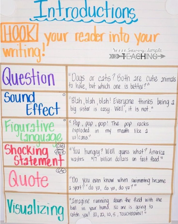
Opinion Transition Words Anchor Chart From Weebly
Show the students how they can link sentences and paragraphs together with transition words. This is a powerful tool that many students (especially younger ones) neglect, and they can get used to using it by having a chart by their side. This chart can help them come up with the appropriate transition word. As time goes by, using transition words will become more natural, and they won’t have to refer to the anchor chart every time.
You can use different designs here, depending on how you want them to use transition words. For example, you can use a stoplight design and give examples for three types of transition words:
| Green—Beginning | In the beginning Once upon a time To begin with Firstly First off |
| Yellow—Middle | Meanwhile Next Then Second Secondly Furthermore After that Later |
| Red—End | Last Lastly Finally At last Third In the end To summarize In conclusion |
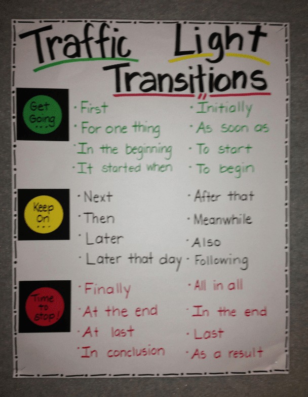
Opinion Reasons Anchor Charts—OREO From Our Global Classroom
Opinion Reasons anchor charts are great as they teach students about the structure of a good opinion writing piece. It shows how they’re supposed to present their thoughts and how to reinforce them with logic. Having a memorable acronym is only a bonus.
Use this chart to introduce the OREO formula and show students how to present their ideas. The formula is as follows:
- Opinion —Introduce your opinion about a given topic
- Reason —Provide information or logical explanations that support your opinion
- Examples —Give details and real-life scenarios that support your opinion
- Opinion —State your opinion again to affirm your point of view
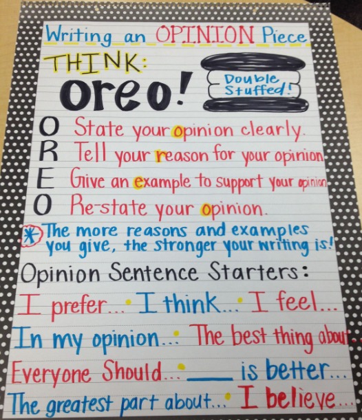
Download High-Quality Opinion Writing Anchor Charts From Teach Simple
While writing anchor charts can be straightforward, and you can even get your students to make them, they still need to be carefully thought out. How do you make sure you use all the necessary information and the easy-to-remember definitions? Planning an anchor chart can be difficult, and it can take you hours, especially if you’re new to it.
If you don’t have the time (or the will) to come up with your own for every class you plan, you can sign up for Teach Simple and find thousands of lesson plans , anchor charts, and other materials related to ELA and writing in particular.
Every product listed on Teach Simple is made by a teacher exclusively, and other teachers review each material to ensure it meets various standards and quality requirements. This way, you can rest assured you’ll enrich your classes with high-quality anchor charts made by people who know what it takes to teach students different types of writing.
Different ways to use anchor charts to teach opinion writing
Let’s look at how anchor charts can be used differently to highlight opinion writing.
Scaffolding From Lucky Little Learners
Students who are not proficient in each element of scaffolding writing can become overwhelmed quickly, so instruction in these elements is crucial. However, breaking them down into bite-sized portions will make them much more manageable.
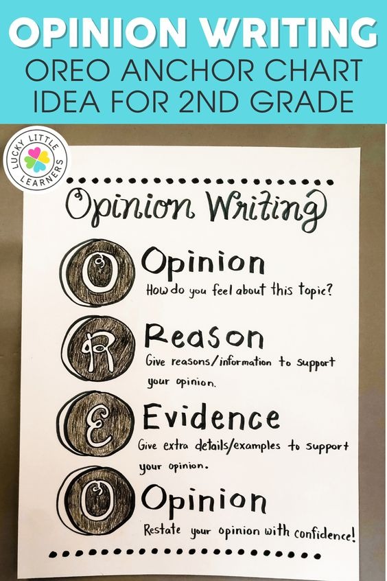
Fact Vs. Opinion sorting From Lucky Little Learners
Sorting facts and opinions is something that should be done in groups. What better way to get your students to express their opinions? And you can build the anchor chart together, making it far more relevant to the students. You could use many techniques to practice this skill with your team. For example, ask your students to jot down one thing they know about broccoli on a post-it note and stick it to the board. The students will typically write that it’s green, tasty, gross, healthy, and a vegetable. Once the notes are placed on the board, discuss whether a claim is a fact or an opinion and categorize it.
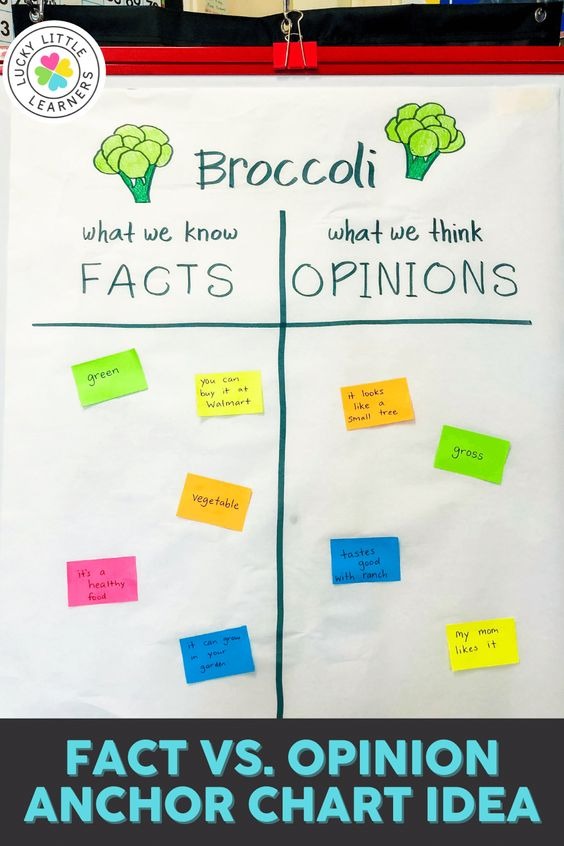
Display examples
It is essential to show students what various levels of mastery look like. Showing your students examples of completed writing can help them visualize expectations and encourage them to keep working and growing.
Model good opinion writing from Mrs. Winter’s Bliss
To illustrate how you would use a graphic organizer to plan your writing, model it for your students. At the beginning of your writing, introduce your perspective with a topic sentence. Next, list your supporting arguments. Finish with a final sentence that reiterates your viewpoint. As a group, identify the topic sentence, the supporting reasons, and the conclusion in your shared writing.
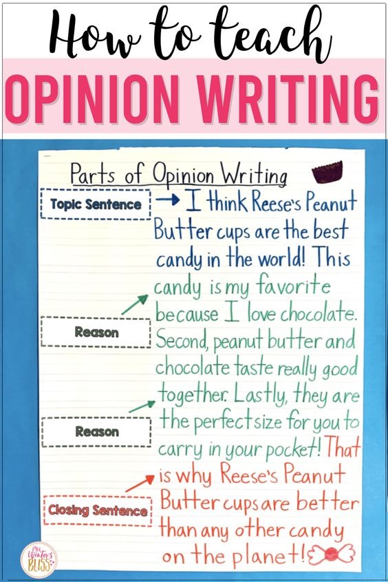
Opinion Essay Structure From Wild About Fifth
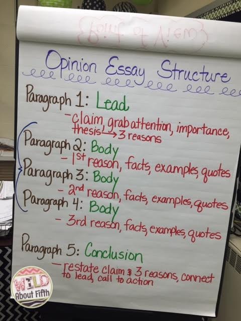
Opinion writing resources from Teach Simple
Looking for an opinion writing chart that covers all the bases? Here is everything you need. All these charts and resources support the elements you need to get started to ensure your students understand how to express their opinion in writing.
Opinion writing anchor chart By First in Line
These charts give students the O.R.E.O. acronym to remember and can be placed on a display board or in their notebooks.
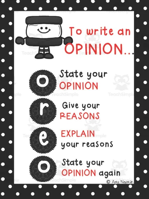
Digital graphic organizers By Teach Me This
This resource is jam-packed with digital opinion writing templates that will give your students multiple opportunities to practice this comprehension strategy.
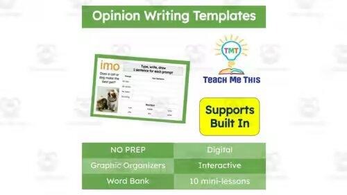
“What do you think?” opinion writing activity By Have Fun Teaching
This graphic organizer is perfect for younger students and guides them every step of the way.
“Would you rather…?” By Aunt Minty’s Education Place
This resource is compiled with 20 high-interest opinion/persuasive writing activities designed for students in Grades K-3.
Opinion writing unit – analyze two accounts of the same topic
This resource lets students practice analyzing multiple versions of the same issue and integrating their learning into a complete opinion response.

Opinion writing unit: paid for chores By Life Beyond the Gradebook
Two texts are included in this resource, one in support of the topic, and one against the topic. The students should use these texts to find evidence that supports their own opinion and use it in their essays.
Opinion writing Anchor Charts from Teachers
Opinion transitions from art of it.
Sentence starters and transition examples can ease students in and take some of the pressure off.
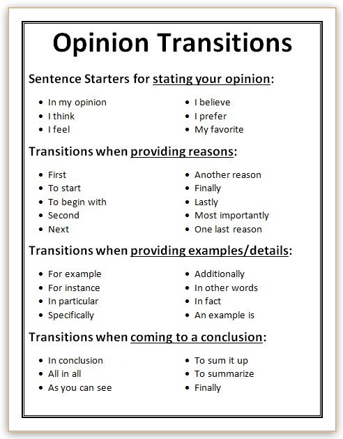
Opinion writing planner From Art Of It
This prewriting graphic organizer will guide students through their planning process.
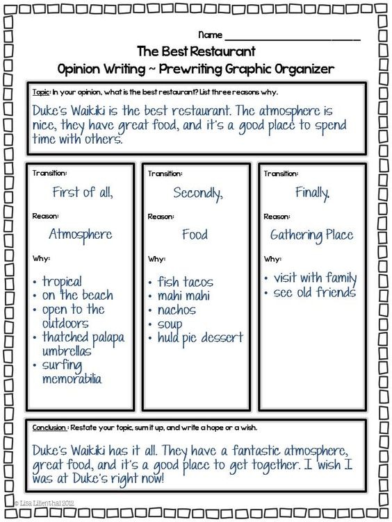
Opinion writing checklist From Worksheetplace
This checklist is great for helping students check their work to ensure they have covered everything.
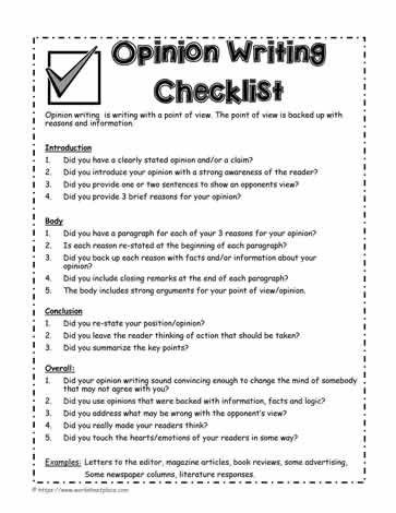
Having a wide variety of opinion anchor charts available can help break down a topic into smaller chunks and make it easier to understand. In addition, using visual aids like anchor charts helps make the lessons more memorable and engaging. Finally, when students need a confidence boost, they are usually grateful to have something to refer so they can move forward independently.
Check out our top pick for anchor charts for writing :
- Opinion Writing Anchor Chart
- Writing With a Purpose Anchor Chart
- Anchor Charts for Writing
- Appeal to Senses Anchor Chart
- Poetry Writing | Anchor Charts & Visuals
- Anchor Charts Professional Development
- Fact and Opinion Anchor Chart
- Idioms Anchor Chart
- Homophones Anchor Chart
- Writing a Beginning, Middle, and End
- Verbs Anchor Chart
- Nonfiction vs. Fiction Comparison Anchor Chart
- Teaching Plot Anchor Chart
- Author’s Claims Anchor Chart
Share Article:
Download unlimited teaching resources, join free today, teach simple.
The team behind Teach Simple is a small but dedicated group who are passionate about education and making a positive impact on the lives of teachers and students.
We have a lot of interesting articles and educational resources from a wide variety of authors and teaching professionals.
What Is A Theme Anchor Chart And Where To Get Them Online
Informational writing anchor charts—what types there are.
Last Updated on August 30, 2023 by Teach Simple
Shared Teaching
Systematic Teaching for First and Second Grade
Essential Opinion Writing Anchor Charts
January 18, 2023 | Leave a Comment

Opinion writing anchor charts are a must-have in my classroom. While I don’t usually feel I have the time in my day to make a cute anchor chart, I like to project my charts during lessons.
The opinion writing anchor charts that I'll walk you through today are posted in my room during my opinion writing unit for students to reference frequently. I just simply print them from my computer rather than hand make them.
Understanding Facts and Opinions
When introducing opinion writing, I like to go over what makes an opinion. For me, that is teaching my students to recognize a fact versus an opinion. Although it seems like a simple concept, the majority of my second graders struggle with this.
Reviewing my opinion and fact charts each day during my lessons, helps them grasp the difference. Every time I review these opinion writing anchor charts, I provide specific kid-friendly examples.
- I believe slime is horrible.
- I feel there should be longer recess times.
- I think second grade is the best grade.
Using these examples are always guaranteed to get my students joining in on the conversation.

Stating an Opinion
After I teach my students how to identify between facts and opinions, the next step is to teach the introduction. In my second grade class the introduction and stating their opinion is taught as the same thing. I tell them, “When you state your opinion, you are introducing it.”
As I move through my opinion unit, we expand on the introduction to be part of a paragraph. Like most of my lessons we take small steps to get to our end goal. My opinion writing anchor charts are kept simple so students can focus on the one skill I want them to learn for the lesson (or lessons).

Proving Reasons for an Opinion
Are you noticing a pattern? My recommended opinion writing anchor charts are taken from the Common Core Standards. Each poster is based on one of the necessary skills that the standard requires students to learn and this next anchor chart is no different.
After we talk about what our opinion is and stating it, we move onto providing reasons for our opinion. This is perhaps my most simple anchor chart where students learn the answer to the question “Why?” is providing the reason. I like to put the linking words on the chart to help students get started in providing multiple reasons.

Using Linking Words
Now of course my second graders need a bit more discussion and practice with linking words than the previous opinion writing anchor chart. For second grade I am pushing my students beyond first, next, and last linking words they hopefully learned in first grade. First grade teachers, take note!
Using the linking words anchor chart during my opinion writing unit, I am wanting students to learn that different linking words are used for different parts of the writing piece. I designed this anchor chart with that in mind and labeled the linking words for reasons and conclusions.

Writing a Conclusion
The last of the essential opinion writing anchor charts is writing a conclusion. I actually have a series of anchor charts for conclusions as they can be a difficult concept for second graders. I like to be explicit in my lessons that the introduction and conclusion are closely related sentences.
My initial anchor chart for conclusions shows students a visual of where they can find a conclusion. The second anchor chart I introduce references an introductory sentence and a concluding sentence so I can point out the different word choices between the sentences. I really want students to see this relationship between the two sentences.

Want Ready-to-Use Opinion Writing Anchor Charts with a Full Curriculum?
You can be one of the first to get my Second Grade Opinion Writing Unit when it is ready at the end of January 2023. I am pre-selling it in my store now. This unit includes over 300 teacher slides walking you step-by-step through all the mini lessons, student worksheets in print and digital formats, and printable anchor charts (including the ones in this post).
Check it out by clicking on the picture below.

Related Post: How to Teach Opinion Writing in Primary Grades
What anchor charts do you feel are essential when teaching opinion writing? Feel free to share below!
Leave your comments cancel reply.
You must be logged in to post a comment.

Shared Ideas
Purdue Online Writing Lab Purdue OWL® College of Liberal Arts
Welcome to the Purdue Online Writing Lab

Welcome to the Purdue OWL
This page is brought to you by the OWL at Purdue University. When printing this page, you must include the entire legal notice.
Copyright ©1995-2018 by The Writing Lab & The OWL at Purdue and Purdue University. All rights reserved. This material may not be published, reproduced, broadcast, rewritten, or redistributed without permission. Use of this site constitutes acceptance of our terms and conditions of fair use.
The Online Writing Lab at Purdue University houses writing resources and instructional material, and we provide these as a free service of the Writing Lab at Purdue. Students, members of the community, and users worldwide will find information to assist with many writing projects. Teachers and trainers may use this material for in-class and out-of-class instruction.
The Purdue On-Campus Writing Lab and Purdue Online Writing Lab assist clients in their development as writers—no matter what their skill level—with on-campus consultations, online participation, and community engagement. The Purdue Writing Lab serves the Purdue, West Lafayette, campus and coordinates with local literacy initiatives. The Purdue OWL offers global support through online reference materials and services.
A Message From the Assistant Director of Content Development
The Purdue OWL® is committed to supporting students, instructors, and writers by offering a wide range of resources that are developed and revised with them in mind. To do this, the OWL team is always exploring possibilties for a better design, allowing accessibility and user experience to guide our process. As the OWL undergoes some changes, we welcome your feedback and suggestions by email at any time.
Please don't hesitate to contact us via our contact page if you have any questions or comments.
All the best,
Social Media
Facebook twitter.
parts of an essay anchor chart
All Formats
Resource types, all resource types.
- Rating Count
- Price (Ascending)
- Price (Descending)
- Most Recent
Parts of an essay anchor chart

Parts of an Essay Anchor Chart with Flipbook
Parts of an Argument Essay Handouts / Anchor Charts

Parts of an Argument Essay Anchor Charts

Literary Analysis Posters - Essay Format Anchor Charts

Essay Handouts/ Anchor Charts Bundle for Language & Composition / College

AP Language & Composition Handouts/ Anchor Charts Mega Bundle

Classroom Posters: Essay Writing Anchor Charts

Writing Introduction Paragraph Anchor Chart , Graphic Organizer, and Sample

Essay Structure: Anchor Chart / Graphic Organizer

Benchmark Advance Florida Expository Writing Anchor Chart 2nd Grade

- Portable Network Graphics

Anchor Charts for Writing ANY Essay for Middle School

Parts of a Rhetorical Analysis Essay Handouts / Anchor Charts

Essay Writing Anchor Charts

Parts of a Painted Essay Cloze note form

Description Writing Anchor Chart and Practice Worksheet for Elaborating in Essay

- Easel Activity

Essay Evidence Anchor Charts for AP Literature

Body Paragraph TRACES Poster/ Anchor Chart /Annotation Key

TDA Anchor Chart

Parts of a Synthesis Essay Handouts / Anchor Charts

PEAL Paragraph Anchor Chart

- Word Document File

Topic Sentences Anchor Chart

Opinion Writing Anchor Chart Lesson Plan Activities ESL Opinion Writing

Essay Types Identification Worksheet or Sort Expository Argumentative Narrative
Opinion Writing with Step-by-Step Writing® - Primary Writing - Essay Writing

- We're hiring
- Help & FAQ
- Privacy policy
- Student privacy
- Terms of service
- Tell us what you think
Why the Pandemic Probably Started in a Lab, in 5 Key Points

By Alina Chan
Dr. Chan is a molecular biologist at the Broad Institute of M.I.T. and Harvard, and a co-author of “Viral: The Search for the Origin of Covid-19.”
This article has been updated to reflect news developments.
On Monday, Dr. Anthony Fauci returned to the halls of Congress and testified before the House subcommittee investigating the Covid-19 pandemic. He was questioned about several topics related to the government’s handling of Covid-19, including how the National Institute of Allergy and Infectious Diseases, which he directed until retiring in 2022, supported risky virus work at a Chinese institute whose research may have caused the pandemic.
For more than four years, reflexive partisan politics have derailed the search for the truth about a catastrophe that has touched us all. It has been estimated that at least 25 million people around the world have died because of Covid-19, with over a million of those deaths in the United States.
Although how the pandemic started has been hotly debated, a growing volume of evidence — gleaned from public records released under the Freedom of Information Act, digital sleuthing through online databases, scientific papers analyzing the virus and its spread, and leaks from within the U.S. government — suggests that the pandemic most likely occurred because a virus escaped from a research lab in Wuhan, China. If so, it would be the most costly accident in the history of science.
Here’s what we now know:
1 The SARS-like virus that caused the pandemic emerged in Wuhan, the city where the world’s foremost research lab for SARS-like viruses is located.
- At the Wuhan Institute of Virology, a team of scientists had been hunting for SARS-like viruses for over a decade, led by Shi Zhengli.
- Their research showed that the viruses most similar to SARS‑CoV‑2, the virus that caused the pandemic, circulate in bats that live r oughly 1,000 miles away from Wuhan. Scientists from Dr. Shi’s team traveled repeatedly to Yunnan province to collect these viruses and had expanded their search to Southeast Asia. Bats in other parts of China have not been found to carry viruses that are as closely related to SARS-CoV-2.

The closest known relatives to SARS-CoV-2 were found in southwestern China and in Laos.
Large cities
Mine in Yunnan province
Cave in Laos
South China Sea

The closest known relatives to SARS-CoV-2
were found in southwestern China and in Laos.
philippines

The closest known relatives to SARS-CoV-2 were found
in southwestern China and Laos.
Sources: Sarah Temmam et al., Nature; SimpleMaps
Note: Cities shown have a population of at least 200,000.

There are hundreds of large cities in China and Southeast Asia.

There are hundreds of large cities in China
and Southeast Asia.

The pandemic started roughly 1,000 miles away, in Wuhan, home to the world’s foremost SARS-like virus research lab.

The pandemic started roughly 1,000 miles away,
in Wuhan, home to the world’s foremost SARS-like virus research lab.

The pandemic started roughly 1,000 miles away, in Wuhan,
home to the world’s foremost SARS-like virus research lab.
- Even at hot spots where these viruses exist naturally near the cave bats of southwestern China and Southeast Asia, the scientists argued, as recently as 2019 , that bat coronavirus spillover into humans is rare .
- When the Covid-19 outbreak was detected, Dr. Shi initially wondered if the novel coronavirus had come from her laboratory , saying she had never expected such an outbreak to occur in Wuhan.
- The SARS‑CoV‑2 virus is exceptionally contagious and can jump from species to species like wildfire . Yet it left no known trace of infection at its source or anywhere along what would have been a thousand-mile journey before emerging in Wuhan.
2 The year before the outbreak, the Wuhan institute, working with U.S. partners, had proposed creating viruses with SARS‑CoV‑2’s defining feature.
- Dr. Shi’s group was fascinated by how coronaviruses jump from species to species. To find viruses, they took samples from bats and other animals , as well as from sick people living near animals carrying these viruses or associated with the wildlife trade. Much of this work was conducted in partnership with the EcoHealth Alliance, a U.S.-based scientific organization that, since 2002, has been awarded over $80 million in federal funding to research the risks of emerging infectious diseases.
- The laboratory pursued risky research that resulted in viruses becoming more infectious : Coronaviruses were grown from samples from infected animals and genetically reconstructed and recombined to create new viruses unknown in nature. These new viruses were passed through cells from bats, pigs, primates and humans and were used to infect civets and humanized mice (mice modified with human genes). In essence, this process forced these viruses to adapt to new host species, and the viruses with mutations that allowed them to thrive emerged as victors.
- By 2019, Dr. Shi’s group had published a database describing more than 22,000 collected wildlife samples. But external access was shut off in the fall of 2019, and the database was not shared with American collaborators even after the pandemic started , when such a rich virus collection would have been most useful in tracking the origin of SARS‑CoV‑2. It remains unclear whether the Wuhan institute possessed a precursor of the pandemic virus.
- In 2021, The Intercept published a leaked 2018 grant proposal for a research project named Defuse , which had been written as a collaboration between EcoHealth, the Wuhan institute and Ralph Baric at the University of North Carolina, who had been on the cutting edge of coronavirus research for years. The proposal described plans to create viruses strikingly similar to SARS‑CoV‑2.
- Coronaviruses bear their name because their surface is studded with protein spikes, like a spiky crown, which they use to enter animal cells. T he Defuse project proposed to search for and create SARS-like viruses carrying spikes with a unique feature: a furin cleavage site — the same feature that enhances SARS‑CoV‑2’s infectiousness in humans, making it capable of causing a pandemic. Defuse was never funded by the United States . However, in his testimony on Monday, Dr. Fauci explained that the Wuhan institute would not need to rely on U.S. funding to pursue research independently.

The Wuhan lab ran risky experiments to learn about how SARS-like viruses might infect humans.
1. Collect SARS-like viruses from bats and other wild animals, as well as from people exposed to them.

2. Identify high-risk viruses by screening for spike proteins that facilitate infection of human cells.

2. Identify high-risk viruses by screening for spike proteins that facilitate infection of
human cells.

In Defuse, the scientists proposed to add a furin cleavage site to the spike protein.
3. Create new coronaviruses by inserting spike proteins or other features that could make the viruses more infectious in humans.

4. Infect human cells, civets and humanized mice with the new coronaviruses, to determine how dangerous they might be.

- While it’s possible that the furin cleavage site could have evolved naturally (as seen in some distantly related coronaviruses), out of the hundreds of SARS-like viruses cataloged by scientists, SARS‑CoV‑2 is the only one known to possess a furin cleavage site in its spike. And the genetic data suggest that the virus had only recently gained the furin cleavage site before it started the pandemic.
- Ultimately, a never-before-seen SARS-like virus with a newly introduced furin cleavage site, matching the description in the Wuhan institute’s Defuse proposal, caused an outbreak in Wuhan less than two years after the proposal was drafted.
- When the Wuhan scientists published their seminal paper about Covid-19 as the pandemic roared to life in 2020, they did not mention the virus’s furin cleavage site — a feature they should have been on the lookout for, according to their own grant proposal, and a feature quickly recognized by other scientists.
- Worse still, as the pandemic raged, their American collaborators failed to publicly reveal the existence of the Defuse proposal. The president of EcoHealth, Peter Daszak, recently admitted to Congress that he doesn’t know about virus samples collected by the Wuhan institute after 2015 and never asked the lab’s scientists if they had started the work described in Defuse. In May, citing failures in EcoHealth’s monitoring of risky experiments conducted at the Wuhan lab, the Biden administration suspended all federal funding for the organization and Dr. Daszak, and initiated proceedings to bar them from receiving future grants. In his testimony on Monday, Dr. Fauci said that he supported the decision to suspend and bar EcoHealth.
- Separately, Dr. Baric described the competitive dynamic between his research group and the institute when he told Congress that the Wuhan scientists would probably not have shared their most interesting newly discovered viruses with him . Documents and email correspondence between the institute and Dr. Baric are still being withheld from the public while their release is fiercely contested in litigation.
- In the end, American partners very likely knew of only a fraction of the research done in Wuhan. According to U.S. intelligence sources, some of the institute’s virus research was classified or conducted with or on behalf of the Chinese military . In the congressional hearing on Monday, Dr. Fauci repeatedly acknowledged the lack of visibility into experiments conducted at the Wuhan institute, saying, “None of us can know everything that’s going on in China, or in Wuhan, or what have you. And that’s the reason why — I say today, and I’ve said at the T.I.,” referring to his transcribed interview with the subcommittee, “I keep an open mind as to what the origin is.”
3 The Wuhan lab pursued this type of work under low biosafety conditions that could not have contained an airborne virus as infectious as SARS‑CoV‑2.
- Labs working with live viruses generally operate at one of four biosafety levels (known in ascending order of stringency as BSL-1, 2, 3 and 4) that describe the work practices that are considered sufficiently safe depending on the characteristics of each pathogen. The Wuhan institute’s scientists worked with SARS-like viruses under inappropriately low biosafety conditions .

In the United States, virologists generally use stricter Biosafety Level 3 protocols when working with SARS-like viruses.
Biosafety cabinets prevent
viral particles from escaping.
Viral particles
Personal respirators provide
a second layer of defense against breathing in the virus.
DIRECT CONTACT
Gloves prevent skin contact.
Disposable wraparound
gowns cover much of the rest of the body.

Personal respirators provide a second layer of defense against breathing in the virus.
Disposable wraparound gowns
cover much of the rest of the body.
Note: Biosafety levels are not internationally standardized, and some countries use more permissive protocols than others.

The Wuhan lab had been regularly working with SARS-like viruses under Biosafety Level 2 conditions, which could not prevent a highly infectious virus like SARS-CoV-2 from escaping.
Some work is done in the open air, and masks are not required.
Less protective equipment provides more opportunities
for contamination.

Some work is done in the open air,
and masks are not required.
Less protective equipment provides more opportunities for contamination.
- In one experiment, Dr. Shi’s group genetically engineered an unexpectedly deadly SARS-like virus (not closely related to SARS‑CoV‑2) that exhibited a 10,000-fold increase in the quantity of virus in the lungs and brains of humanized mice . Wuhan institute scientists handled these live viruses at low biosafet y levels , including BSL-2.
- Even the much more stringent containment at BSL-3 cannot fully prevent SARS‑CoV‑2 from escaping . Two years into the pandemic, the virus infected a scientist in a BSL-3 laboratory in Taiwan, which was, at the time, a zero-Covid country. The scientist had been vaccinated and was tested only after losing the sense of smell. By then, more than 100 close contacts had been exposed. Human error is a source of exposure even at the highest biosafety levels , and the risks are much greater for scientists working with infectious pathogens at low biosafety.
- An early draft of the Defuse proposal stated that the Wuhan lab would do their virus work at BSL-2 to make it “highly cost-effective.” Dr. Baric added a note to the draft highlighting the importance of using BSL-3 to contain SARS-like viruses that could infect human cells, writing that “U.S. researchers will likely freak out.” Years later, after SARS‑CoV‑2 had killed millions, Dr. Baric wrote to Dr. Daszak : “I have no doubt that they followed state determined rules and did the work under BSL-2. Yes China has the right to set their own policy. You believe this was appropriate containment if you want but don’t expect me to believe it. Moreover, don’t insult my intelligence by trying to feed me this load of BS.”
- SARS‑CoV‑2 is a stealthy virus that transmits effectively through the air, causes a range of symptoms similar to those of other common respiratory diseases and can be spread by infected people before symptoms even appear. If the virus had escaped from a BSL-2 laboratory in 2019, the leak most likely would have gone undetected until too late.
- One alarming detail — leaked to The Wall Street Journal and confirmed by current and former U.S. government officials — is that scientists on Dr. Shi’s team fell ill with Covid-like symptoms in the fall of 2019 . One of the scientists had been named in the Defuse proposal as the person in charge of virus discovery work. The scientists denied having been sick .
4 The hypothesis that Covid-19 came from an animal at the Huanan Seafood Market in Wuhan is not supported by strong evidence.
- In December 2019, Chinese investigators assumed the outbreak had started at a centrally located market frequented by thousands of visitors daily. This bias in their search for early cases meant that cases unlinked to or located far away from the market would very likely have been missed. To make things worse, the Chinese authorities blocked the reporting of early cases not linked to the market and, claiming biosafety precautions, ordered the destruction of patient samples on January 3, 2020, making it nearly impossible to see the complete picture of the earliest Covid-19 cases. Information about dozens of early cases from November and December 2019 remains inaccessible.
- A pair of papers published in Science in 2022 made the best case for SARS‑CoV‑2 having emerged naturally from human-animal contact at the Wuhan market by focusing on a map of the early cases and asserting that the virus had jumped from animals into humans twice at the market in 2019. More recently, the two papers have been countered by other virologists and scientists who convincingly demonstrate that the available market evidence does not distinguish between a human superspreader event and a natural spillover at the market.
- Furthermore, the existing genetic and early case data show that all known Covid-19 cases probably stem from a single introduction of SARS‑CoV‑2 into people, and the outbreak at the Wuhan market probably happened after the virus had already been circulating in humans.

An analysis of SARS-CoV-2’s evolutionary tree shows how the virus evolved as it started to spread through humans.
SARS-COV-2 Viruses closest
to bat coronaviruses
more mutations

Source: Lv et al., Virus Evolution (2024) , as reproduced by Jesse Bloom

The viruses that infected people linked to the market were most likely not the earliest form of the virus that started the pandemic.

- Not a single infected animal has ever been confirmed at the market or in its supply chain. Without good evidence that the pandemic started at the Huanan Seafood Market, the fact that the virus emerged in Wuhan points squarely at its unique SARS-like virus laboratory.
5 Key evidence that would be expected if the virus had emerged from the wildlife trade is still missing.

In previous outbreaks of coronaviruses, scientists were able to demonstrate natural origin by collecting multiple pieces of evidence linking infected humans to infected animals.
Infected animals
Earliest known
cases exposed to
live animals
Antibody evidence
of animals and
animal traders having
been infected
Ancestral variants
of the virus found in
Documented trade
of host animals
between the area
where bats carry
closely related viruses
and the outbreak site

Infected animals found
Earliest known cases exposed to live animals
Antibody evidence of animals and animal
traders having been infected
Ancestral variants of the virus found in animals
Documented trade of host animals
between the area where bats carry closely
related viruses and the outbreak site

For SARS-CoV-2, these same key pieces of evidence are still missing , more than four years after the virus emerged.

For SARS-CoV-2, these same key pieces of evidence are still missing ,
more than four years after the virus emerged.
- Despite the intense search trained on the animal trade and people linked to the market, investigators have not reported finding any animals infected with SARS‑CoV‑2 that had not been infected by humans. Yet, infected animal sources and other connective pieces of evidence were found for the earlier SARS and MERS outbreaks as quickly as within a few days, despite the less advanced viral forensic technologies of two decades ago.
- Even though Wuhan is the home base of virus hunters with world-leading expertise in tracking novel SARS-like viruses, investigators have either failed to collect or report key evidence that would be expected if Covid-19 emerged from the wildlife trade . For example, investigators have not determined that the earliest known cases had exposure to intermediate host animals before falling ill. No antibody evidence shows that animal traders in Wuhan are regularly exposed to SARS-like viruses, as would be expected in such situations.
- With today’s technology, scientists can detect how respiratory viruses — including SARS, MERS and the flu — circulate in animals while making repeated attempts to jump across species . Thankfully, these variants usually fail to transmit well after crossing over to a new species and tend to die off after a small number of infections. In contrast, virologists and other scientists agree that SARS‑CoV‑2 required little to no adaptation to spread rapidly in humans and other animals . The virus appears to have succeeded in causing a pandemic upon its only detected jump into humans.
The pandemic could have been caused by any of hundreds of virus species, at any of tens of thousands of wildlife markets, in any of thousands of cities, and in any year. But it was a SARS-like coronavirus with a unique furin cleavage site that emerged in Wuhan, less than two years after scientists, sometimes working under inadequate biosafety conditions, proposed collecting and creating viruses of that same design.
While several natural spillover scenarios remain plausible, and we still don’t know enough about the full extent of virus research conducted at the Wuhan institute by Dr. Shi’s team and other researchers, a laboratory accident is the most parsimonious explanation of how the pandemic began.
Given what we now know, investigators should follow their strongest leads and subpoena all exchanges between the Wuhan scientists and their international partners, including unpublished research proposals, manuscripts, data and commercial orders. In particular, exchanges from 2018 and 2019 — the critical two years before the emergence of Covid-19 — are very likely to be illuminating (and require no cooperation from the Chinese government to acquire), yet they remain beyond the public’s view more than four years after the pandemic began.
Whether the pandemic started on a lab bench or in a market stall, it is undeniable that U.S. federal funding helped to build an unprecedented collection of SARS-like viruses at the Wuhan institute, as well as contributing to research that enhanced them . Advocates and funders of the institute’s research, including Dr. Fauci, should cooperate with the investigation to help identify and close the loopholes that allowed such dangerous work to occur. The world must not continue to bear the intolerable risks of research with the potential to cause pandemics .
A successful investigation of the pandemic’s root cause would have the power to break a decades-long scientific impasse on pathogen research safety, determining how governments will spend billions of dollars to prevent future pandemics. A credible investigation would also deter future acts of negligence and deceit by demonstrating that it is indeed possible to be held accountable for causing a viral pandemic. Last but not least, people of all nations need to see their leaders — and especially, their scientists — heading the charge to find out what caused this world-shaking event. Restoring public trust in science and government leadership requires it.
A thorough investigation by the U.S. government could unearth more evidence while spurring whistleblowers to find their courage and seek their moment of opportunity. It would also show the world that U.S. leaders and scientists are not afraid of what the truth behind the pandemic may be.
More on how the pandemic may have started

Where Did the Coronavirus Come From? What We Already Know Is Troubling.
Even if the coronavirus did not emerge from a lab, the groundwork for a potential disaster had been laid for years, and learning its lessons is essential to preventing others.
By Zeynep Tufekci

Why Does Bad Science on Covid’s Origin Get Hyped?
If the raccoon dog was a smoking gun, it fired blanks.
By David Wallace-Wells

A Plea for Making Virus Research Safer
A way forward for lab safety.
By Jesse Bloom
The Times is committed to publishing a diversity of letters to the editor. We’d like to hear what you think about this or any of our articles. Here are some tips . And here’s our email: [email protected] .
Follow the New York Times Opinion section on Facebook , Instagram , TikTok , WhatsApp , X and Threads .
Alina Chan ( @ayjchan ) is a molecular biologist at the Broad Institute of M.I.T. and Harvard, and a co-author of “ Viral : The Search for the Origin of Covid-19.” She was a member of the Pathogens Project , which the Bulletin of the Atomic Scientists organized to generate new thinking on responsible, high-risk pathogen research.
- Share full article
Advertisement
Digital SAT Suite of Assessments
SAT Practice and Preparation
From free practice tests to a checklist of what to bring on test day, College Board provides everything you need to prepare for the digital SAT.
Step 1: Now
Download and install the Bluebook app.
Step 2: Two Weeks Before Test Day
Take a full-length practice test in Bluebook.
Step 3: Five Days Before Test Day
Complete exam setup in Bluebook and get your admission ticket.
Step 4: On Test Day
Arrive on time (check your admission ticket).
Studying and Practice Tests
Practice tests.
Find full-length practice tests on Bluebook™ as well as downloadable linear SAT practice tests.
Khan Academy
Official Digital SAT Prep on Khan Academy ® is free, comprehensive, and available to all students.
Assistive Technology
Get information on how to practice for the digital SAT if you're using assistive technology.

My Practice
Take full-length digital SAT practice exams by first downloading Bluebook and completing practice tests. Then sign into My Practice to view practice test results and review practice exam items, answers, and explanations.
What to Bring and Do on Test Day
Find out everything you need to bring and do for the digital SAT.
SAT Student Guide (U.S.)
This guide provides helpful information for students taking the SAT during a weekend administration in Spring 2024.
SAT International Student Guide
A guide to the SAT for international students to learn how to prepare for test day. It covers the structure of the digital test, how to download the app and practice, information about policies, and testing rules.
SAT School Day Student Guide
Information about SAT School Day, sample test materials, and test-taking advice and tips.
SAT Practice Quick Start Guide
Learn how to practice for the SAT with this step-by-step guide.
Guía de inicio rápido de la práctica
Aprende cómo practicar para el SAT con esta guía de inicio rápido.
Why Should I Practice for the SAT?
This resource informs students about the benefits of practicing for the SAT and provides links to free practice resources.
¿Por qué debería practicar para el SAT?
Este folleto ofrece información sobre los beneficios de practicar para el SAT e incluye enlaces hacia recursos de práctica.
A Parent/Guardian's Guide to Official SAT Practice: Getting Your Teen Ready for the SAT
This resource provides parents and guardians with a schedule outline to help their child prepare for the SAT and includes links to free official practice materials.
A Parent/Guardian's Guide to Official SAT Practice: Getting Your Teen Ready for the SAT (Spanish)
Sat suite question bank: overview.
Stash Learn
Menu Toggle
Back to Stash
Home / Investing / How To Read a Stock Chart: A Beginner’s Guide + Stock Chart Glossary
Apr 18, 2024
How To Read a Stock Chart: A Beginner’s Guide + Stock Chart Glossary

Table of Contents
- Elements of a Stock Chart
- Reading Stock Charts: Basic Terms To Know
- Types of Stock Charts
- Analyzing Stock Trends
Reading stock charts might feel intimidating if you’ve never looked at one before. Don’t be scared away, it’s simply a visual representation of data.
In fact, reading stock charts might feel like reading another language. In a way, it is—but once you understand the basics, it’s a lot simpler to become fluent than you might think.
A stock chart is a graph that shows the price of a stock over a certain period of time. It allows you to gauge a stock’s current and past performance and forecast how it might perform in the future. Knowing how to read stock charts is a great skill to have in your arsenal when it comes to choosing the right stocks and making more informed investing decisions overall.
In this post, we’ll walk through stock chart basics, compare three different types, and explain how each displays an investment’s performance.
Keep reading to learn how to read a stock chart.
1. Understand the anatomy of a stock chart
Learning how to read stock charts becomes easier when you break it down into individual parts. Let’s use Alphabet’s (aka Google, GOOG) stock chart as an example, taken from Google Finance.

The chart above is filtered by one day, so it’s showing Alphabet’s stock performance over the course of August 22, 2022. You can filter the time shown by days, months, or years.
Here are some basic stock chart elements to know and notice at first glance:
- Ticker: you can find any company’s stock chart by searching the company’s ticker—the string of letters shown next to the company name, “GOOG” in Alphabet’s case.
- Current price: the current price is the last price a stock was traded for during regular trading hours—9:30 a.m. to 4 p.m. Eastern Time. After trading hours the price will reflect the closing price at the close of the last trading day. Here we see the current price is $115.15, down 2.51% since the markets opened at 9:30 am ET on August 22.
- Previous close: this is the closing price of the previous trading day. Here we see the stock price was $118.12 at the market close on August 21.
- Y-axis: the vertical axis shows prices in dollars.
- X-axis: the horizontal axis shows the length of time for your chosen period.
2. Grasp basic terms on a stock chart
In addition to the chart line, here are some key terms to know when learning how to read stock charts:
- Open, high, and low: the open is the price a stock trades for at the beginning of the day, and the high and low are the highest and lowest prices a stock trades for during those hours.
- Previous close: the closing price of the previous trading day.
- Market cap (market capitalization): this is a measure of a company’s value based on their total shares of stock, found by multiplying the most recent share price by the number of total outstanding shares.
- P/E ratio (price-to-earnings ratio): this is a measure of a company’s value used to gauge whether a stock is over- or undervalued , expressed as a ratio between a company’s stock price and its earnings.
- Dividend yield : this is the amount paid to an investor in dividends, expressed as a percentage of the stock price.
- 52-week range: this is the highest and lowest price a stock has traded for in the past year (or 52 weeks).
Once you’ve grasped the basics outlined above, you’ll eventually want to understand the additional terms below. You’ll likely run into them when you move onto more advanced charts, and they provide helpful context when it comes to knowing how to read stock numbers.
- Bid and ask price: the bid is the highest price an investor is willing to pay for a share of stock. The ask is the lowest price an investor is willing to sell a share of stock for. A smaller spread is generally seen for stock shares with high trading activity—meaning there are a lot of buyers and sellers.
- Volume and average volume: volume tells you the number of shares that are currently being traded that day. The average volume is just what it sounds like—the average number of shares that were traded during a day.
- EPS (TTM) and earnings date: short for earnings per share (EPS) for the last year, or “trailing 12 months” (TTM), this is found by dividing a company’s net profit by their total number of shares of stock. The resulting number helps investors gauge a company’s profitability. The higher the EPS, the more investors are willing to pay for that company’s shares.
- Ex-dividend date: this is a deadline for investors buying shares of stock from a company. If you purchase a stock on or after the ex-dividend date, you won’t receive dividends for that period.
- Beta: this is a numerical value used to measure how risky a stock is based on the overall market. Betas greater than one indicate a more volatile stock for a set period of time, while the inverse is true for betas below one.
- One-year target estimate: this represents an estimate of a stock’s price in one year, based on an average found by several analysts. The keyword here is estimate —while it can be a helpful gauge, it’s ultimately just a forecast and could swing in another direction.
Take a look at how these stock chart terms are applied across different types of stock charts below.
3. Know the different types of stock charts
If you’ve just begun learning how to read stock charts, line charts such as Alphabet’s above are akin to swimming in the shallow end of the pool—they’re great for beginners. That said, there are other types of charts that provide a more in-depth look at stock prices and performance.

A line chart is the most common type of stock chart. It uses a simple line to represent a stock’s price movements over time and displays the closing price for each time period.

While a line chart shows just the closing price for a set period of time, both bar and candlestick charts also show the open, high, and low in addition to the closing price.
A bar chart uses vertical bars instead of lines to represent a stock’s price, which is often color-coded like the example above. They also have vertical lines with short horizontal lines protruding from each side.
- The top of the bar represents the high, and the bottom represents the low.
- The short horizontal line protruding on the left indicates the opening price, and the one on the right shows the closing price.
Bar charts allow you to gauge stock trends and price volatility with slightly more precision than a line chart.
Candlestick chart

A candlestick chart presents the same data as a bar chart, but with more complexity. In short, candlestick charts show stock price variability from the market open to close.
- The body of the candle expresses the open and close prices.
- The small lines above and below the body, or the wicks, represent the high and low prices.
- The colors of the candlestick indicate if a stock price closed above or below its opening level—green means the stock increased in value, and red indicates the stock decreased in value. These colors are helpful in getting a fuller view of a stock’s performance.
All three types of stock charts are widely used—the one you use is ultimately a matter of preference.
4. Finally, analyze the stock trends
Reading stock charts gets easier with practice, and there are a few helpful points to keep in mind when analyzing stock trends, otherwise known as “technical analysis.” The end goal is to not only understand the patterns you see, but also further investigate their movements to predict future performance .
Here are some technical analysis basics to keep in mind when learning to read stock charts:
Pay attention to trend lines
Trend lines show the general direction a stock’s price is moving. They’re helpful in assessing price movements because it’s widely assumed that a stock will generally continue in the same direction it’s been going. If a stock chart shows an upward-moving trend line, investors might anticipate that it will continue to rise. A stock chart with a downward-moving trend line might indicate that it will continue to fall.
Keep in mind that trend lines rarely move in one direction constantly—swings and fluctuations are normal. Instead, you want to assess the overall trend.
Identify support and resistance levels
In addition to trend lines, investors can also draw lines to connect highs and lows, known as support and resistance levels. These are the levels a stock stays within over a period of time, and investors use them to help gauge the right time to buy or sell their shares.
- A level of support shows a price a stock is unlikely to drop below.
- A level of resistance shows a price a stock is unlikely to go above.
If a stock breaks through support or resistance, it can be a signal to investors to enter or exit the market. If it breaks through resistance, an investor might believe there’s a good chance the stock will continue to rise, so broken resistance can indicate a good time to enter. If a stock falls past a support area, it may continue to fall, which could indicate a good time to exit.
When analyzing stock charts, remember that trend lines can look different depending on the period of time you’re viewing on the chart. You might see an upward trend line indicating a stock price is rising, but be sure to look at a longer time horizon (at least a year) to get a fuller picture of its performance. A short-term rise could be an outstanding blip in what’s actually an overall downward trend.
Understand trading volumes
The small vertical lines you’ll find at the bottom of most stock charts show the volume at which the stock is traded. While you shouldn’t base your trading decisions on volume alone, it’s helpful to consider. Volume will often increase when major news about a company is released—good or bad. Higher volumes are also associated with more trading activity, indicating you’ll have an easier time buying or selling a share quickly.
Learning to read stock charts might feel confusing, but it’s more simple than you’d think once you know what to look for. Remember to view stock charts relative to your personal time horizon. A chart for a one-day time period isn’t all that helpful if you’re planning to stay invested for the next few decades.
If you’re looking for extra support, consider turning to a platform like Stash that can automatically save or invest money for you.

Investing made easy.
Start today with any dollar amount.
All episodes are available now. You can listen to Teach Me How to Money right here on our site, and via the podcast apps below.

Related Articles

How to research stocks

The 12 largest cannabis companies in 2024

How to profit from inflation: best inflation investments to know

How to invest in index funds: a 3-step beginner’s guide

Saving vs. investing: 2 ways to reach your financial goals

Stock market holidays 2024
Invest in yourself.
By using this website you agree to our Terms of Use and Privacy Policy . To begin investing on Stash, you must be approved from an account verification perspective and open a brokerage account.
Welcome to Stash101, our free financial education platform. Stash101 is not an investment adviser and is distinct from Stash RIA. Nothing here is considered investment advice.
- Grades 6-12
- School Leaders
NEW: Classroom Clean-Up/Set-Up Email Course! 🧽
Anchor Charts 101: Why and How To Use Them
Everything you need to know about this super useful strategy.

One of the best, most effective tools for the classroom is anchor charts, although you won’t find Anchor Charts 101 on most teacher training programs’ syllabi. If you’re new to teaching, you may have lots of questions about what anchor charts are, what purpose they serve, how to get started, and when to use them. So we’ve created this primer to help you out! Also included is a huge list of anchor chart roundups to use as a resource. Once you get started, we’re pretty sure anchor charts are going to be one of your favorite go-to strategies.
What is an anchor chart?

Michelle Krzmarzick/Character Traits via krzmarzickm.blogspot.com
An anchor chart is a tool used to support instruction (i.e., “anchor” the learning for students). As you teach a lesson, you create a chart, together with your students, that captures the most important content and relevant strategies. Anchor charts build a culture of literacy in the classroom by making thinking—both the teacher’s and students’—visible.
How do I create anchor charts?
You really don’t need any special materials or artistic skills—just chart paper and a colorful assortment of markers.
It’s easy to incorporate anchor charts into your lesson plans. All it takes is a clear purpose and some pre-planning.
Typically, you will prepare the framework of your chart ahead of time, giving it a title, including the learning objective, and creating headers for the main points or strategies you want to highlight. It’s very important not to create the entire poster ahead of time. They are best used as an interactive tool with students.
As you model a lesson or learning strategy and interact with your students through discussion, you fill in the blank spaces of the anchor chart. For an awesome tutorial, check out this blog and template from third grade teacher Michael Friermood.

The Thinker Builder/Anchor Chart via thethinkerbuilder.com
After your chart is created, it can be displayed as needed—for a short unit, as a one-time reference tool, as something you continue to add to, or as something that stays up all year—like your classroom procedures or behavior expectations.
Posting the charts keeps relevant and current learning accessible to students, reminds them of prior learning, and enables them to make connections as new learning happens. Students can refer to them and use them as they think about the topic, question ideas, expand ideas, and/or contribute to discussions in class.
A few helpful tips:
Make them colorful and print-rich..
Use different colors and bullet points to help students discriminate between strategies and quickly access information.
Keep them simple and neat.
Use easy-to-read graphics and clear organization. Don’t allow distracting, irrelevant details or stray marks, such as arrows or overemphatic use of underlining.
Draw simple pictures to complement the words.
The more ways students can access information about a subject, the better.

Teacher Trap/3 Secrets for Teaching Character Traits via teachertrap.com
Don’t over use them.
While anchor charts are a super-useful tool, don’t feel as if you need to create one for every single lesson. Choose carefully so the ones you create have the greatest impact.
Don’t be afraid to borrow from others.
Teachers always get their best ideas from other teachers. If your teammate has already tackled a topic, use the same format. Just make sure you create your own version from scratch so your students experience the learning as you go. You’ll find tons of examples at the links included below.
How do I use anchor charts in my classroom?
Now that you know the how , you may be wondering about the when and why . Here are a few ways to get the most bang for your buck.
Reach maximum engagement.
When students are involved in the process of creating learning tools, they are more likely to comprehend more deeply and remember more of what they learn. Anchor charts trigger connections with the initial lesson.
Bring lessons to life.
If you are studying a topic that lends itself particularly well to a visual aid, create an anchor chart! If you are studying plants, draw a giant flower and label all of the parts of it while you teach about it.

2nd Grade Ponderings/Anchor Chart Linky Party via 2ndgradeponderings.blogspot.com
Support independent work.
Anchor charts provide students with a source to reference when working on their own. They support students and also save teachers from having to spend classroom time going over concepts multiple times.
Create a library of reference materials.
To help students keep information straight, you could create charts for each topic. For example, if you’re teaching math concepts, you could create a chart for geometric shapes, the difference between perimeter and area, and how to multiply and divide fractions.
Reinforce classroom procedures.
Provide students with a visual to remind them of routines that make your classroom run smoothly. Some examples: how to use centers, how to line up, how to check books out of your classroom library.

The Primary Buzz/Learning to listen via theprimarybuzz.blogspot.com
Try them in shared writing.
Model how to write an introduction, the parts of a letter, and the proper use of grammar such as quotation marks, commas, etc.
Use them as a companion to read-alouds.
Create an anchor chart as you stop to make observations, ask questions, take note of story elements, or make predictions.
How can I use anchor charts to introduce new skills?
Anchor charts are great for laying the foundation for a new unit of study and giving an overview of concepts. They make it easy to break complex concepts down into bite-size pieces. If you are teaching U.S. government, for example, create a diagram of the three branches of government along with the primary responsibilities of each, to help simplify the concept for students.
The charts are also great for helping students keep track of vocabulary. For each chart, include a box with vocabulary words as an easy reference for students.

True Life I’m a Teacher/Anchor Charts via truelifeimateacher.com
Helpful Links and Resources
Now that you’ve got the basics of Anchor Chart 101, it’s time to get inspired! Here are links to the best chart compilation articles on WeAreTeachers:
- 20 Anchor Charts To Help Boost Kids’ Tech Skills, Virtually or in the Classroom
- 15 Anchor Charts To Teach Main Idea
- 12 Character Traits Anchor Charts for Elementary and Middle School ELA Classes
- 18 Fraction Anchor Charts for Your Classroom
- 15 Anchor Charts for Teaching Theme
- 49 Anchor Charts That Nail Reading Comprehension
- 15 Fantastic Sustainability and Recycling Anchor Charts
- 17 Anchor Charts To Teach Place Value
19 Classroom Management Anchor Charts
- 40 Must-Have Anchor Charts for Teaching Writing of All Kinds
- 17 Fabulous Fluency Anchor Charts
- 23 Close Reading Anchor Charts That Will Help Your Students Dig Deep
- 12 Anchor Charts To Help Teach Financial Literacy to Your Students
- Get Your Facts Straight With These 18 Nonfiction Anchor Charts
- 20 Perfect Anchor Charts To Teach Phonics and Blends
In addition, there are over 1,000 examples of anchor charts on our WeAreTeachers Pinterest boards . Search by subject matter on topics from math and science to reading and writing to classroom management or by grade level.
Do you 😍 anchor charts as much as we do? Come and share your best tips in our WeAreTeachers HELPLINE group on Facebook.
Plus, check out 10 awesome ideas for anchor chart organization and storage ..

You Might Also Like

Check out these fun ways to display your classroom rules! Continue Reading
Copyright © 2024. All rights reserved. 5335 Gate Parkway, Jacksonville, FL 32256
IMAGES
VIDEO
COMMENTS
There are 5 steps to writing a good IELTS bar chart essay: 1) Analyse the question. 2) Identify the main features. 3) Write an introduction. 4) Write an overview. 5) Write the details paragraphs. Use this simple planning process as you practice writing IELTS bar chart essays and you'll have no problem remembering it in the exam.
The chart shows the relative proportion of fifteen elements in Martian soil, listed in order from "most" to "least": oxygen, silicon, iron, magnesium, calcium, sulfur, aluminum, sodium, potassium, chlorine, helium, nitrogen, phosphorus, beryllium, and other. Oxygen makes up about ⅓ of the composition, while silicon and iron together ...
Step 1: Give a clear overview of what the figure is about, showing that you understand the main message it conveys. Step 2: Describe the data in a systematic way (left to right, top to bottom, biggest to smallest) using numbers and words from the figure. Step 3: Compare significant elements of the figure, mentioning any trends or changes in the ...
As we have seen, a bar chart is just another way of expressing data. For task 1 of the IELTS writing test, you may be asked to write about a bar chart. You will have to write more than 150 words and it is recommended that you do this in 20 minutes or less. (You will have a total of 1 hour for 2 tasks.)
To effectively write about an IELTS Writing Task 1 bar chart, follow these tips. 1. Start by Reading the Title. First and foremost, you should read the title. Often, I have students report on the essay in an inverted order because they didn't read the bar chart title. For example, an IELTS Writing Task 1 bar chart that I give students has the ...
Revised on July 23, 2023. An essay outline is a way of planning the structure of your essay before you start writing. It involves writing quick summary sentences or phrases for every point you will cover in each paragraph, giving you a picture of how your argument will unfold. You'll sometimes be asked to submit an essay outline as a separate ...
significant exceptions. anything else that really stands out. There are 3 main features in this graph. 1) It takes over 26 years for a Vietnamese person to buy a car. 2) Vietnam has the second highest average costs but the second lowest wages. 3) Cost of a car in Singapore is nearly 3 times the next most expensive.
Worksheets and downloads. Writing about a bar chart - exercises 525.21 KB. Writing about a bar chart - answers 170.59 KB. Writing about a bar chart - report 449.01 KB. Writing about a bar chart - writing practice 209.81 KB.
Ensure the essay contains more than one body paragraph, ideally two, to adequately cover the chart's information. Organize the information logically across paragraphs, deciding on a logical division for each paragraph's focus. Support each statement in the body paragraphs with specific numerical data from the chart.
Remember that it is not essential to write about each and every bar. You can just write it by mentioning the key features only. 2. Don't forget to mention the percentages which is an important variable of the graph here. 3. Take care of the years mentioned and write the correct one against the correct country name.
In this post, we will look at a Writing Task 1 Academic bar chart essay example from the IELTS writing task 1 Academic Test. Students often ask if the questions are repeated year after year and the answer is no, but the type of chart or graph can be. There are so many questions written each year, you may find you practice answering various ...
How to Prepare to Write an Essay. Before you start writing your essay, you need to figure out who you're writing for (audience), what you're writing about (topic/theme), and what you're going to say (argument and thesis). This section contains links to handouts, chapters, videos and more to help you prepare to write an essay.
Histogram: A chart that displays the distribution of a dataset, showing the frequency of different values or ranges. Doughnut chart: Similar to a pie chart but with a hole in the center, often used to display multiple sets of data. Bubble chart: A scatter plot in which a third dimension of the data is shown through the size of markers.
The chart also serves as a reminder they can turn to when writing their essay. A writing anchor chart can focus on different elements of writing, but you should always start with the ones that focus on the structure, such as: Introduction anchor chart; Paragraph anchor chart; Conclusion anchor chart; Body paragraph anchor chart
The last of the essential opinion writing anchor charts is writing a conclusion. I actually have a series of anchor charts for conclusions as they can be a difficult concept for second graders. I like to be explicit in my lessons that the introduction and conclusion are closely related sentences. My initial anchor chart for conclusions shows ...
This chart could be used to support paragraph writing or essays. Source: Teaching With a Mountain View/Informational Text Structures. 18. OREO Opinion Writing. This deliciously inspired opinion anchor chart can be used by students in grades 3-5 during writers workshop or when developing an opinion for discussion or debate.
Mission. The Purdue On-Campus Writing Lab and Purdue Online Writing Lab assist clients in their development as writers—no matter what their skill level—with on-campus consultations, online participation, and community engagement. The Purdue Writing Lab serves the Purdue, West Lafayette, campus and coordinates with local literacy initiatives.
Parts of an Argument Essay Anchor Charts. This is a set of three anchor charts to introduce or review the parts of an argument essay. It includes definitions, examples and transition words. It is perfect for preparations for the New York State Regents Exam.Please note, this product is only the anchor charts.
Dr. Chan is a molecular biologist at the Broad Institute of M.I.T. and Harvard, and a co-author of "Viral: The Search for the Origin of Covid-19." This article has been updated to reflect news ...
My Practice. Take full-length digital SAT practice exams by first downloading Bluebook and completing practice tests. Then sign into My Practice to view practice test results and review practice exam items, answers, and explanations. Download Bluebook.
Ticker: you can find any company's stock chart by searching the company's ticker—the string of letters shown next to the company name, "GOOG" in Alphabet's case. Current price: the current price is the last price a stock was traded for during regular trading hours—9:30 a.m. to 4 p.m. Eastern Time.
An anchor chart is a tool used to support instruction (i.e., "anchor" the learning for students). As you teach a lesson, you create a chart, together with your students, that captures the most important content and relevant strategies. Anchor charts build a culture of literacy in the classroom by making thinking—both the teacher's and ...
But our new mathematical analysis of the court's decisions from the 2022-2023 session shows just how much it makes sense to think of this Supreme Court as a 3-3-3 court — one whose divides are ...