Flutter Case Study: Multiple Navigators with BottomNavigationBar
Today we’re going to look at navigation in Flutter.
But not just any boring navigation. 😉
No, ladies and gentlemen, we’re going to make this interesting.
Here’s an app with a BottomNavigationBar :
What we want is for each tab to have its own navigation stack. This is so that we don’t lose the navigation history when switching tabs. Example:
How to build this? Short version:
- Create an app with a Scaffold and a BottomNavigationBar .
- In the Scaffold body, create a Stack with one child for each tab.
- Each child is an Offstage widget with a child Navigator .
- Don’t forget to handle Android back navigation with WillPopScope .
Want the longer and more interesting explanation? First, a couple of disclaimers:
- This article assumes you are familiar with navigation in Flutter. See the Navigation basics tutorial, as well as the Navigator , MaterialPageRoute , and MaterialApp classes for more context.
- Some of this code is experimental. If you know of a better way, please let me know.
Ok, let’s get started.

It’s all about the navigators
All Flutter apps always define a MaterialApp . Normally this sits at the root of the widget tree:
Then, we can define our App class like so:
Here, BottomNavigation is a custom widget that draws the three tabs with the correct colors, using BottomNavigationBar . It takes the currentTab as an input and calls the _selectTab method to update the state as needed.
The interesting part is the _buildBody() method. For simplicity, we can start by adding a FlatButton with a callback to push a new page:
How does the _push() method work?
- MaterialPageRoute takes care of creating a new route to be pushed
- Navigator.of(context) finds a Navigator up the widget tree, and uses it to push the new route.
You may wonder, where does the Navigator come from?
We haven’t created one ourselves and the parent of our App class is the MaterialApp at the root of the widget tree.
As it turns out, MaterialApp creates its own Navigator internally.
However, if we just use Navigator.of(context) to push the new route, something unexpected happens.
The whole BottomNavigationBar and its contents slide away as the new page is presented. Not cool. 🤨
What we actually want is for the detail page to be pushed over the main page, but to keep the BottomNavigationBar at the bottom.
This does not work because Navigator.of(context) finds an ancestor of the BottomNavigatorBar itself. In fact, the widget tree looks something like this:
And if we open up the Flutter inspector, here it is:
If we could use a Navigator that is not an ancestor of our BottomNavigationBar , then things would work as intended.
Ok Navigator, show me what you can do
The solution is to wrap the body of our Scaffold object with a new Navigator .
But before we do that, let’s introduce thee new classes that we’ll be using to show our final UI.
The first class is called TabNavigator :
How does this work?
- On lines 1-4, we define two route names: / and /detail
- On line 7, we define the constructor for TabNavigator . This takes a navigatorKey and a tabItem .
- Note that navigatorKey has type GlobalKey<NavigatorState> . We need this to uniquely identify the navigator across the entire app (read more about GlobalKey here ).
- On line 21, we define a _routeBuilders method, which associates a WidgetBuilder to each of the two routes we have defined. We’ll look at the ColorsListPage and ColorDetailPage in a second.
- On line 39, we implement the build() method, which returns a new Navigator object.
- This takes a key and an initialRoute parameter.
- It also has an onGenerateRoute method, which is called every time a route needs to be generated. This makes use of the _routeBuilders() method we have defined above.
- On lines 11-19 we define a _push() method which is used to push a detail route with a ColorDetailPage .
Here is the ColorsListPage class:
The purpose of this class is to show a ListView with all the color shades of the input MaterialColor . MaterialColor is nothing more than a ColorSwatch with ten different shades.
For completeness, here is the ColorDetailPage :
This one is simple: it just shows a page with an AppBar and the color shade that is selected from the input MaterialColor . It looks like this:
Putting things together
Now that we have our TabNavigator , let’s go back to our App and make use of it:
- First, we define a navigatorKey .
- Then in our build() method we create a TabNavigator with it and also pass in the currentTab .
If we run the app now, we can see that push works correctly when selecting a list item, and the BottomNavigationBar stays in place. Yay! 😀
There is one problem though. Switching between tabs doesn’t seem to work, as we always show the red pages inside the Scaffold body.
Multiple Navigators
This is because we have defined a new navigator, but this is shared across all three tabs.
Remember : what we want is independent navigation stacks for each tab!
Let’s fix this:
A few notes:
On lines 9-13 we define a map of global navigator keys. This is what we need to ensure we use multiple navigators.
The body of our Scaffold is now a Stack with three children.
Each child is built in the _buildOffstageNavigator() method.
This uses the Offstage widget with a child TabNavigator . The offstage property is true if the tab being rendered doesn’t match the current tab.
We pass navigatorKey[tabItem] to our TabNavigator to ensure that we have one separate navigator key for each tab.
If we compile and run the app, everything now works as intented. We can push / pop each navigator independently, and the offstage navigators keep their state. 🚀
One more thing
If we run the app on Android, we observe an interesting behaviour when we press the back button:
The app is dismissed and we are back to the home screen!
This is because we haven’t specified how the back button should be handled.
Let’s fix that:
This is done with the WillPopScope widget, which controls how routes are dismissed. From the documentation of WillPopScope :
Registers a callback to veto attempts by the user to dismiss the enclosing /// [ModalRoute]
On line 4 we define a onWillPop() callback to return false if the current navigator can pop, or true otherwise.
If we run the app again, we can see that pressing the back button dismisses any pushed routes, and only if we press it again we leave the app.
One thing to note is that when we push a new route on Android, this slides in from the bottom. Instead the convention is to slide in from the right on iOS.
Also, the transition on Android is a bit jittery for some reason. I’m not sure if this is an emulator issue and it looks ok on a real device.
Credits go to Brian Egan for finding a way to make the navigators work. It was his idea to use a Stack with Offstage widgets to preserve the state of the navigators.
Today we have learned a good deal about Flutter navigation, and how to combine BottomNavigationBar , Stack , Offstage and Navigator widgets to enable multiple navigation stacks.
Using Offstage widgets ensures that all our navigators preserve their state as they remain inside the widget tree. This likely comes with some performance penalty, so I recommend to profile your app if you choose to use them.
The entire source code for this article can be found here:
- Flutter Nested Navigation demo
Please let me know in the comments if I have done something silly, or you know a better way of doing this. 😉
Happy coding!
LEARN FLUTTER TODAY
Sign up for updates and get my free Flutter Layout Cheat Sheet.
Success! Now check your email to confirm your subscription.
There was an error submitting your subscription. Please try again.
- ← Previous Post
- Next Post →
Flutter Bottom Navigation Bar with Multiple Navigators
Flutter bottomnavigationbar with multiple navigators.
This is the source code for my article:
- Flutter Bottom Navigation Bar with Multiple Navigators: A Case Study
In this example each tab has its own navigation stack. This is so that we don’t lose the navigation history when switching tabs.
This is a very common use case for a lot of apps.
How is it built?
- Create an app with a Scaffold and a BottomNavigationBar .
- In the Scaffold body, create a Stack with one child for each tab.
- Each child is an Offstage widget with a child Navigator .
- Don’t forget to handle Android back navigation with WillPopScope .
Read the full story on my article:
- Brian Egan : for suggesting to use Stack + Offstage & Navigator widgets.
License: MIT
View Github
A simple todo llist app using ChatGPT to generage tasks
Image editor app built with flutter, you might also like..., flutter bottomnavigationbar example, a flutter bottom navigation bar that present navigation in modern applications, persistent bottom navigation bar for flutter, subscribe to flutter awesome.
Get the latest posts delivered right to your inbox
Flutter: BottomAppBar Navigation with FAB
Andrea Bizzotto
Sep 13, 2018 7 min read
Today we'll see how to add a FloatingActionButton (FAB) with options to a BottomAppBar in Flutter. And we'll build this UI:
Our specific goal here is to have a custom BottomAppBar that behaves in the same way as BottomNavigationBar . That is, there are multiple tabs with exactly one selected tab at any given time.
You may wonder, why not using BottomNavigationBar directly?
While it is technically possible to "dock" a FloatingActionButton to a BottomNavigationBar , this does not work very well in practice. More on this below.
For now, let's see how we can achieve the desired look and feel with BottomAppBar .
Adding a centered FAB
After creating a new Flutter project, we get the default sample app. This already includes a FloatingActionButton for incrementing a counter.
We can add a BottomAppBar to our Scaffold.bottomNavigationBar like so:
Note how we set Scaffold.floatingActionButtonLocation to FloatingActionButtonLocation.centerDocked to "dock" our FAB to the middle of our BottomAppBar .
Also we set notchedShape: CircularNotchedRectangle() to add a nice notched shape in the BottomAppBar below the FAB.
If we run the app at this stage, this is what we get:
Adding tabs with Navigation
In addition to our FAB, we want to add tabs so that we can view different pages in our app.
To do this, we can create a custom FABBottomAppBar to take care of the following:
- show either 2 or 4 tabs (our design is symmetrical).
- highlight and keep track of the currently selected tab.
- fire a callback each time a tab is selected, so that the parent can update the current page.
So how would a minimal API look like for our FABBottomAppBar ? Let's see:
First, we define a FABBottomAppBarItem class to contain an IconData and a String . This represents a single tab item.
Then, we create a FABBottomAppBar widget. This needs to specify a list of items and a callback ( onTabSelected ).
FABBottomAppBar itself is a StatefulWidget , since it needs to keep track of the selected tab and update its appearance accordingly.
In the FABBottomAppBarState class, we define a _selectedIndex , which is updated when we call _updateIndex .
Next, we need to define the build method, where we add all the items:
A few notes:
- Lines 3 to 9 : here we use a list generator to create the tab items, passing in the correct item, index and width.
- Lines 11 to 17 : we create a BottomAppBar containing a Row with the items we have defined. We use MainAxisSize.max and MainAxisAlignment.spaceAround to ensure that the full width is used and the items are equally spaced.
Then, we implement the _buildTabItem method. Here it is:
On line 6 we check if the selected index matches the current tab index, and we choose the active/inactive color accordingly.
On lines 13 to 26 we define an InkWell wrapped inside a Material widget. This gives us an onTap gesture recognizer and provides a material splash effect when the widget is tapped.
The child of our InkWell is a Column which contains an Icon and Text , both configured with the data from the input FABBottomAppBarItem .
The whole result is wrapped inside an Expanded widget. This guarantees that each item has the same width inside the parent Row .
We can test the FABBottomAppBar we created by using it as the bottomNavigationBar of our Scaffold , and providing four items:
Here is the result:
We can now switch tabs, and get a callback each time we do so.
Sweating the details
Encouraging progress so far. But there are a few things that we could improve to make our FABBottomAppBar more "production-ready".
In the example code above, we have hard-coded the following things:
- BottomAppBar : height , backgroundColor and notchedShape
- Active / inactive tab color
In addition, the middle tab icons feel a bit too close to the FAB itself. It would be good to add some spacing in the middle.
Even better, why not add a small optional text caption just below the FAB, baseline-aligned with the text of the tabs?
Let's address all these concerns in one go. Here is the final code for our FABBottomAppBar :
Note how now we can specify a centerItemText , which will be positioned just below the FAB. If this is empty or null , we render an empty Text .
Here is the final result:
What about BottomNavigationBar?
I have tried docking the FAB inside a BottomNavigationBar , but I have found some limitations:
- There is no way of adding a placeholder or empty text under the FAB, other than creating a BottomNavigationBarItem . This is not desirable as BottomNavigationBarItem is a tab in its own right and can be tapped.
- BottomNavigationBar doesn't support notchedShape .
Using BottomAppBar requires more code but is more flexible as it uses a Row under the hood, and this can be configured as we please.
By the way, if you want to learn more about BottomNavigationBar and how to use it to enable multiple independent Navigators, make sure to read my previous article:
- Flutter Case Study: Multiple Navigators with BottomNavigationBar
Full source code
I open sourced my full example here on GitHub . 🙏
Feel free to reuse it in your projects. 😎
Revealing options when the FAB is tapped
This is covered on the next article:
- Flutter: Adding Animated Overlays to Your App
Happy coding!
Grow as a Flutter Developer
Join 21K+ Flutter developers who get in-depth articles (on Fridays) and hand-picked Flutter resources (every month):
No spam, ever. Unsubscribe at any time.
Invest in yourself with my high-quality Flutter courses.
Flutter Foundations Course
Learn about State Management, App Architecture, Navigation, Testing, and much more by building a Flutter eCommerce app on iOS, Android, and web.

Flutter & Firebase Masterclass
Learn about Firebase Auth, Cloud Firestore, Cloud Functions, Stripe payments, and much more by building a full-stack eCommerce app with Flutter & Firebase.

The Complete Dart Developer Guide
Learn Dart Programming in depth. Includes: basic to advanced topics, exercises, and projects. Fully updated to Dart 2.15.
Flutter Animations Masterclass
Master Flutter animations and build a completely custom habit tracking application.
Advisory boards aren’t only for executives. Join the LogRocket Content Advisory Board today →

- Product Management
- Solve User-Reported Issues
- Find Issues Faster
- Optimize Conversion and Adoption
- Start Monitoring for Free
How to build a bottom navigation bar in Flutter

Mobile applications often have various categories of content to offer. The Google Play Store app, for example, presents its content in categories such as games, apps, movies, and books. In Flutter apps, the BottomNavigationBar widget enables users to see any one category as the app starts and quickly look at the others with just the tap of a finger.

In this tutorial, we’ll tell you everything you need to know about BottomNavigationBar in Flutter. We’ll demonstrate how it works, walk through some use cases, and show you how to customize the BottomNavigationBar widget in your Flutter app.
Here’s what we’ll cover:
What is BottomNavigationBar in Flutter?
Customizing the bottomnavigationbar, how to preserve the state of pages, how to include tabbar with bottomnavigationbar, hiding bottomnavigationbar on scroll.
BottomNavigationBar is a widget that displays a row of small widgets at the bottom of a Flutter app. Usually, it’s used to show around three to five items. Each item must have a label and an icon. BottomNavigationBar allows you to select one item at a time and quickly navigate to a given page.
Now let’s walk through the process of creating a simple BottomNavigationBar step by step. The finished product will look as follows:
Showing BottomNavigationBar
The BottomNavigationBar widget is given to the bottomNavigationBar property of Scaffold :
BottomNavigationBar has a required property called items . items accept a widget of a type BottomNavigationBarItem . BottomNavigationBarItem is simply used to show the actual item inside BottomNavigationBar.
The above code just displays the BottomNavigationBar with the first item selected as the default. It does not change the selection yet as we click on the other items:
Showing a selection of items
To show the selection of other items, we’ll use two properties: onTap and currentIndex .
The _selectedIndex variable holds the value of the currently selected item. _selectedIndex is given to the currentIndex property.
The _onItemTapped() callback is assigned to onTap of BottomNavigationBar, which returns the index when the item is tapped. Simply assigning a currently selected item index to _selectedIndex and doing setState will show the item as selected in BottomNavigationBar.
Displaying the page of the selected item
As of now, we don’t have any page to show based on the selected item. So let’s go ahead and great it:
_pages hold a list of widgets. For simplicity, we’re just showing a big icon of the item itself.
Showing one page in the center of the screen from _pages based on the _selectedIndex of the item will do the rest of the magic.
Now we have BottomNavigationBar up and running:
The illustration below shows how the code translates into the design:
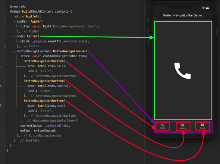
BottomNavigationBar has a lot of options to customize it per your need. Let’s zoom in on some of the properties you can customize.

Background color
You may want to change the background color of the BottomNavigationBar to match your brand. You do that simply by using the backgroundColor property.
Over 200k developers use LogRocket to create better digital experiences
By default, the BottomNavigationBar is set to elevate 8 points from the surface so that it appears on top of pages. You can set this property to any value:
You can shrink or magnify the size of all the icons at once using iconSize property:
Mouse cursor
When running on the web, you can customize the mouse cursor when it hovers over an item on the BottomNavigationBar:
Selected item
You can make the selected item appear different from an unselected one using the several selected properties of BottomNavigationBar:
Unselected items
You may also want to change the look and feels of unselected items. BottomNavigationBar has a few unselected properties that you can use:
Removing labels
If you want to get rid of the labels entirely, you can use showSelectedLabels and showUnselectedLabels :
Highlighting the selected item
You can emphasize the selected item by setting the BottomNavigationBar type to BottomNavigationBarType.shifting :
Although the basic version of BottomNavigationBar is working well, we have one problem: whatever action — e.g., searching, filtering, entering text, scrolling through a list, filling out a contact form, etc. — is being performed on the page will be lost upon selecting another item from the BottomNavigationBar:
In the demo above, we’re trying to find a contact. When we switch to the camera section before we finish our search and then return to the chat section, the previously entered text is completely gone.
Fear not — the solution is pretty simple. Simply replace the existing widget with IndexedStack . The IndexedStack widget holds a stack of widgets but shows only one at a time. Since all the widgets stay in the stack, the state is preserved.
The index property is used to show one page from the _pages , which is given to the children property.
Sometimes a single page is not enough to cover a wide range of subcategories within a parent category inside BottomNavigationBar. For example, the Google Play Store app has subcategories labeled For you, Top charts, Kids, etc. A scenario like this calls for the Flutter TabBar widget .
For demonstration purposes, let’s try to add TabBar for incoming, outgoing, and missed calls inside the calls section, as shown below:
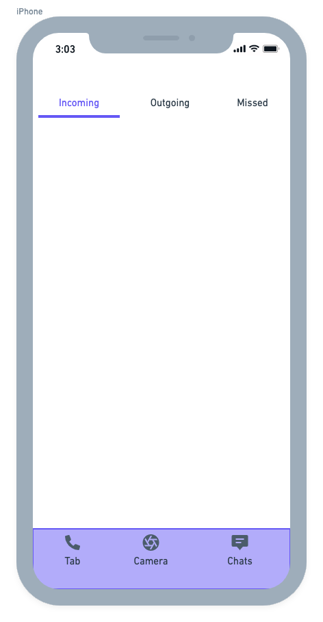
The overall structure of BottomNavigationBar remains the same. You may need to create a separate class for the page in which you want to include a TabBar. For that purpose, the CallsPage is created and added to the list of pages.
The CallsPage looks like this:
Here’s the output:
When building a Flutter app, you always want to utilize the screen space as efficiently as possible. When a user is scrolling through a long list of items on one of the pages in your app, you can hide the BottomNavigationBar smoothly. This behavior improves the user experience because you’re showing only content that is required at that moment.
As of now, the BottomNavigationBar stays as it is while scrolling through the list of outgoing calls:
Let’s walk through the process of hiding the BottomNavigationBar step by step.
First, wrap your list view inside the NotificationListener widget. NotificationListener listens to the scroll notification happening on the ListView.
Next, implement the _handleScrollNotification method to determine the scroll direction. Notify the page that hosts the BottomNavigationBar to hide it when the user scrolls down.
Wrap the BottomNavigationBar inside the SizeTransition widget. SizeTransition animates the size of BottomNavigationBar.
Start hiding animation on receiving the callback from the page that has the ListView .
Here is the result:
That’s it! The full code for this Flutter BottomNavigationBar example can be found on GitHub .
In this tutorial, we showed how to integrate BottomNavigationBar and customize it. We also learned various use cases with examples that you’ll likely encounter while developing a full-fledged Flutter app. I hope the practical examples we examined in this article helped you understand these important concepts.
Get set up with LogRocket's modern error tracking in minutes:
- Visit https://logrocket.com/signup/ to get an app ID
Install LogRocket via npm or script tag. LogRocket.init() must be called client-side, not server-side
Share this:
- Click to share on Twitter (Opens in new window)
- Click to share on Reddit (Opens in new window)
- Click to share on LinkedIn (Opens in new window)
- Click to share on Facebook (Opens in new window)

Stop guessing about your digital experience with LogRocket
Recent posts:.

Using Pavex for Rust web development
The Pavex Rust web framework is an exciting project that provides high performance, great usability, and speed.

Using the ResizeObserver API in React for responsive designs
With ResizeObserver, you can build aesthetic React apps with responsive components that look and behave as you intend on any device.

Creating JavaScript tables using Tabulator
Explore React Tabulator to create interactive JavaScript tables, easily integrating pagination, search functionality, and bulk data submission.

How to create heatmaps in JavaScript: The Heat.js library
This tutorial will explore the application of heatmaps in JavaScript projects, focusing on how to use the Heat.js library to generate them.

6 Replies to "How to build a bottom navigation bar in Flutter"
Thank You! You helped me understand nested Scaffold with BottomNavigationBar, also hiding bar is very hendy.
After a lot of research and a lot of time wasted, this was the solution to my problem. Thank you very much
Thank you for such an in depth and concise explanation. I was looking at something exactly like where the app should have a bottom navigation bar always present and some pages will have a secondary navigation (tab bar). You provided everything I needed.
Awesome. You saved me a lot of time for my app. I wasn’t aware you could ‘nest’ these navigation widgets. But it makes sense. Thank you.
Super! Thank you very much!
Leave a Reply Cancel reply
Download this source code for 5 USD
Multiple navigators with bottom navigation bar.

Multiple Navigators with BottomNavigationBar
This is the source code for my article:
- Flutter Case Study: Multiple Navigators with BottomNavigationBar
In this example each tab has its own navigation stack. This is so that we don’t lose the navigation history when switching tabs.
This is a very common use case for a lot of apps.
How is it built?
- Create an app with a Scaffold and a BottomNavigationBar .
- In the Scaffold body, create a Stack with one child for each tab.
- Each child is an Offstage widget with a child Navigator .
- Don’t forget to handle Android back navigation with WillPopScope .
Read the full story on my article:
- Brian Egan : for suggesting to use Stack + Offstage & Navigator widgets.
License: MIT
![[2024] Cactus - An application developed for the Android operating system, built using Flutter Apps](https://i0.wp.com/freefluttersource.com/wp-content/uploads/2023/05/Code-2022-11-58-02.jpg?resize=150%2C150&ssl=1)
Cactus – An application developed for the Android operating system, built using Flutter
![[2024] Understanding some flutter/dart concepts Proof of concept](https://i0.wp.com/freefluttersource.com/wp-content/uploads/2023/05/Code-2022-03-37-56.jpg?resize=150%2C150&ssl=1)
Understanding some flutter/dart concepts
Related posts, challenge 3 navigation bar management with flutter, an example of the material 3 navigation bar, custom shaped bottom navigation bar in flutter.
Comments are closed.
Navigation Menu
Search code, repositories, users, issues, pull requests..., provide feedback.
We read every piece of feedback, and take your input very seriously.
Saved searches
Use saved searches to filter your results more quickly.
To see all available qualifiers, see our documentation .
- Notifications
Nested navigation with BottomNavigationBar
bizz84/nested-navigation-demo-flutter
Folders and files, repository files navigation, flutter bottomnavigationbar with multiple navigators.
This is the source code for my article:
- Flutter Bottom Navigation Bar with Multiple Navigators: A Case Study
In this example each tab has its own navigation stack. This is so that we don’t lose the navigation history when switching tabs.
This is a very common use case for a lot of apps.
How is it built?
- Create an app with a Scaffold and a BottomNavigationBar .
- In the Scaffold body, create a Stack with one child for each tab.
- Each child is an Offstage widget with a child Navigator .
- Don't forget to handle Android back navigation with WillPopScope .
Read the full story on my article:
- Brian Egan : for suggesting to use Stack + Offstage & Navigator widgets.
License: MIT
- Kotlin 1.2%
- Objective-C 0.3%
- material.dart
- BottomNavigationBar class
A material widget that's displayed at the bottom of an app for selecting among a small number of views, typically between three and five.
There is an updated version of this component, NavigationBar , that's preferred for new applications and applications that are configured for Material 3 (see ThemeData.useMaterial3 ).
The bottom navigation bar consists of multiple items in the form of text labels, icons, or both, laid out on top of a piece of material. It provides quick navigation between the top-level views of an app. For larger screens, side navigation may be a better fit.
A bottom navigation bar is usually used in conjunction with a Scaffold , where it is provided as the Scaffold.bottomNavigationBar argument.
The bottom navigation bar's type changes how its items are displayed. If not specified, then it's automatically set to BottomNavigationBarType.fixed when there are less than four items, and BottomNavigationBarType.shifting otherwise.
The length of items must be at least two and each item's icon and label must not be null.
- BottomNavigationBarType.fixed , the default when there are less than four items . The selected item is rendered with the selectedItemColor if it's non-null, otherwise the theme's ColorScheme.primary color is used for Brightness.light themes and ColorScheme.secondary for Brightness.dark themes. If backgroundColor is null, The navigation bar's background color defaults to the Material background color, ThemeData.canvasColor (essentially opaque white).
- BottomNavigationBarType.shifting , the default when there are four or more items . If selectedItemColor is null, all items are rendered in white. The navigation bar's background color is the same as the BottomNavigationBarItem.backgroundColor of the selected item. In this case it's assumed that each item will have a different background color and that background color will contrast well with white.
Updating to NavigationBar
The NavigationBar widget's visuals are a little bit different, see the Material 3 spec at m3.material.io/components/navigation-bar/overview for more details.
The NavigationBar widget's API is also slightly different. To update from BottomNavigationBar to NavigationBar , you will need to make the following changes.
Instead of using BottomNavigationBar.items , which takes a list of BottomNavigationBarItem s, use NavigationBar.destinations , which takes a list of widgets. Usually, you use a list of NavigationDestination widgets. Just like BottomNavigationBarItem s, NavigationDestination s have a label and icon field.
Instead of using BottomNavigationBar.onTap , use NavigationBar.onDestinationSelected , which is also a callback that is called when the user taps on a navigation bar item.
Instead of using BottomNavigationBar.currentIndex , use NavigationBar.selectedIndex , which is also an integer that represents the index of the selected destination.
You may also need to make changes to the styling of the NavigationBar , see the properties in the NavigationBar constructor for more details.
Using BottomNavigationBar
To create a local project with this code sample, run: flutter create --sample=material.BottomNavigationBar.1 mysample
To create a local project with this code sample, run: flutter create --sample=material.BottomNavigationBar.2 mysample
To create a local project with this code sample, run: flutter create --sample=material.BottomNavigationBar.3 mysample
To create a local project with this code sample, run: flutter create --sample=material.BottomNavigationBar.4 mysample
- BottomNavigationBarItem
- material.io/design/components/bottom-navigation.html
- NavigationBar , this widget's replacement in Material Design 3.
- DiagnosticableTree
- StatefulWidget
- BottomNavigationBar
Constructors
Material library.

COMMENTS
Wrap up. Today we have learned a good deal about Flutter navigation, and how to combine BottomNavigationBar, Stack, Offstage and Navigator widgets to enable multiple navigation stacks. Using Offstage widgets ensures that all our navigators preserve their state as they remain inside the widget tree.
A few notes: On lines 9-13 we define a map of global navigator keys. This is what we need to ensure we use multiple navigators. The body of our Scaffold is now a Stack with three children.; Each ...
Credits go to Brian Egan for finding a way to make the navigators work. It was his idea to use a Stack with Offstage widgets to preserve the state of the navigators. Wrap up. Today we have learned a good deal about Flutter navigation, and how to combine BottomNavigationBar, Stack, Offstage and Navigator widgets to enable multiple navigation stacks.
Create an app with a Scaffold and a BottomNavigationBar. In the Scaffold body, create a Stack with one child for each tab. Each child is an Offstage widget with a child Navigator. Don't forget to handle Android back navigation with WillPopScope. Read the full story on my article: Flutter Case Study: Multiple Navigators with ...
Flutter BottomNavigationBar with Multiple Navigators. This is the source code for my article: Flutter Bottom Navigation Bar with Multiple Navigators: A Case Study; Preview. In this example each tab has its own navigation stack. This is so that we don't lose the navigation history when switching tabs. This is a very common use case for a lot ...
Create an app with a Scaffold and a BottomNavigationBar. \n; In the Scaffold body, create a Stack with one child for each tab. \n; Each child is an Offstage widget with a child Navigator. \n; Don't forget to handle Android back navigation with WillPopScope. \n \n. Read the full story on my article: \n \n; Flutter Case Study: Multiple Navigators ...
By the way, if you want to learn more about BottomNavigationBar and how to use it to enable multiple independent Navigators, make sure to read my previous article: Flutter Case Study: Multiple Navigators with BottomNavigationBar; Full source code. I open sourced my full example here on GitHub. 🙏. Feel free to reuse it in your projects. 😎
We have learned how to use a bottom navigation bar with nested navigation in each section of the app, while retaining the state of each section. Navigating back is possible using the back button ...
What is BottomNavigationBar in Flutter? BottomNavigationBar is a widget that displays a row of small widgets at the bottom of a Flutter app. Usually, it's used to show around three to five items. Each item must have a label and an icon. BottomNavigationBar allows you to select one item at a time and quickly navigate to a given page.
Create a bottom navigation bar that is fixed at the bottom of the screen, regardless of what page you are on, while also maintaining state between tabs
Also you can use navigation bottombar in certain screen by using navigator-functions instead of flutter navigator.push(); use following pushNewScreen for more details checkout persistent_bottom_nav_bar#navigator-functions. pushNewScreen( context, screen: MainScreen(), withNavBar: false, // OPTIONAL VALUE. True by default.
Create an app with a Scaffold and a BottomNavigationBar. In the Scaffold body, create a Stack with one child for each tab. Each child is an Offstage widget with a child Navigator. Don't forget to handle Android back navigation with WillPopScope. Read the full story on my article: Flutter Case Study: Multiple Navigators with ...
View community ranking In the Top 1% of largest communities on Reddit Flutter Case Study: Multiple Navigators with BottomNavigationBar
By the way, if you want to learn more about BottomNavigationBar and how to use it to enable multiple independent Navigators, make sure to read my previous article: Flutter Case Study: Multiple ...
Multiple Navigators with BottomNavigationBar · Issue #31483 · flutter/flutter · GitHub. flutter / flutter Public. Notifications. Fork 26.6k. Star 162k.
Create an app with a Scaffold and a BottomNavigationBar. In the Scaffold body, create a Stack with one child for each tab. Each child is an Offstage widget with a child Navigator. Don't forget to handle Android back navigation with WillPopScope. Read the full story on my article: Flutter Bottom Navigation Bar with Multiple Navigators: A Case Study
The bottom navigation bar consists of multiple items in the form of text labels, icons, or both, laid out on top of a piece of material. It provides quick navigation between the top-level views of an app. For larger screens, side navigation may be a better fit. A bottom navigation bar is usually used in conjunction with a Scaffold , where it is ...
maybe I don't really understand your problem. Is the BottomNavigationBar not supposed to be seen across many screens? My BottomNavigationBar is in my MyApp class, which is called by the main. From the MyApp class, I start all the screens of my App. My code looks like:
In a Flutter app, you can customize the colors of the status bar (the bar at the top of the screen that displays the time, battery status… 2 min read · Feb 27, 2024 See more recommendations
The problem is that in my HomePage() I use Get.toNamed('otheRoute') and I lose the Appbar and the BottomNavigationBar. I nedd to achieve the result as the link. This is my navigator page