Reference management. Clean and simple.

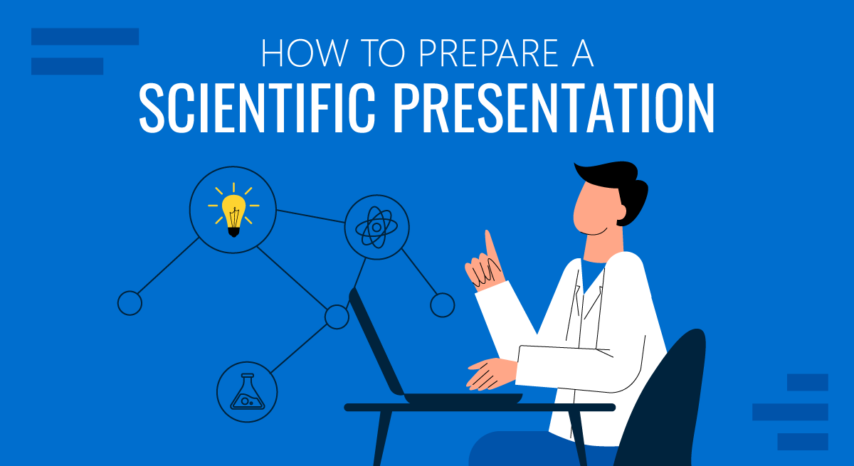
How to make a scientific presentation

Scientific presentation outlines
Questions to ask yourself before you write your talk, 1. how much time do you have, 2. who will you speak to, 3. what do you want the audience to learn from your talk, step 1: outline your presentation, step 2: plan your presentation slides, step 3: make the presentation slides, slide design, text elements, animations and transitions, step 4: practice your presentation, final thoughts, frequently asked questions about preparing scientific presentations, related articles.
A good scientific presentation achieves three things: you communicate the science clearly, your research leaves a lasting impression on your audience, and you enhance your reputation as a scientist.
But, what is the best way to prepare for a scientific presentation? How do you start writing a talk? What details do you include, and what do you leave out?
It’s tempting to launch into making lots of slides. But, starting with the slides can mean you neglect the narrative of your presentation, resulting in an overly detailed, boring talk.
The key to making an engaging scientific presentation is to prepare the narrative of your talk before beginning to construct your presentation slides. Planning your talk will ensure that you tell a clear, compelling scientific story that will engage the audience.
In this guide, you’ll find everything you need to know to make a good oral scientific presentation, including:
- The different types of oral scientific presentations and how they are delivered;
- How to outline a scientific presentation;
- How to make slides for a scientific presentation.
Our advice results from delving into the literature on writing scientific talks and from our own experiences as scientists in giving and listening to presentations. We provide tips and best practices for giving scientific talks in a separate post.
There are two main types of scientific talks:
- Your talk focuses on a single study . Typically, you tell the story of a single scientific paper. This format is common for short talks at contributed sessions in conferences.
- Your talk describes multiple studies. You tell the story of multiple scientific papers. It is crucial to have a theme that unites the studies, for example, an overarching question or problem statement, with each study representing specific but different variations of the same theme. Typically, PhD defenses, invited seminars, lectures, or talks for a prospective employer (i.e., “job talks”) fall into this category.
➡️ Learn how to prepare an excellent thesis defense
The length of time you are allotted for your talk will determine whether you will discuss a single study or multiple studies, and which details to include in your story.
The background and interests of your audience will determine the narrative direction of your talk, and what devices you will use to get their attention. Will you be speaking to people specializing in your field, or will the audience also contain people from disciplines other than your own? To reach non-specialists, you will need to discuss the broader implications of your study outside your field.
The needs of the audience will also determine what technical details you will include, and the language you will use. For example, an undergraduate audience will have different needs than an audience of seasoned academics. Students will require a more comprehensive overview of background information and explanations of jargon but will need less technical methodological details.
Your goal is to speak to the majority. But, make your talk accessible to the least knowledgeable person in the room.
This is called the thesis statement, or simply the “take-home message”. Having listened to your talk, what message do you want the audience to take away from your presentation? Describe the main idea in one or two sentences. You want this theme to be present throughout your presentation. Again, the thesis statement will depend on the audience and the type of talk you are giving.
Your thesis statement will drive the narrative for your talk. By deciding the take-home message you want to convince the audience of as a result of listening to your talk, you decide how the story of your talk will flow and how you will navigate its twists and turns. The thesis statement tells you the results you need to show, which subsequently tells you the methods or studies you need to describe, which decides the angle you take in your introduction.
➡️ Learn how to write a thesis statement
The goal of your talk is that the audience leaves afterward with a clear understanding of the key take-away message of your research. To achieve that goal, you need to tell a coherent, logical story that conveys your thesis statement throughout the presentation. You can tell your story through careful preparation of your talk.
Preparation of a scientific presentation involves three separate stages: outlining the scientific narrative, preparing slides, and practicing your delivery. Making the slides of your talk without first planning what you are going to say is inefficient.
Here, we provide a 4 step guide to writing your scientific presentation:
- Outline your presentation
- Plan your presentation slides
- Make the presentation slides
- Practice your presentation

Writing an outline helps you consider the key pieces of your talk and how they fit together from the beginning, preventing you from forgetting any important details. It also means you avoid changing the order of your slides multiple times, saving you time.
Plan your talk as discrete sections. In the table below, we describe the sections for a single study talk vs. a talk discussing multiple studies:
The following tips apply when writing the outline of a single study talk. You can easily adapt this framework if you are writing a talk discussing multiple studies.
Introduction: Writing the introduction can be the hardest part of writing a talk. And when giving it, it’s the point where you might be at your most nervous. But preparing a good, concise introduction will settle your nerves.
The introduction tells the audience the story of why you studied your topic. A good introduction succinctly achieves four things, in the following order.
- It gives a broad perspective on the problem or topic for people in the audience who may be outside your discipline (i.e., it explains the big-picture problem motivating your study).
- It describes why you did the study, and why the audience should care.
- It gives a brief indication of how your study addressed the problem and provides the necessary background information that the audience needs to understand your work.
- It indicates what the audience will learn from the talk, and prepares them for what will come next.
A good introduction not only gives the big picture and motivations behind your study but also concisely sets the stage for what the audience will learn from the talk (e.g., the questions your work answers, and/or the hypotheses that your work tests). The end of the introduction will lead to a natural transition to the methods.
Give a broad perspective on the problem. The easiest way to start with the big picture is to think of a hook for the first slide of your presentation. A hook is an opening that gets the audience’s attention and gets them interested in your story. In science, this might take the form of a why, or a how question, or it could be a statement about a major problem or open question in your field. Other examples of hooks include quotes, short anecdotes, or interesting statistics.
Why should the audience care? Next, decide on the angle you are going to take on your hook that links to the thesis of your talk. In other words, you need to set the context, i.e., explain why the audience should care. For example, you may introduce an observation from nature, a pattern in experimental data, or a theory that you want to test. The audience must understand your motivations for the study.
Supplementary details. Once you have established the hook and angle, you need to include supplementary details to support them. For example, you might state your hypothesis. Then go into previous work and the current state of knowledge. Include citations of these studies. If you need to introduce some technical methodological details, theory, or jargon, do it here.
Conclude your introduction. The motivation for the work and background information should set the stage for the conclusion of the introduction, where you describe the goals of your study, and any hypotheses or predictions. Let the audience know what they are going to learn.
Methods: The audience will use your description of the methods to assess the approach you took in your study and to decide whether your findings are credible. Tell the story of your methods in chronological order. Use visuals to describe your methods as much as possible. If you have equations, make sure to take the time to explain them. Decide what methods to include and how you will show them. You need enough detail so that your audience will understand what you did and therefore can evaluate your approach, but avoid including superfluous details that do not support your main idea. You want to avoid the common mistake of including too much data, as the audience can read the paper(s) later.
Results: This is the evidence you present for your thesis. The audience will use the results to evaluate the support for your main idea. Choose the most important and interesting results—those that support your thesis. You don’t need to present all the results from your study (indeed, you most likely won’t have time to present them all). Break down complex results into digestible pieces, e.g., comparisons over multiple slides (more tips in the next section).
Summary: Summarize your main findings. Displaying your main findings through visuals can be effective. Emphasize the new contributions to scientific knowledge that your work makes.
Conclusion: Complete the circle by relating your conclusions to the big picture topic in your introduction—and your hook, if possible. It’s important to describe any alternative explanations for your findings. You might also speculate on future directions arising from your research. The slides that comprise your conclusion do not need to state “conclusion”. Rather, the concluding slide title should be a declarative sentence linking back to the big picture problem and your main idea.
It’s important to end well by planning a strong closure to your talk, after which you will thank the audience. Your closing statement should relate to your thesis, perhaps by stating it differently or memorably. Avoid ending awkwardly by memorizing your closing sentence.
By now, you have an outline of the story of your talk, which you can use to plan your slides. Your slides should complement and enhance what you will say. Use the following steps to prepare your slides.
- Write the slide titles to match your talk outline. These should be clear and informative declarative sentences that succinctly give the main idea of the slide (e.g., don’t use “Methods” as a slide title). Have one major idea per slide. In a YouTube talk on designing effective slides , researcher Michael Alley shows examples of instructive slide titles.
- Decide how you will convey the main idea of the slide (e.g., what figures, photographs, equations, statistics, references, or other elements you will need). The body of the slide should support the slide’s main idea.
- Under each slide title, outline what you want to say, in bullet points.
In sum, for each slide, prepare a title that summarizes its major idea, a list of visual elements, and a summary of the points you will make. Ensure each slide connects to your thesis. If it doesn’t, then you don’t need the slide.
Slides for scientific presentations have three major components: text (including labels and legends), graphics, and equations. Here, we give tips on how to present each of these components.
- Have an informative title slide. Include the names of all coauthors and their affiliations. Include an attractive image relating to your study.
- Make the foreground content of your slides “pop” by using an appropriate background. Slides that have white backgrounds with black text work well for small rooms, whereas slides with black backgrounds and white text are suitable for large rooms.
- The layout of your slides should be simple. Pay attention to how and where you lay the visual and text elements on each slide. It’s tempting to cram information, but you need lots of empty space. Retain space at the sides and bottom of your slides.
- Use sans serif fonts with a font size of at least 20 for text, and up to 40 for slide titles. Citations can be in 14 font and should be included at the bottom of the slide.
- Use bold or italics to emphasize words, not underlines or caps. Keep these effects to a minimum.
- Use concise text . You don’t need full sentences. Convey the essence of your message in as few words as possible. Write down what you’d like to say, and then shorten it for the slide. Remove unnecessary filler words.
- Text blocks should be limited to two lines. This will prevent you from crowding too much information on the slide.
- Include names of technical terms in your talk slides, especially if they are not familiar to everyone in the audience.
- Proofread your slides. Typos and grammatical errors are distracting for your audience.
- Include citations for the hypotheses or observations of other scientists.
- Good figures and graphics are essential to sustain audience interest. Use graphics and photographs to show the experiment or study system in action and to explain abstract concepts.
- Don’t use figures straight from your paper as they may be too detailed for your talk, and details like axes may be too small. Make new versions if necessary. Make them large enough to be visible from the back of the room.
- Use graphs to show your results, not tables. Tables are difficult for your audience to digest! If you must present a table, keep it simple.
- Label the axes of graphs and indicate the units. Label important components of graphics and photographs and include captions. Include sources for graphics that are not your own.
- Explain all the elements of a graph. This includes the axes, what the colors and markers mean, and patterns in the data.
- Use colors in figures and text in a meaningful, not random, way. For example, contrasting colors can be effective for pointing out comparisons and/or differences. Don’t use neon colors or pastels.
- Use thick lines in figures, and use color to create contrasts in the figures you present. Don’t use red/green or red/blue combinations, as color-blind audience members can’t distinguish between them.
- Arrows or circles can be effective for drawing attention to key details in graphs and equations. Add some text annotations along with them.
- Write your summary and conclusion slides using graphics, rather than showing a slide with a list of bullet points. Showing some of your results again can be helpful to remind the audience of your message.
- If your talk has equations, take time to explain them. Include text boxes to explain variables and mathematical terms, and put them under each term in the equation.
- Combine equations with a graphic that shows the scientific principle, or include a diagram of the mathematical model.
- Use animations judiciously. They are helpful to reveal complex ideas gradually, for example, if you need to make a comparison or contrast or to build a complicated argument or figure. For lists, reveal one bullet point at a time. New ideas appearing sequentially will help your audience follow your logic.
- Slide transitions should be simple. Silly ones distract from your message.
- Decide how you will make the transition as you move from one section of your talk to the next. For example, if you spend time talking through details, provide a summary afterward, especially in a long talk. Another common tactic is to have a “home slide” that you return to multiple times during the talk that reinforces your main idea or message. In her YouTube talk on designing effective scientific presentations , Stanford biologist Susan McConnell suggests using the approach of home slides to build a cohesive narrative.
To deliver a polished presentation, it is essential to practice it. Here are some tips.
- For your first run-through, practice alone. Pay attention to your narrative. Does your story flow naturally? Do you know how you will start and end? Are there any awkward transitions? Do animations help you tell your story? Do your slides help to convey what you are saying or are they missing components?
- Next, practice in front of your advisor, and/or your peers (e.g., your lab group). Ask someone to time your talk. Take note of their feedback and the questions that they ask you (you might be asked similar questions during your real talk).
- Edit your talk, taking into account the feedback you’ve received. Eliminate superfluous slides that don’t contribute to your takeaway message.
- Practice as many times as needed to memorize the order of your slides and the key transition points of your talk. However, don’t try to learn your talk word for word. Instead, memorize opening and closing statements, and sentences at key junctures in the presentation. Your presentation should resemble a serious but spontaneous conversation with the audience.
- Practicing multiple times also helps you hone the delivery of your talk. While rehearsing, pay attention to your vocal intonations and speed. Make sure to take pauses while you speak, and make eye contact with your imaginary audience.
- Make sure your talk finishes within the allotted time, and remember to leave time for questions. Conferences are particularly strict on run time.
- Anticipate questions and challenges from the audience, and clarify ambiguities within your slides and/or speech in response.
- If you anticipate that you could be asked questions about details but you don’t have time to include them, or they detract from the main message of your talk, you can prepare slides that address these questions and place them after the final slide of your talk.
➡️ More tips for giving scientific presentations
An organized presentation with a clear narrative will help you communicate your ideas effectively, which is essential for engaging your audience and conveying the importance of your work. Taking time to plan and outline your scientific presentation before writing the slides will help you manage your nerves and feel more confident during the presentation, which will improve your overall performance.
A good scientific presentation has an engaging scientific narrative with a memorable take-home message. It has clear, informative slides that enhance what the speaker says. You need to practice your talk many times to ensure you deliver a polished presentation.
First, consider who will attend your presentation, and what you want the audience to learn about your research. Tailor your content to their level of knowledge and interests. Second, create an outline for your presentation, including the key points you want to make and the evidence you will use to support those points. Finally, practice your presentation several times to ensure that it flows smoothly and that you are comfortable with the material.
Prepare an opening that immediately gets the audience’s attention. A common device is a why or a how question, or a statement of a major open problem in your field, but you could also start with a quote, interesting statistic, or case study from your field.
Scientific presentations typically either focus on a single study (e.g., a 15-minute conference presentation) or tell the story of multiple studies (e.g., a PhD defense or 50-minute conference keynote talk). For a single study talk, the structure follows the scientific paper format: Introduction, Methods, Results, Summary, and Conclusion, whereas the format of a talk discussing multiple studies is more complex, but a theme unifies the studies.
Ensure you have one major idea per slide, and convey that idea clearly (through images, equations, statistics, citations, video, etc.). The slide should include a title that summarizes the major point of the slide, should not contain too much text or too many graphics, and color should be used meaningfully.

Home Blog Education How to Prepare Your Scientific Presentation
How to Prepare Your Scientific Presentation
Since the dawn of time, humans were eager to find explanations for the world around them. At first, our scientific method was very simplistic and somewhat naive. We observed and reflected. But with the progressive evolution of research methods and thinking paradigms, we arrived into the modern era of enlightenment and science. So what represents the modern scientific method and how can you accurately share and present your research findings to others? These are the two fundamental questions we attempt to answer in this post.
What is the Scientific Method?
To better understand the concept, let’s start with this scientific method definition from the International Encyclopedia of Human Geography :
The scientific method is a way of conducting research, based on theory construction, the generation of testable hypotheses, their empirical testing, and the revision of theory if the hypothesis is rejected.
Essentially, a scientific method is a cumulative term, used to describe the process any scientist uses to objectively interpret the world (and specific phenomenon) around them.
The scientific method is the opposite of beliefs and cognitive biases — mostly irrational, often unconscious, interpretations of different occurrences that we lean on as a mental shortcut.
The scientific method in research, on the contrary, forces the thinker to holistically assess and test our approaches to interpreting data. So that they could gain consistent and non-arbitrary results.

The common scientific method examples are:
- Systematic observation
- Experimentation
- Inductive and deductive reasoning
- Formation and testing of hypotheses and theories
All of the above are used by both scientists and businesses to make better sense of the data and/or phenomenon at hand.
The Evolution of the Scientific Method
According to the Stanford Encyclopedia of Philosophy , ancient thinkers such as Plato and Aristotle are believed to be the forefathers of the scientific method. They were among the first to try to justify and refine their thought process using the scientific method experiments and deductive reasoning.
Both developed specific systems for knowledge acquisition and processing. For example, the Platonic way of knowledge emphasized reasoning as the main method for learning but downplayed the importance of observation. The Aristotelian corpus of knowledge, on the contrary, said that we must carefully observe the natural world to discover its fundamental principles.
In medieval times, thinkers such as Thomas Aquinas, Roger Bacon, and Andreas Vesalius among many others worked on further clarifying how we can obtain proven knowledge through observation and induction.
The 16th–18th centuries are believed to have given the greatest advances in terms of scientific method application. We, humans, learned to better interpret the world around us from mechanical, biological, economic, political, and medical perspectives. Thinkers such as Galileo Galilei, Francis Bacon, and their followers also increasingly switched to a tradition of explaining everything through mathematics, geometry, and numbers.
Up till today, mathematical and mechanical explanations remain the core parts of the scientific method.
Why is the Scientific Method Important Today?
Because our ancestors didn’t have as much data as we do. We now live in the era of paramount data accessibility and connectivity, where over 2.5 quintillions of data are produced each day. This has tremendously accelerated knowledge creation.
But, at the same time, such overwhelming exposure to data made us more prone to external influences, biases, and false beliefs. These can jeopardize the objectivity of any research you are conducting.
Scientific findings need to remain objective, verifiable, accurate, and consistent. Diligent usage of scientific methods in modern business and science helps ensure proper data interpretation, results replication, and undisputable validity.
6 Steps of the Scientific Method
Over the course of history, the scientific method underwent many interactions. Yet, it still carries some of the integral steps our ancestors used to analyze the world such as observation and inductive reasoning. However, the modern scientific method steps differ a bit.

1. Make an Observation
An observation serves as a baseline for your research. There are two important characteristics for a good research observation:
- It must be objective, not subjective.
- It must be verifiable, meaning others can say it’s true or false with this.
For example, This apple is red (objective/verifiable observation). This apple is delicious (subjective, harder-to-verify observation).
2. Develop a Hypothesis
Observations tell us about the present or past. But the goal of science is to glean in the future. A scientific hypothesis is based on prior knowledge and produced through reasoning as an attempt to descriptive a future event.
Here are characteristics of a good scientific hypothesis:
- General and tentative idea
- Agrees with all available observations
- Testable and potentially falsifiable
Remember: If we state our hypothesis to indicate there is no effect, our hypothesis is a cause-and-effect relationship . A hypothesis, which asserts no effect, is called a null hypothesis.
3. Make a Prediction
A hypothesis is a mental “launchpad” for predicting the existence of other phenomena or quantitative results of new observations.
Going back to an earlier example here’s how to turn it into a hypothesis and a potential prediction for proving it. For example: If this apple is red, other apples of this type should be red too.
Your goal is then to decide which variables can help you prove or disprove your hypothesis and prepare to test these.
4. Perform an Experiment
Collect all the information around variables that will help you prove or disprove your prediction. According to the scientific method, a hypothesis has to be discarded or modified if its predictions are clearly and repeatedly incompatible with experimental results.

Yes, you may come up with an elegant theory. However, if your hypothetical predictions cannot be backed by experimental results, you cannot use them as a valid explanation of the phenomenon.
5. Analyze the Results of the Experiment
To come up with proof for your hypothesis, use different statistical analysis methods to interpret the meaning behind your data.
Remember to stay objective and emotionally unattached to your results. If 95 apples turned red, but 5 were yellow, does it disprove your hypothesis? Not entirely. It may mean that you didn’t account for all variables and must adapt the parameters of your experiment.
Here are some common data analysis techniques, used as a part of a scientific method:
- Statistical analysis
- Cause and effect analysis (see cause and effect analysis slides )
- Regression analysis
- Factor analysis
- Cluster analysis
- Time series analysis
- Diagnostic analysis
- Root cause analysis (see root cause analysis slides )
6. Draw a Conclusion
Every experiment has two possible outcomes:
- The results correspond to the prediction
- The results disprove the prediction
If that’s the latter, as a scientist you must discard the prediction then and most likely also rework the hypothesis based on it.
How to Give a Scientific Presentation to Showcase Your Methods
Whether you are doing a poster session, conference talk, or follow-up presentation on a recently published journal article, most of your peers need to know how you’ve arrived at the presented conclusions.
In other words, they will probe your scientific method for gaps to ensure that your results are fair and possible to replicate. So that they could incorporate your theories in their research too. Thus your scientific presentation must be sharp, on-point, and focus clearly on your research approaches.
Below we propose a quick framework for creating a compelling scientific presentation in PowerPoint (+ some helpful templates!).
1. Open with a Research Question
Here’s how to start a scientific presentation with ease: share your research question. On the first slide, briefly recap how your thought process went. Briefly state what was the underlying aim of your research: Share your main hypothesis, mention if you could prove or disprove them.
It might be tempting to pack a lot of ideas into your first slide but don’t. Keep the opening of your presentation short to pique the audience’s initial interest and set the stage for the follow-up narrative.

2. Disclose Your Methods
Whether you are doing a science poster presentation or conference talk, many audience members would be curious to understand how you arrived at your results. Deliver this information at the beginning of your presentation to avoid any ambiguities.
Here’s how to organize your science methods on a presentation:
- Do not use bullet points or full sentences. Use diagrams and structured images to list the methods
- Use visuals and iconography to use metaphors where possible.
- Organize your methods by groups e.g. quantifiable and non-quantifiable
Finally, when you work on visuals for your presentation — charts, graphs, illustrations, etc. — think from the perspective of a subject novice. Does the image really convey the key information around the subject? Does it help break down complex ideas?

3. Spotlight the Results
Obviously, the research results will be your biggest bragging right. However, don’t over-pack your presentation with a long-winded discussion of your findings and how revolutionary these may be for the community.
Rather than writing a wall of text, do this instead:
- Use graphs with large axis values/numbers to showcase the findings in great detail
- Prioritize formats that are known to everybody (e.g. odds ratios, Kaplan Meier curves, etc.)
- Do not include more than 5 lines of plain text per slide
Overall, when you feel that the results slide gets too cramped, it’s best to move the data to a new one.
Also, as you work on organizing data on your scientific presentation PowerPoint template , think if there are obvious limitations and gaps. If yes, make sure you acknowledge them during your speech.
4. Mention Study Limitations
The scientific method mandates objectivity. That’s why every researcher must clearly state what was excluded from their study. Remember: no piece of scientific research is truly universal and has certain boundaries. However, when you fail to personally state those, others might struggle to draw the line themselves and replicate your results. Then, if they fail to do so, they’d question the viability of your research.
5. Conclude with a Memorable Takeaway Message
Every experienced speaker will tell you that the audience best retains the information they hear first and last. Most people will attend more than one scientific presentation during the day.
So if you want the audience to better remember your talk, brainstorm a take-home message for the last slide of your presentation. Think of your last slide texts as an elevator pitch — a short, concluding message, summarizing your research.
To Conclude
Today we have no shortage of research and scientific methods for testing and proving our hypothesis. However, unlike our ancestors, most scientists experience deeper scrutiny when it comes to presenting and explaining their findings to others. That’s why it’s important to ensure that your scientific presentation clearly relays the aim, vector, and thought process behind your research.

Like this article? Please share
Education, Presentation Ideas, Presentation Skills, Presentation Tips Filed under Education
Related Articles

Filed under Google Slides Tutorials • May 3rd, 2024
How to Work with Google Slides Version History
Go back to previous changes or check who edited your presentation. Learn how to work with Google Slides Version History here.

Filed under Design , Presentation Ideas • May 1st, 2024
The Power of Mind Map Note Taking for Presenters
Add a new tool to your repertoire of presentation skills by mastering the art of mind map note taking. An ideal process to facilitate content retention.

Filed under Google Slides Tutorials • April 29th, 2024
Best Google Slides Add-Ons
Optimize your Google Slides experience by installing the best Google Slides add-ons available in the market. Full list with photos.
Leave a Reply
Get in touch
555-555-5555

Limited time offer: 20% off all templates ➞

Scientific Presentation Guide: How to Create an Engaging Research Talk
Creating an effective scientific presentation requires developing clear talking points and slide designs that highlight your most important research results..
Scientific presentations are detailed talks that showcase a research project or analysis results. This comprehensive guide reviews everything you need to know to give an engaging presentation for scientific conferences, lab meetings, and PhD thesis talks. From creating your presentation outline to designing effective slides, the tips in this article will give you the tools you need to impress your scientific peers and superiors.

Step 1. Create a Presentation Outline
The first step to giving a good scientific talk is to create a presentation outline that engages the audience at the start of the talk, highlights only 3-5 main points of your research, and then ends with a clear take-home message. Creating an outline ensures that the overall talk storyline is clear and will save you time when you start to design your slides.
Engage Your Audience
The first part of your presentation outline should contain slide ideas that will gain your audience's attention. Below are a few recommendations for slides that engage your audience at the start of the talk:
- Create a slide that makes connects your data or presentation information to a shared purpose, such as relevance to solving a medical problem or fundamental question in your field of research
- Create slides that ask and invite questions
- Use humor or entertainment

Identify Clear Main Points
After writing down your engagement ideas, the next step is to list the main points that will become the outline slide for your presentation. A great way to accomplish this is to set a timer for five minutes and write down all of the main points and results or your research that you want to discuss in the talk. When the time is up, review the points and select no more than three to five main points that create your talk outline. Limiting the amount of information you share goes a long way in maintaining audience engagement and understanding.

Create a Take-Home Message
And finally, you should brainstorm a single take-home message that makes the most important main point stand out. This is the one idea that you want people to remember or to take action on after your talk. This can be your core research discovery or the next steps that will move the project forward.
Step 2. Choose a Professional Slide Theme
After you have a good presentation outline, the next step is to choose your slide colors and create a theme. Good slide themes use between two to four main colors that are accessible to people with color vision deficiencies. Read this article to learn more about choosing the best scientific color palettes .
You can also choose templates that already have an accessible color scheme. However, be aware that many PowerPoint templates that are available online are too cheesy for a scientific audience. Below options to download professional scientific slide templates that are designed specifically for academic conferences, research talks, and graduate thesis defenses.

Step 3. Design Your Slides
Designing good slides is essential to maintaining audience interest during your scientific talk. Follow these four best practices for designing your slides:
- Keep it simple: limit the amount of information you show on each slide
- Use images and illustrations that clearly show the main points with very little text.
- Read this article to see research slide example designs for inspiration
- When you are using text, try to reduce the scientific jargon that is unnecessary. Text on research talk slides needs to be much more simple than the text used in scientific publications (see example below).
- Use appear/disappear animations to break up the details into smaller digestible bites
- Sign up for the free presentation design course to learn PowerPoint animation tricks

Scientific Presentation Design Summary
All of the examples and tips described in this article will help you create impressive scientific presentations. Below is the summary of how to give an engaging talk that will earn respect from your scientific community.
Step 1. Draft Presentation Outline. Create a presentation outline that clearly highlights the main point of your research. Make sure to start your talk outline with ideas to engage your audience and end your talk with a clear take-home message.
Step 2. Choose Slide Theme. Use a slide template or theme that looks professional, best represents your data, and matches your audience's expectations. Do not use slides that are too plain or too cheesy.
Step 3. Design Engaging Slides. Effective presentation slide designs use clear data visualizations and limits the amount of information that is added to each slide.
And a final tip is to practice your presentation so that you can refine your talking points. This way you will also know how long it will take you to cover the most essential information on your slides. Thank you for choosing Simplified Science Publishing as your science communication resource and good luck with your presentations!
Interested in free design templates and training?
Explore scientific illustration templates and courses by creating a Simplified Science Publishing Log In. Whether you are new to data visualization design or have some experience, these resources will improve your ability to use both basic and advanced design tools.
Interested in reading more articles on scientific design? Learn more below:

Data Storytelling Techniques: How to Tell a Great Data Story in 4 Steps

Best Science PowerPoint Templates and Slide Design Examples

Free Research Poster Templates and Tutorials
Content is protected by Copyright license. Website visitors are welcome to share images and articles, however they must include the Simplified Science Publishing URL source link when shared. Thank you!
Online Courses
Stay up-to-date for new simplified science courses, subscribe to our newsletter.
Thank you for signing up!
You have been added to the emailing list and will only recieve updates when there are new courses or templates added to the website.
We use cookies on this site to enhance your user experience and we do not sell data. By using this website, you are giving your consent for us to set cookies: View Privacy Policy
Simplified Science Publishing, LLC
This website uses cookies to improve your user experience. By continuing to use the site, you are accepting our use of cookies. Read the ACS privacy policy.
- ACS Publications
10 Keys to an Engaging Scientific Presentation
- May 31, 2018
What makes an engaging scientific presentation? Georgia Tech Professor Will Ratcliff uses a method based on the style of nature documentary presenter David Attenborough. Ratcliff’s approach looks to capture an audience’s natural curiosity by using engaging visuals and simple storytelling techniques. Here are his 10 keys to an engaging scientific presentation: 1) Be an Entertainer First: […]

What makes an engaging scientific presentation? Georgia Tech Professor Will Ratcliff uses a method based on the style of nature documentary presenter David Attenborough. Ratcliff’s approach looks to capture an audience’s natural curiosity by using engaging visuals and simple storytelling techniques.
Here are his 10 keys to an engaging scientific presentation:
1) Be an Entertainer First : Before your science can wow your audience, they have to understand it. Before they can understand it, you must engage them with what you’re saying. Look at your presentation from your audience’s perspective and think about how they’ll relate to your material. Focus on presenting your science in a way that engages and entertains as it explains.
2) Be a Storyteller, Not a Lecturer : Don’t assume that your audience knows your field. Tell the story of your science: identify the big picture backdrop, your specific research questions, how you answer those questions, and how it affects the way we now think about the big picture.
3) Prioritize Clarity : If the audience doesn’t understand every word you use, they’ll stop paying attention, and you may never win them back. Your goal is to never lose their attention in the first place, so make an effort to be clear and have a simple narrative arc to your talk.
4) Mind Your Transitions: The easiest place to lose your audience’s focus is when you move from one slide to another. Practice the transitions in your talk to make sure the link between the ideas of one slide and the next remains clear.
5) Keep Complete Sentences Out of Your Slides: Keep the text in your slides to a minimum. Instead, use compelling visual to hold your audience’s attention while you speak.
6) Animations Are Your Friend: You can use animations to reveal new details on your slide as they become relevant to what you are saying. That way you get to control what your audience is seeing, minimizing distraction and putting laser pointers out of a job. Note: never use silly and unnecessary animations, like spinning or scrolling text, this will just annoy your audience.
7) Get Excited: If you’re not excited and energetic about your work, your audience won’t be either.
8) Look at the Audience: Don’t stare at the floor, the ceiling, or your slides while you’re presenting. Look directly at your audience, or if you’re nervous, toward the back of the lecture hall. This will help you connect with your audience.
9) Be Wary of Jokes: Scientific talks are serious by nature and you have more to lose than to gain. If a joke is poorly timed or if you misjudge an audience, you risk alienating them. Play it safe and find other ways to be entertaining unless you know your audience well.
10) Leave the Laser Pointer at Home: Laser pointers are distracting. If you feel you need one to guide your audience through a slide, that’s a sign your slide is too cluttered.
Want More Tips on Giving an Engaging Scientific Presentation? Check Out: 3 Elements of a Great Scientific Talk
Want the latest stories delivered to your inbox each month.
- Enterprise Custom Courses
- Build Your Own Courses
- Help Center
- Clinical Trial Recruitment
- Pharmaceutical Marketing
- Health Department Resources
- Patient Education
- Research Presentation
- Remote Monitoring
- Health Literacy & SciComm
- Student Education & Higher Ed
- Individual Learning
- Member Directory
- Community Chats on Slack
- SciComm Program
- The Story-Driven Method
- The Instructional Method
How to Create an Engaging Science Presentation: A Quick Guide
We’ve all been there – rushing to put slides together for an upcoming talk, filling them with bullet points and text that we want to remember to cover. We aren’t sure exactly what the audience will want to know or how much detail to include, so we default to putting ALL the details in that might be needed. But such efforts often result in presentations that are too long, too confusing, and difficult for both ourselves and our audiences to navigate.
Today I gave a workshop to public health graduate students about how to create more engaging science presentations and talks. I’ve summarized the main takeaways below. I hope this quick guide will be useful to you as you prepare for your next science talk or presentation!

The best science talks start with a process of simplifying – peeling back the layers of information and detail to get at the one core idea that you want to communicate. Over the course of your talk, you may present 2-3 key messages that relate to, demonstrate, provide examples of or underpin this idea. (Three is a nice round number of messages or takeaways that your audience will be able to remember!) But stick to one big idea. Trying to communicate too much in a presentation or talk will overwhelm your audience, and they may walk away without a good memory of any of the ideas you presented.
Once you’ve settled on your one big idea, you can develop a theme that will pervade every aspect of your talk. This theme might be a defining element of your big idea and something that can tie all of your data or talking points together. Your theme should inform the examples, anecdotes and analogies that you use to make the science concepts you present more accessible. It should also inform your slides’ very design – the colors, visuals, layout and content flow.
If you have trouble identifying your big idea and your theme, you can try using what scientist and science author Randy Olson calls the “Dobzhansky Template.” Fill in the blanks of this statement: “ Nothing in [your talk topic, research topic or big idea] makes sense, except in the light of [your theme!] .”
Here’s an example for you: “Nothing in the creation of engaging science talks makes sense except in the light of people’s need for personal connection .” With this statement, I’m identifying a key aspect, a unifying theme, for my talk (or blog post) on how to create engaging science talks. We all crave personal connection. Yes, even to the speakers of science talks we listen to! What does this mean in terms of what we want or expect from these speakers? It means we want storytelling . We want to hear their stories, know their background, hear about their struggles and triumphs! We want to be able to step into their shoes and see what they saw. We want to interact with them.
")
Tell a Story
Narratives engage more than facts. By telling a story , using suspense and characters to pull people through your presentation, you will capture and keep their attention for longer. People also remember information presented in a story format better than they do information presented as disparate facts or bullet points.
“Story is a pull strategy. If your story is good enough, people—of their own free will—come to the conclusion they can trust you and the message you bring.” – Annette Simmons
Storytelling is a powerful science communication tool. In storytelling, both the storyteller and the listener or reader contribute to the story’s meaning through their interpretations, feelings and emotions. Liz Neeley, former executive director of The Story Collider, once said: “Science communicators frequently fail to understand that a feeling is almost never conquered with a fact.”
Stories are exciting. They elicit emotions. They help foster a personal connection between the storyteller and the listener, and a connection between the listener and the topic, characters or ideas presented in the story.
But what IS a story? As humans, we excel at recognizing a story when we hear one, but defining a story’s key characteristics is more difficult than you might think. If you ask anyone to explain what makes for a good story, they likely will have a hard time explaining it.
In her fantastic book Wired for Story , Lisa Cron starts by explaining what a story is NOT.
It is not plot – that is just what happens in the story.
It is not characters , although characters are critical components of storytelling, even if they are not human or even alive. Cells and molecules could be the characters of your next science talk!
It is not suspense or conflict , although these elements get us closer to what defines a good story. But just because your talk builds suspense does not necessarily make it an engaging story. What if we don’t identify with your characters?
The truth is that the key defining element of story is internal change . Think of how every Aesop’s fable communicates a moral or lesson that the main character learned from some journey. As Lisa Cron writes, “A story is how what happens affects someone who is trying to achieve what turns out to be a difficult goal, and how he or she changes as a result.” The key here is the part about “how he or she changes.” A great story calls characters to a great adventure, but the adventure doesn’t leave them just as they were before. The adventure – like a scientific discovery that took years of experimentation (and failure) in the lab – leads to an internal change, in perspective or knowledge or behavior, as a result of conflicts overcome.
This is the secret of storytelling. A story asks characters to change and grow, and so the scientists in our stories must change and grow, discover new things about themselves and overcome challenges that force them to adopt new perspectives. So if you are giving a science talk about your own research, this might look like telling stories about your own struggles, growths and changes in perspective as you made your journey to discovery!
How can you bring a story of internal change to your next science presentation or talk?
What is one of the most common mistakes people make when creating slides to accompany a science talk? They use WAY too much text, and they use visuals as an afterthought. Worse yet, they use visuals that are copyrighted without attribution. They use stock imagery that reinforces stereotypes. They use visuals pasted from a Google search that don’t help the viewer understand or interpret what is said or written on the slides.
Visuals can be a powerful tool to advance audience learning or engagement during your science talks. You can use visuals to provide concrete examples of concepts you are talking about. You can use imagery that sparks thought or emotion. You can use visuals that reinforce your BIG idea or the theme of your talk, in a way that will make your talk more memorable for them. Yes, you might need to use a scientific figure, graph, chart or data visualization here and there if you are giving a more technical scientific talk, and that’s ok as long as you also talk the audience through this visual. Don’t assume they can listen to you talk about something different while also taking the time to interpret the message in this graphic or visualization – they can’t.
The same goes for text. You are demanding way too much brainpower of your audience to expect them to listen to you while also reading your slides. And if you are saying the same things as are written on your slides, they will grow bored. Simple visual aids used the right way, however, can delight your audience and help them better understand what you are saying.
Consider working with a professional artist or designer to create visuals for the slides of your next science talk! They excel at creating visuals that capture people’s attention, curiosity and emotions. And if you do this, your visuals will perfectly match what you are trying to communicate in words, boosting learning and understanding.
Foster Interaction
A good science talk or presentation gives the audience opportunities to interact with you! This could be through questions, activities, discussions or thought experiments. Let the audience explore your data or interpretations with you. They will be more engaged and likely trust you more as a result, because they felt heard .
")
Personalize!
Most great science speakers make themselves vulnerable in a way – they tell personal stories of struggles, growth and discovery. Personal stories are engaging. They also help the audience care about what the speaker has to say.
It can be scary to talk about yourself, especially for a scientist who has been trained to focus solely on the data. But the humans listening to your talk or presentation crave human connection. They will also grab hold of anything that helps them better relate to you. Give them that in the form of personal stories of obstacles overcome, of personal lessons learned, of work-life balance, of your fears and passions. Better yet, tell personal stories that reinforce your theme and show the power of your big idea!
")
Do you have other strategies for how you make your science talks and presentations more engaging? Let me know in the comments below!
Share This Story, Choose Your Platform!
About the author: paige jarreau.

Related Posts

Una actividad práctica para ayudarte a comunicar la ciencia de forma culturalmente relevante

The Power of SciComm in Combatting Mental Health Stigma
Make your scicomm more culturally relevant: a practice activity.

Communicating About Postpartum Depression

Science Communication and Genetic Counselling

Creating Analogies: Elevate Your Science with a Lifeology Course
A Nature Research Service

- On-demand Courses
- Share & disseminate
Advancing your Scientific Presentations
For researchers in the natural sciences who want to improve the quality of their peer-to-peer scientific presentations with both virtual and face-to-face audiences
10 experts who excel at presenting their work, including renowned presentation designers, and trainers and experts in narrative tools
10 hours of learning
15-minute lessons
4-module course with course certificate
About this course
'Advancing Your Scientific Presentations' teaches you how to create more memorable and engaging presentations to your scientific peers. In the course, you will discover how you can develop your research story - the foundation of your presentation - using narrative tools, how to build a slide deck that supports and enhances your presentation, and how to prepare to deliver your presentation on the day.
What you'll learn
- To identify techniques that can help to overcome the challenges that researchers commonly face when creating and delivering oral presentations
- To build compelling research stories to use as the foundation for your presentations
- To create professional slide decks that effectively communicate your research findings to your audience
- To apply strategies to help you deliver your presentation effectively on the day, in both virtual and face-to-face environments
Free Sample Overcoming your research presentation challenges
5 lessons 2h
Free Sample Developing the story behind your talk
7 lessons 2h 30m
Free Sample Building an engaging slide deck
Free sample preparing and navigating your talk.
7 lessons 3h
Free Sample Advancing Your Scientific Presentations: Free Sample - section
No subscription yet? Try this free sample to preview lessons from the course
4 lessons 1h
Start this module
Developed with expert academics and professionals
This course benefits from the insights of experts with a wide range of experience, including:
- Delivering compelling presentations to audiences of scientific peers
- Using narrative techniques when communicating research
- Designing slide decks to support and enhance presentations
- Training researchers how to deliver scientific presentations in a clear and engaging manner
Meet the expert panel that have helped shape and refine the content of the course:
Michael Alley
Teaching Professor of Engineering Communications, Penn State
Shohini Ghose
Professor of Physics and Computer Science, Wilfrid Laurier University
Nolan Haims
Principal, Nolan Haims Creative
Magdalena Skipper
Editor in Chief, Nature and Chief Editorial Advisor, Nature Portfolio
Michael White
Senior Editor, Nature
Advice from experienced researchers
The course has additional insights through video interviews from:
Beatrice Chiew
Postdoctoral Researcher, University of Newcastle, Australia
Jean-luc Doumont
Founding Partner, Principiae
Michael Dahlstrom
LAS Dean's Professor and Director, Greenlee School of Journalism, Iowa State University
Richard Goring
Director, Bright Carbon
Samuel Ramsey
Entomologist, USDA-ARS Bee Research Laboratory
Feedback from course users
I was reluctant to see my research results as a "story" to be told to others. But now I understand it's what makes my results stick. Postdoctoral student, United States
I found it really helpful to have a clear process that I could apply to develop my talk, from the core message to the design details of the slides. Research scientist, India
Discover related courses
Networking for researchers.
Create and nurture professional relationships for mutual benefit
Narrative Tools for Researchers
Examine the best ways you can share your research story persuasively with your peers
Access options
For researchers.
- Register and complete our free course offering , or try a free sample of any of our paid-for courses
- Recommend our courses to your institution, so that we can contact them to discuss becoming a subscriber
For institutions, departments and labs
Find out which of our subscription plans best suits your needs See our subscription plans
Does my institution provide full course access?
When registering, you’ll be asked to select your institution first. If your institution is listed, it has subscribed and provides full access to our on-demand courses catalogue.
My institution isn’t listed!
Select „other“ and register with an individual account. This allows you to access all our free sample course modules, and our entirely free course on peer review. You might also want to recommend our courses to your institution.
I am in charge of purchasing training materials for our lab / department / institution. Buy a subscription
Start this course
Full course access via institutional subscription only. More info
Institutions, departments and labs: Give your research full access to our entire course catalogue
Image Credits
Thank you for visiting nature.com. You are using a browser version with limited support for CSS. To obtain the best experience, we recommend you use a more up to date browser (or turn off compatibility mode in Internet Explorer). In the meantime, to ensure continued support, we are displaying the site without styles and JavaScript.
- View all journals
- Explore content
- About the journal
- Publish with us
- Sign up for alerts
- CAREER GUIDE
- 01 December 2021
How to tell a compelling story in scientific presentations
- Bruce Kirchoff 0
Bruce Kirchoff is a botanist and storyteller at the University of North Carolina at Greensboro in North Carolina, USA. His new book is Presenting Science Concisely .
You can also search for this author in PubMed Google Scholar
You have full access to this article via your institution.

Structuring your presentations with care can help you to clearly communicate to your audience. Credit: Getty
Scientific presentations are too often boring and ineffective. Their focus on techniques and data do not make it easy for the audience to understand the main point of the research.
If you want to reach beyond the narrow group of scientists who work in your specific area, you need to tell your audience members why they should be interested. Three things can help you to be engaging and convey the importance of your research to a wide audience. I had been teaching scientific communication for several years when I was approached to write a book about improving scientific presentations 1 . These are my three most important tips.
State your main finding in your title
The best titles get straight to the point. They tell the audience what you found, and they let them know what your talk will be about. Throughout this article, I will use titles from Nature papers published in the past two years as examples that will stand in for presentation titles. This is because Nature articles have a similar goal of attempting to make discipline-specific research available to a broader audience of scientists. Take, for example: ‘Supply chain diversity buffers cities against food shocks’ 2 .
A great title tells the reader exactly what’s new and precisely conveys the main result, as this one demonstrates. A more conventional title would have been ‘Effect of supply chain diversity on food shocks’, which omits the direction of the effect — so mainly scientists who are interested in your research area will be attracted to the talk. Others will wonder whether the talk will be a waste of time: maybe there was no effect at all.

Collection: Careers toolkit
Another example of a good title is: ‘Organic management promotes natural pest control through altered plant resistance to insects’ 3 .
This title ensures that the audience members know that the talk will be about the beneficial effects of organic crop management before they hear it. They also know that organic management increases plant resistance to insects. This title is much better than one such as: ‘Effects of organic pest management on plant insect resistance’. This title tells the audience the general area of the talk but does not give them the main result.
Finally, look at: ‘A highly magnetized and rapidly rotating white dwarf as small as the Moon’ 4 .
Good titles can just as easily be written for descriptive work as for experimental results. All you need to do is tell your audience what you found. Be as specific as possible. Compare this title with a more conventional one for the same work: ‘Use of the Zwicky Transient Facility to search for short period objects below the main white dwarf cooling sequence’. This title might be of interest to astronomers interested in using this facility, but is unlikely to attract anyone beyond them.
‘But’ is good — use it for dramatic effect
The contradiction implied by the word ‘but’ is one of the most powerful tools a scientist can use 5 . Contradictions introduce problems and provide dramatic effect, tension and a reason to keep listening.
Without such contradictions, the talk will consist of a bunch of results strung together in a seemingly endless and mind-numbing list. We can think of this list as a series of ‘and’ statements: “We did this and this and ran this experiment and found this result and . . . and . . . and.”
Contrast this with a structure that begins with a few important facts, tethered by ands, and then introduces the problem to be solved. Finally, ‘therefore’ can introduce results or subsequent actions. That structure would look like this: ‘X is the current state of knowledge, and we know Y. But Z problem remains. Therefore, we carried out ABC research.’ The introduction of even one contradiction wakes up people in the audience and helps them to focus on the results.
Collection: Conferences
A paper published earlier this year on SARS-CoV-2 and host protein synthesis provides an excellent example of the narrative form using ‘and’, ‘but’ and ‘therefore’ 6 . In the example below, I have shortened the abstract and simplified the transitions, but maintained the authors’ original structure 6 . Although they did not use ‘but’ or ‘therefore’ in their abstract, the existence of these terms is clearly implied. I have made them explicit in the following rendition.
“Coronaviruses have developed a variety of mechanisms to repress host messenger RNA translation and to allow the translation of viral mRNA and block the cellular immune response. But a comprehensive picture of the effects of SARS-CoV-2 infection on cellular gene expression is lacking. Therefore, we combine RNA sequencing, ribosome profiling and metabolic labelling of newly synthesized RNA to comprehensively define the mechanisms that are used by SARS-CoV-2 to shut off cellular protein synthesis.”
In this example, background information is given in the first sentence, linked by a series of conjunctions. Then the problem is introduced — this is the contradiction that comes with ‘but’. The solution to this problem is given in the next sentence (and introduced by using ‘therefore’). This structure makes the text interesting. It will do the same for your presentations.
Use repeated problems and solutions to create a story
Use the power of contradiction to maintain audience engagement throughout your talk. You can string together a series of problems and solutions (buts and therefores) to create a story that leads to your main result. The result highlighted in your title will help you to focus your talk so that the solutions you present lead to this overarching result.
Here is the general pattern:
1. Present the first part of your results.
2. Introduce a problem that remains.
3. Provide a solution to this problem by presenting more results.
4. Introduce the next problem.
5. Present the results that address this problem.
6. Continue this ‘problem and solution’ process through your presentation.
7. End by restating your main finding and summarize how it arises from your intermediate results.
The SARS-CoV-2 abstract 6 uses this pattern of repeated problems (buts) and solutions (therefores). I have modified the wording to clarify these sections.
1. Result 1: SARS-CoV-2 infection leads to a global reduction in translation, but we found that viral transcripts are not preferentially translated.
2. Problem 1: How then does viral mRNA comes to dominate the mRNA pool?
3. Solution 1: Accelerated degradation of cytosolic cellular mRNAs facilitates viral takeover of the mRNA pool in infected cells.
4. Problem 2: How is the translation of induced transcripts affected by SARS-CoV-2 infection?
5. Solution 2: The translation of induced transcripts (including innate immune genes) is impaired.
6. Problem 3: How is translation impaired? What is the mechanism?
7. Solution 3: Impairment is probably mediated by inhibiting the export of nuclear mRNA from the nucleus, which prevents newly transcribed cellular mRNA from accessing ribosomes.
8. Final summary: Our results demonstrate a multipronged strategy used by SARS-CoV-2 to take over the translation machinery and suppress host defences.
Using these three basic tips, you can create engaging presentations that will hold the attention of your audience and help them to remember you. For young scientists, especially, that is the most important thing the audience can take away from your talk.
Nature 600 , S88-S89 (2021)
doi: https://doi.org/10.1038/d41586-021-03603-2
This article is part of Nature Events Guide , an editorially independent supplement. Advertisers have no influence over the content.
This is an article from the Nature Careers Community, a place for Nature readers to share their professional experiences and advice. Guest posts are encouraged .
Kirchoff, B. Presenting Science Concisely (CABI, 2021).
Google Scholar
Gomez, M., Mejia, A., Ruddell, B. L. & Rushforth, R. R. Nature 595 , 250–254 (2021).
Article Google Scholar
Blundell, R. et al. Nature Plants 6 , 483–491 (2020).
Article PubMed Google Scholar
Caiazzo, I. et al. Nature 595 , 39–42 (2021).
Olson, R. The Narrative Gym (Prairie Starfish Press, 2020).
Finkel, Y. et al. Nature 594 , 240–245 (2021).
Download references
Competing Interests
B.K. receives royalties for his book, which this article is based on.
Related Articles

Partner content: Scientific Conferences to fuel new ideas and the next generation of scientists
Partner content: Wellcome Connecting Science: A global provider of genomics learning and training
- Conferences and meetings

How I fled bombed Aleppo to continue my career in science
Career Feature 08 MAY 24

Illuminating ‘the ugly side of science’: fresh incentives for reporting negative results

Hunger on campus: why US PhD students are fighting over food
Career Feature 03 MAY 24

My PI yelled at me and I’m devastated. What do I do?
Career Feature 02 MAY 24

China promises more money for science in 2024
News 08 MAR 24

One-third of Indian STEM conferences have no women
News 15 NOV 23

How remote conferencing broadened my horizons and opened career paths
Career Column 04 AUG 23
Research Associate - Neural Development Disorders
Houston, Texas (US)
Baylor College of Medicine (BCM)
Staff Scientist - Mitochondria and Surgery
Recruitment of talent positions at shengjing hospital of china medical university.
Call for top experts and scholars in the field of science and technology.
Shenyang, Liaoning, China
Shengjing Hospital of China Medical University
Faculty Positions at SUSTech School of Medicine
SUSTech School of Medicine offers equal opportunities and welcome applicants from the world with all ethnic backgrounds.
Shenzhen, Guangdong, China
Southern University of Science and Technology, School of Medicine
Manager, Histology Laboratory - Pathology
Sign up for the Nature Briefing newsletter — what matters in science, free to your inbox daily.
Quick links
- Explore articles by subject
- Guide to authors
- Editorial policies
This service is more advanced with JavaScript available
How to Deliver Great Scientific Presentations A Guide for Scientists and Engineers
- Jean-Philippe Dionne
Continuing in
How to Deliver Great Scientific Presentations
This is a preview of subscription content
Your browser needs to be JavaScript capable to view this video
Try reloading this page, or reviewing your browser settings
You're watching a preview of subscription content. Log in to check access
- View contents
- Details Details
- Transcript Transcript
- Contents Table of contents
This video provides concise and effective tips spanning all relevant areas to deliver engaging scientific presentations. You will strengthen your skills in preparing, practicing and delivering presentations at both physical and virtual conferences and seminars. Best practices for structuring presentations and elements to include and those to exclude such as detailed sections on the use of videos, animations and tables are included. Common errors often seen in scientific presentations are highlighted along with tips on how to interact with audiences and keep them engaged. This will be a valuable resource for scientists in all areas of chemistry and materials science as well as engineers who wish to elevate their scientific presentations.
Introduction
A straight to the point video providing concise and effective tips spanning all relevant areas to delivering engaging scientific presentations.
About The Author

Jean-Philippe Dionne, Ph.D. in Mechanical Engineering (McGill University, Canada) has authored a number of scientific publications (conference proceedings, journal or magazine articles) in the field of personal protective equipment during his 20-year career in the industry. He has spent countless hours preparing and delivering presentations for scientific conferences and other events in various forms throughout his career.
About this video
Related content, presentation skills for scientists and engineers the slide master.
- Dr. Jean-Philippe Dionne
Video Transcript
[MUSIC PLAYING]
It strikes me every time I attend scientific conferences to realize that most presenters definitely stars in their respective domains of research. There are representations that are either boring, way too complex, or both. It’s great to spend 10 years of one’s life at University to get some prestigious degree, but why isn’t any time spent on learning how to give effective presentations?
Great speakers are entertaining and instill confidence. But despite their speaking skills, their message might not get across properly if they rely on poor visual backup. On the brighter side, even a poor public speaker with a shaky mastery of the language can deliver a great and well-structured talk if backed up by the appropriate visual.
Towards that goal, the following video segments are filled with many tricks and tips provided in a very concise manner. The main sections to be covered are some basics to get us started, animations, images and videos, graphs– they rarely get the attention they deserve– tables, maths in equations– always intimidating– structure of your talk, interactions, practice tricks, planning, and delivery– the few terrifying minutes on the stage.
My name is Jean-Philippe Dionne– PhD in mechanical engineering, working in industry with more than 20 years experience delivering scientific presentation, as well as an acute observer of other people’s presentations. I’m confident that all those following the advice provided here, whether young undergrads or seasoned scientists, are likely to benefit from these videos. Let’s proceed.
- Skip to primary navigation
- Skip to main content
- Skip to primary sidebar
- Skip to footer
Bringing the World's Best Biology to You
Designing Effective Scientific Presentations
- Duration: 42:08
00:00:00.17 You're probably tuning into this talk because you're interested in improving your speaking skills 00:00:03.26 and you know, let's face it, none of us really have had a lot of explicit training 00:00:08.20 in presentation as scientists. 00:00:11.03 So, ok, we're not experts. We may not be experts at public speaking, 00:00:16.26 but I would actually suggest to you that we are all experts at listening to talks. 00:00:20.20 Think about the number of hours that each of us has sat in a chair, in a lecture room, 00:00:26.15 in a seminar, in an auditorium, listened to journal clubs, to all kinds of talks, 00:00:33.24 we've spent hours and hours and hours listening to talks. 00:00:37.14 So we're experts at knowing what a good talk is because we know what we want delivered as an audience member. 00:00:44.23 So, if you think about it, why do we go to a talk? 00:00:47.20 Well, we're interested, obviously, in learning some about interesting and novel science. 00:00:52.19 We are going to listen to speakers who we think are credible and knowledgeable 00:00:58.24 and doing novel work. 00:01:01.00 We are responsive to speakers who are enthusiastic and who just keep us awake 00:01:08.28 and we want a talk that is well organized, clear, 00:01:11.11 a talk that we can follow, a talk that's not laden down with jargon 00:01:16.23 and a talk that gives us enough background to understand 00:01:19.12 what's going on, we want to be able to see the data, understand it, interpret it 00:01:23.12 and then make our own decision about the science. 00:01:26.23 So, we're all experts at listening to talks, why can't we just translate what we know 00:01:31.07 we want as an audience member into how we give a talk as individuals. 00:01:37.07 Let's think about something; how many times have we each seen a slide like this. 00:01:41.25 We've seen it a zillion times, right, we're sitting there, in a chair, 00:01:46.06 listening to a seminar, a slide like this comes on. 00:01:49.05 And we have no idea of what to look at. 00:01:52.20 Are we supposed to read all of this text? 00:01:55.07 Are we supposed to look at this figure, or that figure 00:01:58.13 or that figure? 00:01:59.17 We're overwhelmed visually and we've all seen this slide a thousand times. 00:02:02.29 Now, I just want to make a quick disclaimer. 00:02:05.18 This was not my work and I'm not suggesting for a second that the authors of this really gorgeous paper 00:02:12.01 would have shown a slide like that. 00:02:14.24 But, if I were giving a journal club on that topic, I might have produced a slide like this for you 00:02:19.16 in trying to tell you about these data. 00:02:22.07 So, when we think about what we know instinctively is just a disaster, why do we keep doing it 00:02:28.18 again and again and again? 00:02:31.03 I think that we need to know some basic rules about power point 00:02:34.19 and how to structure a talk 00:02:36.13 in order to enable these visuals to work effectively 00:02:39.24 as we're teaching, as we're speaking about our own science, 00:02:44.05 as we're presenting journal clubs. 00:02:45.26 So, what I'm going to do is first of all go through some basics about power point 00:02:48.24 and then we're going to think about how you structure a talk 00:02:52.26 in order to lead a member of the audience through the data 00:02:56.28 in a way that they will understand each piece that you're presenting and 00:03:00.26 be able to really understand what the take-home message is. 00:03:03.05 First of all, what font should you use? 00:03:06.08 It turns out that some of the default fonts in power point and keynote 00:03:10.16 are exactly wrong. The font you should use is a Sans Serif font. 00:03:14.13 What is a Sans Serif font? 00:03:15.03 San Serif fonts are fonts without little doober-hicky lines 00:03:20.06 and stuff at the bottom of letters. 00:03:22.04 And that's to be contrasted with Serif fonts, which have all the little doober-hickies at the bottom of each letter. 00:03:28.19 So, why do you use one and not the other? 00:03:30.20 Well, visual psychophysicists have discovered that using a Sans Serif font when you're projecting text 00:03:39.18 onto a screen like this makes it easier for the audience to read the text 00:03:44.08 quickly. These fonts down here, the Serif fonts, this is the font if you have novel you were going to read it in bed, 00:03:50.17 it's very easy to read. 00:03:52.07 And that's why books are printed with Serif fonts, 00:03:55.03 but you should choose, and there are a range of choices that you can make, 00:03:59.12 one of the Sans Serif fonts for your scientific presentations. 00:04:02.11 How big should your font be? 00:04:04.26 Again, be careful of some of the default font sizes. 00:04:08.16 One of the defaults in Power Point is astronomically huge, 00:04:11.24 bigger than this one right here, it's like 42. 00:04:14.11 It's way too big! You don't need that. 00:04:15.21 So, the range of font sizes that you should use are shown here. 00:04:19.06 Anywhere from 18 down to 36, with one exception. 00:04:24.01 We often, in our scientific presentations, will want to insert a reference to a published paper, 00:04:28.15 which isn't really the focus of the slide, but we want to have it up there 00:04:33.02 for scientific accuracy. 00:04:34.10 So, under those circumstances, you might use a 14 point 00:04:38.12 font, to put your reference at the bottom of the slide. 00:04:42.06 Other than that, just work in this range and you'll be good. 00:04:45.04 Avoid using capital letters. This makes it clear why. 00:04:49.05 It's actually really hard to read all capitols. 00:04:51.16 And secondly, in this age of email, I think we all know that capitalizing everything 00:04:57.19 is the visual equivalent of shouting at someone. 00:05:00.19 So it's just not polite. In addition, when you're thinking about titles 00:05:04.26 or how you would actually capitalize words, 00:05:07.21 use a sentence format. In other words, don't capitalize every word 00:05:11.21 of your title or your text down here. 00:05:15.10 Having capitals of every word slows down the eye and makes it difficult to read. 00:05:20.17 So, remember, the text and the slide is really there for the audience to be able to read quickly 00:05:26.07 and easily. 00:05:27.20 Color schemes are really important and thinking about the background of your slides. 00:05:33.27 Now, we've all seen a lot of slides that have 00:05:37.05 very fancy backgrounds and in fact, 00:05:40.03 you want the simplest possible background. 00:05:42.21 For example, a plain white background with dark letters, 00:05:45.29 either black or blue. 00:05:48.28 That works very well; it's high in contrast 00:05:51.05 and the only thing that appears on the slide is the information that your audience needs 00:05:56.02 to understand this slide in the context of your talk. 00:05:59.21 Avoid using the fancy patterned backgrounds. 00:06:05.03 You don't need your company or university logo 00:06:08.16 on every slide. You do not need a DNA double helix 00:06:11.19 running down every slide. 00:06:12.22 All of that is extraneous. Maybe it might appear on your first slide, 00:06:16.12 but then get rid of it. 00:06:18.08 Streamline it down to as simple as possible and think about the contrast of letters. 00:06:24.08 So dark against light works really well, 00:06:26.17 light against darks works very well. A black background with white letters 00:06:30.12 or bright yellow. Again, high contrast, easy for the audience to read. 00:06:35.12 When should you use which? Well, if you were to give a talk 00:06:39.19 for example, at a very large symposium, with hundreds of people, 00:06:44.06 a very big room, psycophysically, and in terms of the projector, 00:06:49.19 the contrast is greatest if you use a dark background 00:06:52.24 and light letters, under that context. 00:06:55.03 So it's easier to project at high contrast. 00:06:58.10 If you're teaching in a small room, or you're in a circumstance where you're worried about people staying awake, 00:07:07.00 then I would use a white background, with dark letters. 00:07:10.16 That is actually more effective. 00:07:13.13 However, you do want to think about your science. 00:07:15.24 For example, in my science, I use a lot of fluorescence, photomicrographs, where I actually prefer a dark background 00:07:25.20 because the contrast, I want people to be dark adapted so they can really see my data. 00:07:30.22 So in one of my scientific seminars, regardless of whether I'm in a small room or a big room 00:07:35.01 I use a black background. 00:07:36.27 It just works better for my science. 00:07:38.27 There are certain color combinations that you should avoid. Red/green is bad: 00:07:44.04 this is incredibly difficult to look at. In addition, a large fraction of the population is red-green color blind 00:07:51.15 and finally, red is really angry color. I actually saw an entire seminar once 00:07:56.15 with the background color of the slides that was red and 00:08:01.15 I was so agitated by ten minutes into the talk, so avoid that. 00:08:05.02 Other color combinations can be equally bad 00:08:09.07 and this is bad not because the colors are unpleasant 00:08:13.07 but because the contrast here is not big enough 00:08:16.22 for an audience member to actually read 00:08:19.16 the letters against this background. This is important because in science we're often 00:08:24.06 creating, for example, these cartoons, of, for example, of a signal transduction pathway, 00:08:30.19 where you want each protein to be a different color. 00:08:32.03 So we're always looking for a new color for a new protein as we're going through 00:08:36.19 a flow of talk, but we want to make sure that each protein that might in fact be this blue color 00:08:43.14 would then have a label on top of it that's high contrast. For example, for this, it might be black instead of green. 00:08:49.23 Let's think now about how to lay out a slide visually in Power Point 00:08:53.21 so that it's really easy for an audience member to follow the content of your talk. 00:08:59.20 First of all, I strongly recommend that every slide a heading at the top 00:09:04.20 and the best heading is actually a statement, a simple sentence 00:09:08.28 that says in plain english what the bottom line of the slide is. 00:09:13.11 Now you might say, Sue, excuse me, this is not a statement, and you're right 00:09:17.12 ok, busted, this is really going through an outline for this particular talk, but in my science talks 00:09:22.22 every slide is headed by a statement. 00:09:26.10 If you're going to include text in a slide, it's very important to just limit the amount of text. 00:09:32.22 I really, strongly urge you to use no more than two lines of text 00:09:38.16 in a text block. Why is that? 00:09:40.14 The minute you show a big block of text like this, I have lost you as an audience member. 00:09:45.21 You don't know at this point whether you should be reading all of this stuff or listening to me. 00:09:51.03 And if you as an audience member are now distracted and confused about what you should be doing, 00:09:56.21 I as a speaker have lost control of my talk. 00:09:59.25 So, don't use things like this, there's one exception, there might be a wonderful quotation that you want to include in your talk. 00:10:07.05 For example, a quote from The Double Helix or a quote from the beautiful writings of Ramon y Cajal 00:10:15.08 if you're a neurobiologist. And under those circumstances it's great to include the full text. 00:10:20.05 What I recommend you do if you do include a quotation, is rather than read it word by word, 00:10:25.06 instead sort of paraphrase it as you're going along. 00:10:27.13 You might say, well, the reason for limiting blocks of text to just two lines is 00:10:32.01 if it goes on forever, people in the audience are going to have to make this huge effort 00:10:36.08 to read it and that will preclude them from paying attention to what you're saying. 00:10:40.12 So, you can paraphrase a quote, that's very effective, unless it 00:10:43.29 is very poetic and you want to do a dramatic reading, and that's fine too. 00:10:47.21 Lists should be short; try to limit your lists to just three items. 00:10:54.01 Avoid like mad long lists and if you're going to have a list, 00:10:57.24 I strongly recommend that you use the animation feature in PowerPoint 00:11:02.13 to unveil your list one at a time. 00:11:05.22 So, when you're talking about item one in your talk, 00:11:07.17 that will appear. And only when you're ready to talk about item two 00:11:12.28 does that second item appear 00:11:14.24 and likewise, when you're ready to include item three, that will come up as well. 00:11:18.25 Be very generous in a slide with empty space. 00:11:23.01 It's more effective, it's more powerful for the audience. 00:11:26.19 And this is why. If you start to just load your slide with stuff, 00:11:30.11 it's visually overwhelming and often, you can get into a situation, 00:11:35.28 we've all been in seminars before, where something is very, very, very close to the edge of the slide 00:11:41.10 and there's a slight misalignment between the projector 00:11:45.06 and the screen that then results in stuff getting cut off. 00:11:49.16 And we've all been at talks, where someone says "oh, I'm sorry, If you could have seen the slide, 00:11:53.28 then you would have been able to read it." 00:11:55.26 Well, just leaving some space at the different edges, the boundaries of the slide 00:12:00.08 and don't forget about leaving some space at the bottom. 00:12:03.14 If you're in a room where everyone is sitting at the same level, 00:12:07.27 people in the back are trying to see over one another's head, 00:12:11.07 so if you're stuff is too close to bottom, some people in the back can't see it. 00:12:14.26 So, leave space on all three sides and a little space at the top, again for the misalignment problem. 00:12:19.25 Ok, let's think about the style of these slides. I urge you 00:12:25.17 most wholeheartedly to include a simple image 00:12:31.17 on every slide. 00:12:33.01 What, most slides? No, every slide. 00:12:35.28 In every slide of one of my scientific presentations, there is an image. 00:12:40.02 Why is that? Here's the deal. 00:12:43.03 We audience members who are listening to a talk take in and process information 00:12:48.28 in quite different ways from one another. Some of us 00:12:52.22 are readers and that's the reason for having a sentence at the top of each slide. 00:12:57.03 Some of us are going to take in information by reading. 00:13:00.11 Others of us are very visual. If we have an image on the slide, 00:13:04.11 then that appeals to the vision, we're primates, we're very visually oriented 00:13:08.17 so we communicate through pictures. 00:13:10.28 And the third way we talk in information is by listening. 00:13:13.23 The ideal, the perfect power point slide represents an absolutely 00:13:20.22 synchronous match between a simple statement at the top, 00:13:25.13 a simple visual and what you as a speaker are saying. 00:13:30.00 So that the same content is being delivered through all three channels 00:13:34.25 at the same time, without any distractions. 00:13:38.15 Make your slides simple, limit the number of stuff you included in each slide 00:13:44.09 and just make one or two points from each slide. 00:13:47.00 Now, we've all heard this rule, maybe most of us have heard a rule, 00:13:51.11 how many slides should you show in a particular scientific presentation? 00:13:55.15 And the rule that I learned and the rule that perhaps you learned as well, 00:13:58.27 the rule is you show one slide per minute. 00:14:02.10 So, if you're giving a twenty minute talk, 00:14:03.28 you show twenty slides. I would argue now 00:14:08.00 that that might have been true when slides were actually on film 00:14:12.07 and difficult to manipulate and there was no such thing as animations. 00:14:15.19 Now that we have tools like PowerPoint and Keynote, 00:14:19.08 that enable us to build content progressively in slides and to have things that are simple, 00:14:24.27 simple points, that we can easily change from talk to talk, 00:14:29.10 that rule doesn't really hold anymore. 00:14:31.10 And I don't think there is a firm rule, I think it really depends on the amount of information 00:14:35.14 that you're delivering in a talk. 00:14:37.13 So, make your slides simple, 00:14:39.22 don't worry about this one slide per minute rule and rather, get feedback from, as you practice a talk, 00:14:48.04 get feedback from your colleagues 00:14:49.25 about whether you're overwhelming people 00:14:51.22 with too much data and number of slides. 00:14:54.03 If your slides are simple, you can show more than one per minute. 00:14:57.09 We have all seen talks where a slide like this comes up 00:15:01.12 and what does the speaker do? The speaker does this, 00:15:04.01 the speaker says, "I know this slide is really busy, but, the only thing I really want you to look at 00:15:08.23 is this set of data right here". 00:15:11.15 We've been there, right? I've been there, you've been there. 00:15:14.24 What has the speaker just told you? 00:15:16.27 The speaker's just said, I'm too lazy to have created a slide 00:15:20.01 that is actually tailored for what I want to show you. 00:15:22.20 And we as audience members are looking at all of this stuff, 00:15:26.19 we, even if we're told to look at this, I mean, how many of us behave? 00:15:29.29 I, personally, I'm looking this and I'm wondering about that, 00:15:33.22 so the speaker has not only shown a little bit of disrespect, 00:15:37.07 and laziness to us, in my opinion, 00:15:39.27 but in addition, the speaker has lost us as audience members 00:15:43.20 because we're now wandering around the slide 00:15:46.03 and wondering, we're having our own thoughts. 00:15:48.29 So, if you're going to show a slide like this, simply take the data that 00:15:53.16 you want to show, eliminate everything else and put that up. 00:15:57.11 And then explain the data completely. 00:16:01.20 Explain to the audience what the axes are, what each color is, and remember 00:16:06.07 that this is the very first time that anyone in the audience has seen this particular graph. 00:16:12.06 You've seen it a thousand times, you get it intuitively, like that, 00:16:15.18 but they won't. So, just show the data that you want to explain 00:16:19.26 and explain the data that you show. 00:16:21.26 In other words, here's the simple rule: 00:16:24.20 if you're not going to take the time to explain it, get rid of it completely. 00:16:28.07 It doesn't belong there. 00:16:29.17 I want to show you an example of a figure that I used to show in one of my scientific presentations. 00:16:35.14 And it's a brain and it's got some protein and it shows the distribution of those proteins in the brain. 00:16:41.15 It's a pretty simple figure, the content doesn't matter to us. 00:16:45.21 But I want to show you what this figure looked like before I put it into the talk in this format. 00:16:51.12 Here's what the figure looked like in the actual paper that I took it from. 00:16:56.15 It had all of these extra labels that were extraneous, 00:16:59.16 I was never going to explain 00:17:01.07 that MGE stands for the medial ganglionic eminence because it's not relevant to the talk 00:17:06.13 so, what did I do? I took this figure, 00:17:08.22 I put it into Photoshop and I got rid of all of that, 00:17:12.01 leaving only a little landmark, the eye, to orient the audience to what we were saying. 00:17:17.20 So, you can take complex figures, export them, and simply them 00:17:22.29 in order to fit perfectly with your presentation. 00:17:26.14 We have all seen a lot of, especially with the introduction of Keynote, 00:17:33.27 some very fancy transitions between slides. 00:17:37.12 What do me mean by transition? Well, 00:17:39.05 in my talk so far, when I've advanced the slides, you simply see the new slide. 00:17:43.14 Remember when Keynote came out and the first time you were at a talk 00:17:48.06 and the speaker advanced to the next slide 00:17:50.06 and the slide formed a box, and the box rotated in 3 dimensions and then a new slide appeared 00:17:57.25 and you thought "Oh, that's really cool, that was wild!" 00:18:00.11 and then the speaker got their advance and they advanced to the second slide and 00:18:04.28 the slide then did a big spiral and then the new slide appeared 00:18:09.24 and by the third or fourth time that the speaker did that, you felt nauseated. 00:18:13.19 We, yeah, so avoid these fancy transitions, they are not in service of the talk. 00:18:18.18 There is an exception though. 00:18:21.03 There are some transitions that actually illustrate 00:18:22.09 in a very subtle way, actions. Here’s an example. 00:18:25.22 This is a slide that I've shown in some of my presentations 00:18:30.11 that have talked about the migration of neurons in the developing brain. 00:18:35.02 And in this particular talk, the point I wanted to make was that we would take out neurons 00:18:40.14 from a very small region and culture them. So, I used a very simple wipe transition. Watch this,s 00:18:45.04 it's subtle but, there's the transition. 00:18:49.04 It actually wipes from one side to the other. That sort of mimics the act 00:18:52.11 of taking something out of the brain and putting it into culture. 00:18:55.13 So, that's a sensible use, another sensible use would be if you're going to zoom in on something, 00:19:00.22 if you're going to zoom in on this region, you might use a zoom transition. 00:19:04.09 Apart from that, just advance from one slide to the next with a simple transition. 00:19:09.06 Don't drown the audience with data. 00:19:15.02 What makes a talk memorable is when a speaker communicates 00:19:20.26 a couple of take-home messages in a way that presents just enough data 00:19:27.02 to be convincing, but not so much data that the audience is just flooded with information 00:19:33.27 and can't process it. 00:19:36.02 Less is more and here's a way to think about it. Those of us who are biologists 00:19:41.00 are used to culturing cells in minimum essential medium. 00:19:44.17 Just enough of the critical nutrients and elements and vitamins, 00:19:55.07 that a cell needs to survive and nothing extra. Minimum essential medium. 00:20:00.05 Now, if you take out any one of those elements in the medium, 00:20:05.07 the cells will die. Adding more doesn't add any value to your culture. 00:20:11.18 So, if we think about minimum essential media, we can also think about 00:20:17.15 minimum essential data. Just the data that you need 00:20:21.09 to convince the audience of the credibility of your science and no more. 00:20:25.29 That's really difficult and, I think, that's the most difficult decision that we have to make 00:20:32.00 in terms of presenting a seminar. What is just enough? 00:20:36.26 And where's the line between just enough and not too much. 00:20:39.22 For that, experience helps a lot, but also getting feedback from your colleagues, 00:20:43.12 when you're practicing your talk, 00:20:44.22 to ask people, can I get rid of this? What can go? 00:20:48.19 Don't ask what can I add, ask what can go? To make this convincing and thorough, 00:20:54.02 and yet not too much. 00:20:56.04 So, I think we all realize it's really easy to use PowerPoint badly, 00:21:00.01 right? So, we've seen a zillion examples like this, of people presenting journal clubs or seminars 00:21:06.03 you see a slide like that, we as audience members, 00:21:09.28 are visually overwhelmed, we're lost, we don't know what to look at 00:21:12.21 we can't read this stuff, it's too much to read, we're distracted. 00:21:16.11 The minute a slide like this goes up, the speaker has lost the audience completely. 00:21:20.24 So, it takes a lot of work, don't get me wrong, it takes time 00:21:24.22 to use PowerPoint or Keynote effectively in a seminar because you have to think carefully 00:21:30.03 about what you need to present, what you NEED to present, 00:21:33.12 not what you want to present, 00:21:33.27 not what you'd love to present, but what you need to present 00:21:37.16 and to present it using clear, simple graphics 00:21:41.08 and clear, simple text. So, in fact, let's go through an exercise. 00:21:47.03 Let's take that previous slide, from this lovely paper from JCB, 00:21:51.04 which I actually presented for a journal club many years ago. 00:21:54.15 Let's take that previous slide, which is figure 2 from that paper, 00:21:57.10 and let's see how we can break it down into its minimum essential components. 00:22:02.10 The first decision that we have to make in terms of looking at all the data in this figure 00:22:06.10 is what stays and what goes. What's the minimum essential data? 00:22:10.07 What are, excuse my grammatical error there, what are the minimum essential data? 00:22:14.11 that we need in order to present in our journal club. 00:22:17.24 And we might decide at that point that this particular part of the figure, panel b, can go. 00:22:21.23 It's not essential, but everything else is. 00:22:24.01 So, how do we present that? Well, let's deploy our PowerPoint rules 00:22:28.00 in this context. First of all, I'm going show you how I'd present panel a. Look at it for a second, 00:22:33.25 it's got some results in a gel and it's got some images of cells. 00:22:37.15 How might I do that? Well, 00:22:39.15 here's the first figure, here's the first slide in presenting this figure. 00:22:44.09 Notice that there's a sentence at the top, and then I've taken the data 00:22:49.09 from the figure and I've added some stuff over here. 00:22:52.08 I've added two labels that help the audience 00:22:54.14 understand immediately that this is a PCR product and this is actually a Western blot. 00:22:59.15 So I've added some stuff to be helpful to the audience, but I've simplified 00:23:02.07 their focus, so there's a good match between showing this and having the text. 00:23:07.21 And what I would be saying if I were actually presenting a journal club. 00:23:11.00 And then, using a simple animation, 00:23:13.22 I would then unveil the rest of this panel. 00:23:17.10 And I've added something for this audience down here, 00:23:19.06 showing you that this is actually a photomicrograph of MDCK cells. 00:23:25.01 So that's panel a, presented in really two parts, 00:23:28.11 using a simple animation and some additions. 00:23:29.27 The next thing I might want to show actually comes from panel c, 00:23:34.29 of that figure. And I've added a bunch of stuff here to be audience friendly. 00:23:39.25 First of all, notice that there's a sentence at the top, a statement of what's going on. 00:23:44.04 I'm showing just one simple panel, I've added a label, 00:23:48.15 and I've added this statement to help the audience that 00:23:50.21 we're looking down at the surface of these cells. 00:23:52.28 from the lumen. 00:23:54.28 I've also added some color coding so that they know what proteins are visualized 00:24:00.19 in different colors. That wasn't in the original figure, I added that 00:24:04.22 because who is this slide for? It's for the audience. 00:24:06.04 The audience needs this. And then using an animation, we'll then show a side view 00:24:11.01 of the same cells, that' s the control cells. Now watch what happens. 00:24:14.17 Two things happen; the sentence at the top changes, 00:24:17.18 cause there's a new message, and we've added the contrasting view 00:24:21.24 of the cells that have this particular protein knocked down. 00:24:25.26 Let's now think about the last part, a new sentence that really states that 00:24:30.29 this protein is essential for these cells to form little microvilli 00:24:34.13 and in the absence of protein, they don't. 00:24:37.15 So, now we've presented that complicated figure in a few parts using some simple animations 00:24:44.06 in a very audience-friendly format. 00:24:46.07 So, what's the bottom line with PowerPoint? 00:24:48.18 Make simple slides, simple slides, that make one or two points. 00:24:52.06 Build your content progressively using animations, rather than present everything all at once. 00:24:58.02 Just show one, PowerPoint and Keynote, they're all about control. 00:25:02.29 They're controlling what people see, what you're saying, and what they're reading 00:25:08.19 and have all those match at the same time. 00:25:10.19 And remember, if you're not going to talk about it, just leave it out. 00:25:15.06 If you're not going to explain it, it doesn't belong there at all. 00:25:18.07 It goes. Ok, that's what I wanted to tell you about PowerPoint, I hope that's helpful. 00:25:24.12 And now we want to transition into thinking more broadly 00:25:27.24 about how to structure a talk. 00:25:31.14 So that its organization is clear to the audience. 00:25:35.14 And I think about it as almost taking someone by the hand 00:25:37.24 and walking them through the science, right, 00:25:39.19 and saying, here's what I want you to see now 00:25:42.29 and here's the path that we’re following, here's where we've just been 00:25:44.13 and here's where we're going. 00:25:46.02 So, a good talk is like a good paper, it has a structure, 00:25:49.14 right, a good talk starts out with a big question 00:25:53.28 and then we build content over time, we go through the meat of the talk 00:25:57.11 and then we end with a conclusion that basically reaches back out to the big issues that we started with. 00:26:02.24 Same way as we write a paper, why are so bad at actually doing this at talks? 00:26:06.21 Well, if we discipline ourselves to do it, I think we can do it better. 00:26:10.02 I'd like to show you an example from one of my own seminars 00:26:12.22 of how I actually structure an introduction to define the really big question 00:26:18.02 and then give enough background information 00:26:20.20 to enable the audience to be able to follow the meat of the talk 00:26:25.18 in the middle. 00:26:26.10 And as I'm doing that, I also want to show you a trick that I've learned 00:26:31.18 that I think is extraordinarily effective at giving good talks. 00:26:36.29 And that's an idea that I call something like a home slide 00:26:41.15 or a home image. It's a picture, 00:26:44.23 maybe a cartoon, an image of some sort, that is going to signal to the audience 00:26:50.18 that you're at a point in the talk where you're going to make a transition. 00:26:53.17 It's a little signal to the audience to perk up 00:26:55.14 because you're going to tell them where you've just been, 00:26:59.00 what it means and where you're going next. 00:27:00.21 So, as I show you the introduction to one of my talks, 00:27:04.01 I'm going to build up into a home slide that you'll see a little bit later, 00:27:09.03 is going to come up again and again and again 00:27:10.23 at transitions. You might feel a little bit jarred 00:27:13.23 because now the background of the slide is going to change from white to black 00:27:16.21 and this jarred feeling that you might experience 00:27:19.12 is one of the reasons that I think it's actually quite important in a talk 00:27:21.12 to keep the same color background throughout the entire thing. 00:27:25.06 So, here we go. So, here's the first slide from my standard seminar and notice first of all 00:27:30.02 that my name and institution appear right here. 00:27:32.20 Why is that? Well, because people in the audience may be taking notes 00:27:36.12 and they might want to write down your name 00:27:37.04 and they'll want to know how to spell it correctly, 00:27:39.11 so it's a courtesy to them. 00:27:41.00 So, as I start in my talk, I start to discuss 00:27:45.02 a kind of analogy between the brain, which is what we study 00:27:48.13 and a computer chip, because each of them has to make really specific connections with one another, 00:27:55.03 the brain during development and the computer chip in a factory. 00:27:57.21 And I make kind of a joke and see if people laugh and 00:27:59.13 gauge the humor level of my audience at that point. 00:28:03.22 And then I show the audience the cells that I actually work on, the actual circuitry of the brain 00:28:11.08 that my lab studies, in the cerebral cortex 00:28:14.01 and then I frame the major question that my lab is interested in, 00:28:17.03 which really has to do with the question of how it is that these individual neurons in the brain know 00:28:22.22 what kind of connections to form, what are the molecular mechanisms 00:28:26.04 that guide those choices about cell fate and connectivity. 00:28:29.00 At this point then, I introduce the two cell types that the talk will focus on, 00:28:35.07 two sets of neurons that you'll see have different colors 00:28:38.17 and then I introduce two questions that the talk will address 00:28:42.29 during the course of the next however long it is, maybe a forty-five minute seminar. 00:28:47.20 One question having to do with the fate of the yellow cells 00:28:50.20 and another question having to do with the fate of the blue cells. 00:28:55.11 And that, basically then, launches me into the actual data part of the talk. 00:29:02.03 This particular image right here is the "home image" 00:29:07.23 or the home slide that I was referring to 00:29:09.19 just a minute ago. 00:29:11.23 And as you'll see, this image is going to reappear again and again and again 00:29:16.06 in my talk during transitions. And we'll see just in a couple of minutes how that can get played out 00:29:21.08 and how it can be extraordinarily effective in enabling the audience to follow a talk. 00:29:27.04 Ok, so, now we've built up an introduction and we're ready for the middle, right? 00:29:30.26 So, we're ready for the middle of the talk, which is the meat. 00:29:34.20 But, there's a problem. And that is that 00:29:38.21 audiences have fairly limited attention spans. 00:29:42.26 This is an interesting graph, so let's look at a little bit of data. 00:29:46.25 This is a plot of the percentage of a class that's paying full attention to a lecturer 00:29:52.00 over the time during which the lecture is being delivered. 00:29:56.01 Ok, there's some good news, right? 00:29:57.29 The good news is right here, in your introduction, people are actually kinda tuned in and listening. 00:30:02.07 And here's the bad news, which is that ok, let's face it, 00:30:06.17 depending on how compelling the lecturer is, 00:30:10.06 it might be here, or it might be way down there, 00:30:14.11 but the bottom line is that at no, under no circumstance are you ever going to get 00:30:20.01 100% audience attention for your entire talk. 00:30:24.17 Why is that? Well, think about being a member of the audience. 00:30:28.09 Why does this happen? It's because we're human! We have thoughts, 00:30:33.06 we have thoughts that intrude on our attention span, 00:30:37.07 we have thoughts about, oh my gosh, did I remember to load that gel or turn off the power supply, 00:30:43.23 we have thoughts about whether we actually are going to be on time getting the kids from daycare, 00:30:50.10 we have thoughts about someone we just met, 00:30:52.21 you know, we have all these random thoughts that intrude, 00:30:54.29 so we're human and we're going to space out. 00:30:58.20 We then, as speakers have two choices, 00:31:00.02 one is we could say, eh, ok, someone spaced out, take no prisoners, you spaced out, forget it. 00:31:06.02 You're just never going to understand anything else I say. 00:31:09.11 Or, we can just acknowledge the fact that the audience is human, 00:31:13.02 that every single member of an audience is going to tune out at some point. 00:31:19.23 And we can build in a mechanism within our talk to enable them to catch up. 00:31:24.25 So, obviously, I kind of recommend the latter. 00:31:27.18 So, if the middle is the meat of the talk and it's the time when the audience is going to zone out at some point, 00:31:33.18 why? Because they're just people! Well, what are we going to do about it? 00:31:38.13 What I suggest you do is to visualize the middle of the talk in the following way. 00:31:45.02 You're going to have a series of episodes, or data dives, 00:31:51.02 that you're going to present 00:31:52.22 little stories, and as you're presenting a particular story, you're going to start at a level 00:31:59.07 that's fairly untechnical and you might actually get pretty deep into the data. 00:32:02.21 To a level that's really going to appeal really just to specialists in your fields. 00:32:07.07 Now, if we were to give a talk and start presenting our data, and we've all been at seminars where people do this, 00:32:12.11 where we just go down into depth and then we just do data, data, data, data, data, data, data, data 00:32:18.28 and then we conclude and it's over, we've lost people along the way. 00:32:23.12 So, this structure, this visual structure here, is a way of planning your talk 00:32:30.09 so that you can think about diving down into data and then coming up for air 00:32:36.24 and it's at these transition points between data dives 00:32:40.00 that you use your home image to basically let the audience members 00:32:44.10 catch up and know where you've just been, 00:32:48.10 what you're concluding from that part of the data, 00:32:50.24 and where you're going to go next. 00:32:51.28 So, let's look at an example of one of those data dives from one of my seminars. 00:32:57.23 You've already seen the introduction to the seminar, you've already seen how I introduced 00:33:03.10 my home slide. At this point in my talk, I've gone through a review of the literature, 00:33:08.26 the first data dive and I'm now beginning part two of the talk. 00:33:11.23 And here's the beginning of that section. So, once again, you see 00:33:15.14 this home image and you see the two questions. 00:33:17.09 We're half way through the talk, but I'm summarizing part one 00:33:20.17 and getting ready to introduce the second set of questions. 00:33:24.09 At this point, then, I now start to explain that as we focus on the blue cells, 00:33:33.00 that we're going to be looking at the role of a separate protein 00:33:36.26 that is actually expressed in a subset of neurons within the different layers. 00:33:42.18 And then I explain that we've generated knock-out mice in which we've inserted 00:33:45.19 a reporter into the cells that normally express this protein 00:33:49.26 so that we can see their axonal connections. 00:33:51.06 And now, we don't really need to focus on the data, but look, there's a sentence, 00:33:56.24 at the top that basically says what I just told you, 00:34:00.01 then we see a simple figure from the controls 00:34:01.15 in which I would point out that what I want the audience to look at 00:34:05.25 are the blue axons that label the connections between the two hemispheres. 00:34:09.01 That's in the control, then we look at the mutant, the thing I'm going to emphasize 00:34:13.17 is the absence of those connections here. 00:34:15.25 Now, we're going to look at it from the side, same stuff, sentence, two simple images, 00:34:20.28 words will match the content, were I really delivering the seminar to you. 00:34:25.08 And then, I tell you what I told just told you. 00:34:28.21 I just told you that the blue cells express this protein, that they form this type of connection 00:34:34.05 and then I say, you know, in the first part of the talk, 00:34:37.06 I told you about another pathway. 00:34:39.18 So, you might be wondering, what is the relationship between these two pathways? 00:34:43.03 So, then I will go on to actually test that connection, by presenting more data 00:34:50.17 that would then build up into a small conclusion slide 00:34:53.26 showing you that this protein represses the expression of this gene. 00:34:58.27 So, simple graphics that really emphasize the bottom line, 00:35:04.28 the story that I'm telling you, with the minimum essential data. 00:35:07.15 Ok, so we've gone through the meat, thinking about data dives, coming back, making transitions. 00:35:13.00 Now let's think about how to conclude a talk. 00:35:15.22 Here's the good news, is that as you say 00:35:18.29 and now, in conclusion, look what happens to the attention level of your audience. 00:35:23.23 It's like, oh, it's over, hey, I better see what I just saw. 00:35:28.02 So, that's good news, now you've got one more really good chance to deliver your take-home to the audience effectively. 00:35:34.05 There's a danger to this though, as well, and that's the danger of hearing 00:35:40.21 for example, forty minutes into a talk someone say, "Oh, to conclude", 00:35:46.08 and our, we're like, "oh, good, you know, actually, they're ending twenty minutes early, that's great, 00:35:49.19 I can actually get a little bit more work done today." 00:35:51.14 So, they say in conclusion, blah blah blah, blah blah blah, and then, they say 00:35:56.09 "and now in part two of my talk" and what's our response as an audience? 00:36:00.15 We're like, "oooh, dude, no". Why is that? It's because it was a false ending. 00:36:05.13 And it got us all excited. So, if you're going to conclude part one of your talk, 00:36:08.19 do the audience of favor of saying, 00:36:11.29 to some sum up this first part of the seminar, and that way you won't create a false expectation. 00:36:16.20 But, the good news is, you will perk up interest as you signal your conclusion, 00:36:21.13 and that means that you have one last chance to really reiterate your specific conclusions 00:36:28.29 and most of us remember to do that. 00:36:30.00 But it's easy to forget to sort of back out to the big picture. 00:36:34.07 And return to the beginning, to have your talk come full circle, 00:36:37.26 so that you're really ending by revisiting the big questions 00:36:43.08 that you introduced at the very first part of the talk. 00:36:47.04 So, again, here's how I would do it in my talk, just as a visual 00:36:50.16 example of how one might think about this. 00:36:53.10 Concluding up, now, sentence at the top, the same diagram that you've seen before, 00:36:57.27 about this repression and now adding other things you haven't seen in the data, 00:37:01.29 but I would add that, just to remind them, 00:37:04.12 that at least one of these mechanisms works through the modulation of chromatin, 00:37:08.15 they would have seen that slide already. 00:37:10.29 I would then connect it back to the first part of the talk 00:37:13.12 and talk about a little switch that had gotten set up. 00:37:16.06 I would then refer back even earlier to a part of the talk that you didn't see, 00:37:20.26 now going back to the really big picture, 00:37:23.08 questions about how different types of neurons emerge over time. 00:37:26.29 Many of these questions are still unanswered and therefore represent a frontier in my field. 00:37:33.18 I would then wrap up by acknowledging, of course, the colleagues that have contributed to the work over time 00:37:38.19 and then, here's a trick, 00:37:40.27 as you get to the very end of your talk, 00:37:43.15 rather than leaving up your acknowledgements slide, 00:37:46.15 have your conclusion slide appear at the very end. 00:37:50.01 For the question and answer period. 00:37:51.21 Why is that? Well, it helps the audience. 00:37:54.19 Remember everything is in service of the audience and I actually have the misfortune 00:37:58.10 of working on three genes, all of which have names that end in two and none of which are memorable 00:38:03.07 by anyone who doesn't work on them. 00:38:05.09 So, by putting this picture up, I'm enabling the audience to actually ask intelligent questions. 00:38:12.02 First, you know, if they're struggling to remember which gene they had a question about 00:38:15.22 and secondly, when I'm answering a question, 00:38:18.15 I can actually use the visuals to explain my answer. 00:38:21.24 And that turns out to be very helpful. 00:38:23.09 So, I really recommend that at the end of your talk, 00:38:26.18 during Q and A, put your summary slide back up again. 00:38:29.08 It's helpful for you and for the people attending your talk. 00:38:32.18 Ok, so what have I just told you about organizing a great talk? 00:38:37.04 First of all, use PowerPoint wisely. 00:38:40.09 Have very clean, minimal slides. 00:38:43.29 Secondly, start out with a broad introduction, so that everyone in the audience 00:38:49.06 understands the big questions that are compelling in your field 00:38:53.08 and then introduce the specifics gradually, 00:38:55.16 giving them just enough background information so that they can follow the data, 00:38:59.29 but not so much that they're overwhelmed. 00:39:01.22 Third, think of the talk as consisting of these episodes, 00:39:06.01 or little data dives, in which you're going to go 00:39:09.26 at a point into your data, remember the minimum essential data, 00:39:13.17 and then you're going to go into some depth, but then you come up for air 00:39:17.20 and allow the audience to regroup, see where you've just been, 00:39:21.01 frame the next question, and then get there logically, rather than just going through data, data, data, data, 00:39:27.20 which was just going to leave people in the dust. 00:39:29.14 A very effective way of making these transitions explicit 00:39:36.24 is to design a home slide or a home image 00:39:39.26 that is a signal to the audience that you're at a point of transition 00:39:45.00 and they will perk up and it will help them to understand the flow of your talk. 00:39:48.06 And finally, your conclusion here is just the opposite of the introduction. 00:39:53.10 You start more specific with what you've learned, but then end up broad again. 00:39:57.15 So, is this all you need to know to give a great talk? 00:40:00.07 No way! Right? I mean, these are just some basic rules or suggestions or advice 00:40:07.04 about how to create slides that are user-friendly, audience-friendly, 00:40:11.23 and how to structure your talk so that it's well organized and very, very clear, 00:40:16.15 and simple for an audience to follow. 00:40:19.02 But there are a lot of things that go into giving a great talk. 00:40:22.01 There's the whole performance aspect of speaking. 00:40:25.17 There's the actual scientific content, 00:40:28.24 but at least in terms of performance, you can practice that, 00:40:33.18 you can and should rehearse your talks. 00:40:36.17 In fact, the entire time, from the first day of graduate school, all the way, well into being a tenured professor, 00:40:45.13 at Stanford, I rehearsed every talk, every lecture, 00:40:51.03 every journal club, that I gave. 00:40:52.17 Every one of them. And finally, I got so comfortable with speaking 00:40:55.07 I don't actually have to do it anymore. 00:40:58.00 But that means rehearsing, out loud and often in front of an audience, 00:41:02.09 dozens and dozens and dozens of talks, 00:41:04.20 get feedback and practice the way you're going to speak. 00:41:08.23 Have the words rehearsed and get some input from your colleagues 00:41:13.15 about whether you've identified effectively 00:41:16.08 the minimum essential data for the talk. 00:41:18.18 Secondly, have yourself videotaped. 00:41:20.19 Go and watch yourself and see what you do. 00:41:22.24 See if you're gesturing naturally and so on. 00:41:24.21 So, those kinds of aspects of delivery are much more effectively done one on one, 00:41:29.23 rather than through a format like this. 00:41:32.14 Another great resource that I highly recommend is a wonderful book, by Michael Alley, 00:41:37.25 called The Craft of Scientific Presentations. 00:41:39.12 If you're going to have just a single book on scientific presentations in your bookshelf, I personally would recommend this one. 00:41:46.02 It's a terrific model and it's actually the basis of a lot the information that I've presented to you today. 00:41:51.08 Well, that's it! Thank you so much, I hope this has been helpful 00:41:54.05 and I wish you every success with your talks in the future.
- Educators of Adv. Undergrad / Grad

Talk Overview
What is the best way to give scientific presentations that engage and inform your audience? Dr. McConnell gives helpful advice on preparing and presenting an effective scientific talk. She reviews the basics of PowerPoint or Key Note and gives advice on choosing fonts, colors and slide styles. She also recommends ways to structure your talk so the audience stays awake and engaged. Her final recommendation is practice, practice, practice! Whether you are a graduate student presenting journal club or a tenured professor giving an invited lecture, this talk is sure to prove useful.
Speaker Bio
Susan mcconnell.

Susan McConnell received her Ph.D. in Neurobiology from Harvard University and did a postdoctoral fellowship in the Department of Neurobiology at Stanford School of Medicine. She joined the faculty of the Department of Biology at Stanford in 1989. McConnell is a University Fellow in Undergraduate Education, an appointment that recognizes faculty who have made an… Continue Reading
More Talks in Professional Development

Related Resources
M. Alley. (2003) The Craft of Scientific Presentations. Springer.
P. Kenny (1982) A Handbook of Public Speaking for Scientists and Engineers. Institute of Physics Publishing.
Reader Interactions
Monzur Hossain says
March 15, 2019 at 10:30 am
Just wonderful and motivating
May 10, 2023 at 5:00 am
Thanks a lot.
Leave a Reply Cancel reply
Your email address will not be published. Required fields are marked *
Find a Video
- Search All Videos
- Search YouTube
- Short Films
- All Playlists
- All Speakers
- Videos in Other Languages
- Biochemistry
- Bioengineering
- Cell Biology
- CRISPR-Cas Technology
- Development and Stem Cells
- Genetics and Gene Regulation
- Human Disease
- Microbiology
- Neuroscience
- Plant Biology
- Professional Development
For Educators
- Educator Newsletter
- Educator Resources
- Flipped Courses
- Online Courses Resources
- All Educator Resources
Educators Recommend
- Cells of the Immune System
- Discovering Cell Cycle Regulators
- Genome Engineering with CRISPR-Cas9
- Hardy-Weinberg Equilibrium
- Next Generation Sequencing
- Semi-Conservative Replication of DNA
- Toll-Like Receptors in Adaptive Immunity
Free Courses
- Free Online Courses
- Take a Free Course
- Learn Microscopy
- Intro to Microscopy
Career Development
- Professional Development Courses
- Professional Development Talks
- Career Exploration
- Biomedical Workforce
- NRMN Resources
Best of iBiology
- Short Science Films
- Meselson and Stahl
- Doudna & Charpentier’s Nobel Prize
- Decoding Ancestral Knowledge
- Microscopy Series
- Short Microscopy Series
- Famous Discoveries
- Bench to Bedside
- Share Your Research
- Our Mission
- Science Communication Lab
- Financial Conflict of Interest Policy
Princeton Correspondents on Undergraduate Research
How to Make a Successful Research Presentation
Turning a research paper into a visual presentation is difficult; there are pitfalls, and navigating the path to a brief, informative presentation takes time and practice. As a TA for GEO/WRI 201: Methods in Data Analysis & Scientific Writing this past fall, I saw how this process works from an instructor’s standpoint. I’ve presented my own research before, but helping others present theirs taught me a bit more about the process. Here are some tips I learned that may help you with your next research presentation:
More is more
In general, your presentation will always benefit from more practice, more feedback, and more revision. By practicing in front of friends, you can get comfortable with presenting your work while receiving feedback. It is hard to know how to revise your presentation if you never practice. If you are presenting to a general audience, getting feedback from someone outside of your discipline is crucial. Terms and ideas that seem intuitive to you may be completely foreign to someone else, and your well-crafted presentation could fall flat.
Less is more
Limit the scope of your presentation, the number of slides, and the text on each slide. In my experience, text works well for organizing slides, orienting the audience to key terms, and annotating important figures–not for explaining complex ideas. Having fewer slides is usually better as well. In general, about one slide per minute of presentation is an appropriate budget. Too many slides is usually a sign that your topic is too broad.

Limit the scope of your presentation
Don’t present your paper. Presentations are usually around 10 min long. You will not have time to explain all of the research you did in a semester (or a year!) in such a short span of time. Instead, focus on the highlight(s). Identify a single compelling research question which your work addressed, and craft a succinct but complete narrative around it.
You will not have time to explain all of the research you did. Instead, focus on the highlights. Identify a single compelling research question which your work addressed, and craft a succinct but complete narrative around it.
Craft a compelling research narrative
After identifying the focused research question, walk your audience through your research as if it were a story. Presentations with strong narrative arcs are clear, captivating, and compelling.
- Introduction (exposition — rising action)
Orient the audience and draw them in by demonstrating the relevance and importance of your research story with strong global motive. Provide them with the necessary vocabulary and background knowledge to understand the plot of your story. Introduce the key studies (characters) relevant in your story and build tension and conflict with scholarly and data motive. By the end of your introduction, your audience should clearly understand your research question and be dying to know how you resolve the tension built through motive.

- Methods (rising action)
The methods section should transition smoothly and logically from the introduction. Beware of presenting your methods in a boring, arc-killing, ‘this is what I did.’ Focus on the details that set your story apart from the stories other people have already told. Keep the audience interested by clearly motivating your decisions based on your original research question or the tension built in your introduction.
- Results (climax)
Less is usually more here. Only present results which are clearly related to the focused research question you are presenting. Make sure you explain the results clearly so that your audience understands what your research found. This is the peak of tension in your narrative arc, so don’t undercut it by quickly clicking through to your discussion.
- Discussion (falling action)
By now your audience should be dying for a satisfying resolution. Here is where you contextualize your results and begin resolving the tension between past research. Be thorough. If you have too many conflicts left unresolved, or you don’t have enough time to present all of the resolutions, you probably need to further narrow the scope of your presentation.
- Conclusion (denouement)
Return back to your initial research question and motive, resolving any final conflicts and tying up loose ends. Leave the audience with a clear resolution of your focus research question, and use unresolved tension to set up potential sequels (i.e. further research).
Use your medium to enhance the narrative
Visual presentations should be dominated by clear, intentional graphics. Subtle animation in key moments (usually during the results or discussion) can add drama to the narrative arc and make conflict resolutions more satisfying. You are narrating a story written in images, videos, cartoons, and graphs. While your paper is mostly text, with graphics to highlight crucial points, your slides should be the opposite. Adapting to the new medium may require you to create or acquire far more graphics than you included in your paper, but it is necessary to create an engaging presentation.
The most important thing you can do for your presentation is to practice and revise. Bother your friends, your roommates, TAs–anybody who will sit down and listen to your work. Beyond that, think about presentations you have found compelling and try to incorporate some of those elements into your own. Remember you want your work to be comprehensible; you aren’t creating experts in 10 minutes. Above all, try to stay passionate about what you did and why. You put the time in, so show your audience that it’s worth it.
For more insight into research presentations, check out these past PCUR posts written by Emma and Ellie .
— Alec Getraer, Natural Sciences Correspondent
Share this:
- Share on Tumblr

- Program Design
- Peer Mentors
- Excelling in Graduate School
- Oral Communication
- Written communication
- About Climb
Designing PowerPoint Slides for a Scientific Presentation
In the video below, we show you the key principles for designing effective PowerPoint slides for a scientific presentation.
Using examples from actual science presentations, we illustrate the following principles:
- Create each slide as a single message unit
- Explicitly state that single message on the slide
- Avoid bullet points-opt for word tables
- Use simple diagrams
- Signal steps in biological processes
- Annotate key biological structures
- Annotate data in tables and graphs
You can also find this video, and others related to scientific communication, at the CLIMB youtube channel: http://www.youtube.com/climbprogram
Quick Links
Northwestern bioscience programs.
- Biomedical Engineering (BME)
- Chemical and Biological Engineering (ChBE)
- Driskill Graduate Program in the Life Sciences (DGP)
- Interdepartmental Biological Sciences (IBiS)
- Northwestern University Interdepartmental Neuroscience (NUIN)
- Campus Emergency Information
- Contact Northwestern University
- Report an Accessibility Issue
- University Policies
- Northwestern Home
- Northwestern Calendar: PlanIt Purple
- Northwestern Search
Chicago: 420 East Superior Street, Rubloff 6-644, Chicago, IL 60611 312-503-8286
Loading metrics
Open Access
Ten simple rules for effective presentation slides
* E-mail: [email protected]
Affiliation Biomedical Engineering and the Center for Public Health Genomics, University of Virginia, Charlottesville, Virginia, United States of America
- Kristen M. Naegle
Published: December 2, 2021
- https://doi.org/10.1371/journal.pcbi.1009554
- Reader Comments
Citation: Naegle KM (2021) Ten simple rules for effective presentation slides. PLoS Comput Biol 17(12): e1009554. https://doi.org/10.1371/journal.pcbi.1009554
Copyright: © 2021 Kristen M. Naegle. This is an open access article distributed under the terms of the Creative Commons Attribution License , which permits unrestricted use, distribution, and reproduction in any medium, provided the original author and source are credited.
Funding: The author received no specific funding for this work.
Competing interests: The author has declared no competing interests exist.
Introduction
The “presentation slide” is the building block of all academic presentations, whether they are journal clubs, thesis committee meetings, short conference talks, or hour-long seminars. A slide is a single page projected on a screen, usually built on the premise of a title, body, and figures or tables and includes both what is shown and what is spoken about that slide. Multiple slides are strung together to tell the larger story of the presentation. While there have been excellent 10 simple rules on giving entire presentations [ 1 , 2 ], there was an absence in the fine details of how to design a slide for optimal effect—such as the design elements that allow slides to convey meaningful information, to keep the audience engaged and informed, and to deliver the information intended and in the time frame allowed. As all research presentations seek to teach, effective slide design borrows from the same principles as effective teaching, including the consideration of cognitive processing your audience is relying on to organize, process, and retain information. This is written for anyone who needs to prepare slides from any length scale and for most purposes of conveying research to broad audiences. The rules are broken into 3 primary areas. Rules 1 to 5 are about optimizing the scope of each slide. Rules 6 to 8 are about principles around designing elements of the slide. Rules 9 to 10 are about preparing for your presentation, with the slides as the central focus of that preparation.
Rule 1: Include only one idea per slide
Each slide should have one central objective to deliver—the main idea or question [ 3 – 5 ]. Often, this means breaking complex ideas down into manageable pieces (see Fig 1 , where “background” information has been split into 2 key concepts). In another example, if you are presenting a complex computational approach in a large flow diagram, introduce it in smaller units, building it up until you finish with the entire diagram. The progressive buildup of complex information means that audiences are prepared to understand the whole picture, once you have dedicated time to each of the parts. You can accomplish the buildup of components in several ways—for example, using presentation software to cover/uncover information. Personally, I choose to create separate slides for each piece of information content I introduce—where the final slide has the entire diagram, and I use cropping or a cover on duplicated slides that come before to hide what I’m not yet ready to include. I use this method in order to ensure that each slide in my deck truly presents one specific idea (the new content) and the amount of the new information on that slide can be described in 1 minute (Rule 2), but it comes with the trade-off—a change to the format of one of the slides in the series often means changes to all slides.
- PPT PowerPoint slide
- PNG larger image
- TIFF original image
Top left: A background slide that describes the background material on a project from my lab. The slide was created using a PowerPoint Design Template, which had to be modified to increase default text sizes for this figure (i.e., the default text sizes are even worse than shown here). Bottom row: The 2 new slides that break up the content into 2 explicit ideas about the background, using a central graphic. In the first slide, the graphic is an explicit example of the SH2 domain of PI3-kinase interacting with a phosphorylation site (Y754) on the PDGFR to describe the important details of what an SH2 domain and phosphotyrosine ligand are and how they interact. I use that same graphic in the second slide to generalize all binding events and include redundant text to drive home the central message (a lot of possible interactions might occur in the human proteome, more than we can currently measure). Top right highlights which rules were used to move from the original slide to the new slide. Specific changes as highlighted by Rule 7 include increasing contrast by changing the background color, increasing font size, changing to sans serif fonts, and removing all capital text and underlining (using bold to draw attention). PDGFR, platelet-derived growth factor receptor.
https://doi.org/10.1371/journal.pcbi.1009554.g001
Rule 2: Spend only 1 minute per slide
When you present your slide in the talk, it should take 1 minute or less to discuss. This rule is really helpful for planning purposes—a 20-minute presentation should have somewhere around 20 slides. Also, frequently giving your audience new information to feast on helps keep them engaged. During practice, if you find yourself spending more than a minute on a slide, there’s too much for that one slide—it’s time to break up the content into multiple slides or even remove information that is not wholly central to the story you are trying to tell. Reduce, reduce, reduce, until you get to a single message, clearly described, which takes less than 1 minute to present.
Rule 3: Make use of your heading
When each slide conveys only one message, use the heading of that slide to write exactly the message you are trying to deliver. Instead of titling the slide “Results,” try “CTNND1 is central to metastasis” or “False-positive rates are highly sample specific.” Use this landmark signpost to ensure that all the content on that slide is related exactly to the heading and only the heading. Think of the slide heading as the introductory or concluding sentence of a paragraph and the slide content the rest of the paragraph that supports the main point of the paragraph. An audience member should be able to follow along with you in the “paragraph” and come to the same conclusion sentence as your header at the end of the slide.
Rule 4: Include only essential points
While you are speaking, audience members’ eyes and minds will be wandering over your slide. If you have a comment, detail, or figure on a slide, have a plan to explicitly identify and talk about it. If you don’t think it’s important enough to spend time on, then don’t have it on your slide. This is especially important when faculty are present. I often tell students that thesis committee members are like cats: If you put a shiny bauble in front of them, they’ll go after it. Be sure to only put the shiny baubles on slides that you want them to focus on. Putting together a thesis meeting for only faculty is really an exercise in herding cats (if you have cats, you know this is no easy feat). Clear and concise slide design will go a long way in helping you corral those easily distracted faculty members.
Rule 5: Give credit, where credit is due
An exception to Rule 4 is to include proper citations or references to work on your slide. When adding citations, names of other researchers, or other types of credit, use a consistent style and method for adding this information to your slides. Your audience will then be able to easily partition this information from the other content. A common mistake people make is to think “I’ll add that reference later,” but I highly recommend you put the proper reference on the slide at the time you make it, before you forget where it came from. Finally, in certain kinds of presentations, credits can make it clear who did the work. For the faculty members heading labs, it is an effective way to connect your audience with the personnel in the lab who did the work, which is a great career booster for that person. For graduate students, it is an effective way to delineate your contribution to the work, especially in meetings where the goal is to establish your credentials for meeting the rigors of a PhD checkpoint.
Rule 6: Use graphics effectively
As a rule, you should almost never have slides that only contain text. Build your slides around good visualizations. It is a visual presentation after all, and as they say, a picture is worth a thousand words. However, on the flip side, don’t muddy the point of the slide by putting too many complex graphics on a single slide. A multipanel figure that you might include in a manuscript should often be broken into 1 panel per slide (see Rule 1 ). One way to ensure that you use the graphics effectively is to make a point to introduce the figure and its elements to the audience verbally, especially for data figures. For example, you might say the following: “This graph here shows the measured false-positive rate for an experiment and each point is a replicate of the experiment, the graph demonstrates …” If you have put too much on one slide to present in 1 minute (see Rule 2 ), then the complexity or number of the visualizations is too much for just one slide.
Rule 7: Design to avoid cognitive overload
The type of slide elements, the number of them, and how you present them all impact the ability for the audience to intake, organize, and remember the content. For example, a frequent mistake in slide design is to include full sentences, but reading and verbal processing use the same cognitive channels—therefore, an audience member can either read the slide, listen to you, or do some part of both (each poorly), as a result of cognitive overload [ 4 ]. The visual channel is separate, allowing images/videos to be processed with auditory information without cognitive overload [ 6 ] (Rule 6). As presentations are an exercise in listening, and not reading, do what you can to optimize the ability of the audience to listen. Use words sparingly as “guide posts” to you and the audience about major points of the slide. In fact, you can add short text fragments, redundant with the verbal component of the presentation, which has been shown to improve retention [ 7 ] (see Fig 1 for an example of redundant text that avoids cognitive overload). Be careful in the selection of a slide template to minimize accidentally adding elements that the audience must process, but are unimportant. David JP Phillips argues (and effectively demonstrates in his TEDx talk [ 5 ]) that the human brain can easily interpret 6 elements and more than that requires a 500% increase in human cognition load—so keep the total number of elements on the slide to 6 or less. Finally, in addition to the use of short text, white space, and the effective use of graphics/images, you can improve ease of cognitive processing further by considering color choices and font type and size. Here are a few suggestions for improving the experience for your audience, highlighting the importance of these elements for some specific groups:
- Use high contrast colors and simple backgrounds with low to no color—for persons with dyslexia or visual impairment.
- Use sans serif fonts and large font sizes (including figure legends), avoid italics, underlining (use bold font instead for emphasis), and all capital letters—for persons with dyslexia or visual impairment [ 8 ].
- Use color combinations and palettes that can be understood by those with different forms of color blindness [ 9 ]. There are excellent tools available to identify colors to use and ways to simulate your presentation or figures as they might be seen by a person with color blindness (easily found by a web search).
- In this increasing world of virtual presentation tools, consider practicing your talk with a closed captioning system capture your words. Use this to identify how to improve your speaking pace, volume, and annunciation to improve understanding by all members of your audience, but especially those with a hearing impairment.
Rule 8: Design the slide so that a distracted person gets the main takeaway
It is very difficult to stay focused on a presentation, especially if it is long or if it is part of a longer series of talks at a conference. Audience members may get distracted by an important email, or they may start dreaming of lunch. So, it’s important to look at your slide and ask “If they heard nothing I said, will they understand the key concept of this slide?” The other rules are set up to help with this, including clarity of the single point of the slide (Rule 1), titling it with a major conclusion (Rule 3), and the use of figures (Rule 6) and short text redundant to your verbal description (Rule 7). However, with each slide, step back and ask whether its main conclusion is conveyed, even if someone didn’t hear your accompanying dialog. Importantly, ask if the information on the slide is at the right level of abstraction. For example, do you have too many details about the experiment, which hides the conclusion of the experiment (i.e., breaking Rule 1)? If you are worried about not having enough details, keep a slide at the end of your slide deck (after your conclusions and acknowledgments) with the more detailed information that you can refer to during a question and answer period.
Rule 9: Iteratively improve slide design through practice
Well-designed slides that follow the first 8 rules are intended to help you deliver the message you intend and in the amount of time you intend to deliver it in. The best way to ensure that you nailed slide design for your presentation is to practice, typically a lot. The most important aspects of practicing a new presentation, with an eye toward slide design, are the following 2 key points: (1) practice to ensure that you hit, each time through, the most important points (for example, the text guide posts you left yourself and the title of the slide); and (2) practice to ensure that as you conclude the end of one slide, it leads directly to the next slide. Slide transitions, what you say as you end one slide and begin the next, are important to keeping the flow of the “story.” Practice is when I discover that the order of my presentation is poor or that I left myself too few guideposts to remember what was coming next. Additionally, during practice, the most frequent things I have to improve relate to Rule 2 (the slide takes too long to present, usually because I broke Rule 1, and I’m delivering too much information for one slide), Rule 4 (I have a nonessential detail on the slide), and Rule 5 (I forgot to give a key reference). The very best type of practice is in front of an audience (for example, your lab or peers), where, with fresh perspectives, they can help you identify places for improving slide content, design, and connections across the entirety of your talk.
Rule 10: Design to mitigate the impact of technical disasters
The real presentation almost never goes as we planned in our heads or during our practice. Maybe the speaker before you went over time and now you need to adjust. Maybe the computer the organizer is having you use won’t show your video. Maybe your internet is poor on the day you are giving a virtual presentation at a conference. Technical problems are routinely part of the practice of sharing your work through presentations. Hence, you can design your slides to limit the impact certain kinds of technical disasters create and also prepare alternate approaches. Here are just a few examples of the preparation you can do that will take you a long way toward avoiding a complete fiasco:
- Save your presentation as a PDF—if the version of Keynote or PowerPoint on a host computer cause issues, you still have a functional copy that has a higher guarantee of compatibility.
- In using videos, create a backup slide with screen shots of key results. For example, if I have a video of cell migration, I’ll be sure to have a copy of the start and end of the video, in case the video doesn’t play. Even if the video worked, you can pause on this backup slide and take the time to highlight the key results in words if someone could not see or understand the video.
- Avoid animations, such as figures or text that flash/fly-in/etc. Surveys suggest that no one likes movement in presentations [ 3 , 4 ]. There is likely a cognitive underpinning to the almost universal distaste of pointless animations that relates to the idea proposed by Kosslyn and colleagues that animations are salient perceptual units that captures direct attention [ 4 ]. Although perceptual salience can be used to draw attention to and improve retention of specific points, if you use this approach for unnecessary/unimportant things (like animation of your bullet point text, fly-ins of figures, etc.), then you will distract your audience from the important content. Finally, animations cause additional processing burdens for people with visual impairments [ 10 ] and create opportunities for technical disasters if the software on the host system is not compatible with your planned animation.
Conclusions
These rules are just a start in creating more engaging presentations that increase audience retention of your material. However, there are wonderful resources on continuing on the journey of becoming an amazing public speaker, which includes understanding the psychology and neuroscience behind human perception and learning. For example, as highlighted in Rule 7, David JP Phillips has a wonderful TEDx talk on the subject [ 5 ], and “PowerPoint presentation flaws and failures: A psychological analysis,” by Kosslyn and colleagues is deeply detailed about a number of aspects of human cognition and presentation style [ 4 ]. There are many books on the topic, including the popular “Presentation Zen” by Garr Reynolds [ 11 ]. Finally, although briefly touched on here, the visualization of data is an entire topic of its own that is worth perfecting for both written and oral presentations of work, with fantastic resources like Edward Tufte’s “The Visual Display of Quantitative Information” [ 12 ] or the article “Visualization of Biomedical Data” by O’Donoghue and colleagues [ 13 ].
Acknowledgments
I would like to thank the countless presenters, colleagues, students, and mentors from which I have learned a great deal from on effective presentations. Also, a thank you to the wonderful resources published by organizations on how to increase inclusivity. A special thanks to Dr. Jason Papin and Dr. Michael Guertin on early feedback of this editorial.
- View Article
- PubMed/NCBI
- Google Scholar
- 3. Teaching VUC for Making Better PowerPoint Presentations. n.d. Available from: https://cft.vanderbilt.edu/guides-sub-pages/making-better-powerpoint-presentations/#baddeley .
- 8. Creating a dyslexia friendly workplace. Dyslexia friendly style guide. nd. Available from: https://www.bdadyslexia.org.uk/advice/employers/creating-a-dyslexia-friendly-workplace/dyslexia-friendly-style-guide .
- 9. Cravit R. How to Use Color Blind Friendly Palettes to Make Your Charts Accessible. 2019. Available from: https://venngage.com/blog/color-blind-friendly-palette/ .
- 10. Making your conference presentation more accessible to blind and partially sighted people. n.d. Available from: https://vocaleyes.co.uk/services/resources/guidelines-for-making-your-conference-presentation-more-accessible-to-blind-and-partially-sighted-people/ .
- 11. Reynolds G. Presentation Zen: Simple Ideas on Presentation Design and Delivery. 2nd ed. New Riders Pub; 2011.
- 12. Tufte ER. The Visual Display of Quantitative Information. 2nd ed. Graphics Press; 2001.
IMAGES
VIDEO
COMMENTS
Related Articles. This guide provides a 4-step process for making a good scientific presentation: outlining the scientific narrative, preparing slide outlines, constructing slides, and practicing the talk. We give advice on how to make effective slides, including tips for text, graphics, and equations, and how to use rehearsals of your talk to ...
First is a two part set of videos that walks you through organizing a presentation. Part 1 - Creating an Introduction for a 10-15 Minute Scientfic Presentation. Part 2 - Creating the Body of a 10-15 Minute Presentation: Design/Methods; Data Results, Conclusions. Two additional videos should prove useful: Designing PowerPoint Slides for a ...
Rule 2: Spend only 1 minute per slide. When you present your slide in the talk, it should take 1 minute or less to discuss. This rule is really helpful for planning purposes—a 20-minute presentation should have somewhere around 20 slides. Also, frequently giving your audience new information to feast on helps keep them engaged.
Below we propose a quick framework for creating a compelling scientific presentation in PowerPoint (+ some helpful templates!). 1. Open with a Research Question. Here's how to start a scientific presentation with ease: share your research question. On the first slide, briefly recap how your thought process went.
7 Appearance: if you look good, you'll feel good, which will help you give a great speech. 8 Pauses: they give the audience time to think, and help them engage. 9 Body language: use ...
Here are 10 tips to help you present your scientific work and leave the audience wanting more. 1. Set the stage. Get your equipment ready and run through your slides if possible (use the "speaker ready" room if one is available). If you've never been in the venue, try getting there early and walk the room.
Below is the summary of how to give an engaging talk that will earn respect from your scientific community. Step 1. Draft Presentation Outline. Create a presentation outline that clearly highlights the main point of your research. Make sure to start your talk outline with ideas to engage your audience and end your talk with a clear take-home ...
Here are his 10 keys to an engaging scientific presentation: 1) Be an Entertainer First: Before your science can wow your audience, they have to understand it. Before they can understand it, you must engage them with what you're saying. Look at your presentation from your audience's perspective and think about how they'll relate to your ...
Simplify. The best science talks start with a process of simplifying - peeling back the layers of information and detail to get at the one core idea that you want to communicate. Over the course of your talk, you may present 2-3 key messages that relate to, demonstrate, provide examples of or underpin this idea.
Advancing your Scientific Presentations. For researchers in the natural sciences who want to improve the quality of their peer-to-peer scientific presentations with both virtual and face-to-face audiences. 10 experts who excel at presenting their work, including renowned presentation designers, and trainers and experts in narrative tools.
A 10-15 Minute Scientific Presentation, Part 1: Creating an Introduction. For many young scientists, the hardest part of a presentation is the introduction. ... Make sure you select 720p HD on the video (bottom right corner) for best resolution and so scientific illustrations and figures are clear. You can also find this video, ...
In this video, we show you how to shape the body of your 10-15 minute scientific presentation. Here the focus is on presenting your experimental design/methods, the data/results, and the conclusions that can be drawn. The video continues using the same example of published scientific research used to illustrate how to organize an introducion.
The result highlighted in your title will help you to focus your talk so that the solutions you present lead to this overarching result. Here is the general pattern: 1. Present the first part of ...
Best practices for structuring presentations and elements to include and those to exclude such as detailed sections on the use of videos, animations and tables are included. Common errors often seen in scientific presentations are highlighted along with tips on how to interact with audiences and keep them engaged.
Dr. McConnell gives helpful advice on preparing and presenting an effective scientific talk. She reviews the basics of PowerPoint or Key Note and gives advice on choosing fonts, colors and slide styles. She also recommends ways to structure your talk so the audience stays awake and engaged. Her final recommendation is practice, practice, practice!
Practice a 1- to 2-minute pitch until you feel comfortable. The poster and your pitch must be aimed at the audience that will be present. The clearer and more rational your poster layout, the easier it will then be for you to make a strong pitch. —Srinivas.
Presentations with strong narrative arcs are clear, captivating, and compelling. Orient the audience and draw them in by demonstrating the relevance and importance of your research story with strong global motive. Provide them with the necessary vocabulary and background knowledge to understand the plot of your story.
In the video below, we show you the key principles for designing effective PowerPoint slides for a scientific presentation. Using examples from actual science presentations, we illustrate the following principles: Create each slide as a single message unit. Explicitly state that single message on the slide. Avoid bullet points-opt for word tables.
Rule 2: Spend only 1 minute per slide. When you present your slide in the talk, it should take 1 minute or less to discuss. This rule is really helpful for planning purposes—a 20-minute presentation should have somewhere around 20 slides. Also, frequently giving your audience new information to feast on helps keep them engaged.
Preparing an Effective Presentation. Brad R. Conrad, PhD, Director of SPS and Sigma Pi Sigma. Crafting an effective presentation has significant implications on how we best communicate science and can help propel a career to new heights. It is important to understand the keys to effectively presenting and communicating your work.
Invest a sufficient amount of time or poster space in describing the study methods. Clearly organize and deliver the results or synopsis of relevant studies. Include absolute numbers and simple statistics before showing advanced analyses. Remember to present one point at a time. Stay focused.
Step 2 - Select a template from our library. Besides the examples above, you'll find a sizeable collection of poster templates and specifically scientific posters to choose from. There's a template for every need, from a scientific poster for a case study review to templates focused on presenting complex data.